


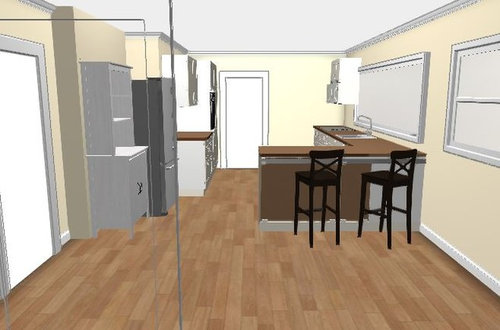
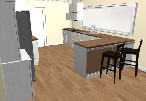
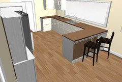
Houzz incorporated kitchen design...feedback please!
nondesigneraaron
6 years ago


Featured Answer
Sort by:Oldest
Comments (19)

sheloveslayouts
6 years ago
nondesigneraaron
6 years agoRelated Discussions
Hoping for kitchen design feedback!
Comments (30)As much as I'd love to save some space and finally settle on something, I haven't been convinced that the bench attached to the island is something that would work for our family/cooking style, so I'm going to abandon that idea for now. Mama goose, the area above the WC/Kitchen is a wide hall/entry with not a lot of natural light, so wouldn't make a great living room. Plus, the kitchen/dining/living room is 35' x 20' (minus the bathroom, of course), so it seems it should be plenty big for all three uses for our family. I've attached two more ideas with the following changes/ideas: - I changed the cookstove/masonry heater to more accurately reflect what it will look like (our planner had drawn in the other one). - I moved the doorway into the kitchen over to the left by about 8 inches to allow more space next to the range. - The kitchen is an L open to the both the woodstove and the dining table, and the two variations on the island are both appliance-free for prep/baking/canning/etc. - One plan has the fridge again near the door, which I'm worried crowds the range a bit. The other has the fridge at the other end of the kitchen, which gives more space to the range on the top wall but then rather separates the window seat from the kitchen, which I'd hoped to avoid, but maybe is fine? - And the thing I'm most excited to have thought about is the phone charging/family command center cabinet in the doorway! I know it's not super ideal to have a cabinet in a doorway (even with a 40" opening), but this way it opens up that desperately needed space on the top wall of the kitchen without me losing the general location the phone charging/family calendar space, and since we're moving that doorway and the wall will be reconstructed anyway it seems perfect. (And I don't think it's a cabinet we'll use when we have people over, either). I'm looking forward to hearing your thoughts and ideas, and helping me see what I've overlooked or forgotten! Nessa...See MoreFinal kitchen design feedback!
Comments (461)Everyone seems to love the backsplash. My friend, who was there when they installed it, says she wishes she could have taken a picture of my face when it went in. I was ecstatic. Not exaggerating when I say I was jumping with joy. I owe a TON of thanks to pal and cpa for inspiring me to get this backsplash!!! I seriously want to buy you guys a bottle of wine! It was pal's idea to use nero marquina and cpa made the first rendering with nero as the backsplash (way back in December 2017!) to help me visualize it. I looked all over the place and couldn't find nero marquina slabs with lots of contrast between dark blacks and bright whites as in cpa's rendering. Nero marquina tends to be more subdued with muddled blacks and whites. But when I discovered the black moon it had the striking black & white look I was searching for. Just like in cpa's rendering and what pal probably envisioned. Like a lot of you said, that backsplash takes the kitchen to the next level and I doubt I would have landed on black moon without nero marquina as my inspiration. It also helped me focus on finding a very specific look instead of considering every single piece of stone I saw. I'm happy with everything so far, the TopZero sinks, the honed white quartz and even my Alexa-enabled faucet -- it's fun! Another cool find was this automated paper towel dispenser. It works surprisingly well and has a high cool factor, if you're looking for a cool kitchen gadget. It looks so much better in my kitchen than having a visible roll of paper towels. I'm going to try to keep counter clutter to a minimum. We'll see how long that lasts after I move in......See MoreHouse Design feedback?
Comments (53)Thank you, Cpartist. Yes, I have read much of your journey here on Houzz. I very much appreciate your attention to my project. Your points about the exterior are things I agree with. Esthetically, again: we are inspired by the northern European architecture of my husband's home country, which also repeats in the original German settler architecture in this area. But my husband likes really modern architecture. So we are imagining/aiming to create a look as if an old-world stone building was discovered and modernized. So many beautiful examples of this... I also hate the look of the many small windows on the north elevation. But my conflict/compromise is that each of the interior spaces really improves with the window there. And they are all small spaces. (Bathroom, stairwell, playroom nook, playroom loft and upstairs dressing room). What do you recommend? Making those spaces windowless? I had thought to just let ivy grow over/around the front around the door, to emphasize it. Staircase: I agree. We hate the spiral staircase, but a long, straight one just wouldn't fit. I agree that it would be way better to have the stairs all in one flight. But the problem there was a conflict between: 1. the third floor needs to open onto it's deck, over the covered outdoor area (which is to the south for many reasons) 2. The best place for the stairs are near the entrance so the living spaces aren't interrupted (right?). Which means that to have both, the 3rd floor would be huge, spanning the length of the front to the back, which we don't need and couldn't afford. I totally agree and I am irked by the waste of space between kitchen and living room. Do you have suggestions? The architect thought it was okay and would end up being used as an entry space for people to gather/say goodbye at gatherings. The outdoor grill: there is a passthrough window from the kitchen on the south east corner... (So looking forward to that feature.) Powder room: yes, the location of this room is the thing I dislike the most. But every other spot I put it seemed worse: with a door potentially opening to a main living space ... Smells, sounds etc. Where would you put it in this plan? (I am 100% influenced by older architecture scale of this room... I just think it's enough... Though I also hear the note about accessibility, and would like to improve that aspect.) TV spot: Again, we aren't watching TV much, and when we do we are all together. The architect thought it would be awesome to be so close and tight. He said it "will feel like you are in your movie" (also it's about as far away as we are now) Thank you, Cpartist! I appreciate your input....See MoreFaucet design feedback request
Comments (8)Thank you all for your candid feedback, I really appreciate it and will integrate it into the design as much as possible. I'll try to address a few of the concerns. A) The forward facing handle is a feature that I feel is worth a second chance. There have been discussions on these forums about this exact issue: https://www.houzz.com/discussions/4994431/can-single-handle-on-kitchen-faucet-be-mounted-forward https://www.houzz.com/discussions/2563408/would-a-front-facing-faucet-handle-bug-you All the comments confirm the benefits I described earlier. The only reasons I can think of for locating the handle to the side are: Convention and aesthetic preference, as well as slightly more room for large pots. Of these reasons I believe that aesthetic preference is the only one that holds much water (pun intended). I don't believe there is a "right" way, but one way certainly has more functional benefits. Handle (and cartridge) placement also comes into play when designing a faucet where the exterior shape simply requires placement in one location over another. My own deck mount faucet at home has the handle facing forward and I cannot think of a single time I have sprayed water on my arm while trying to use it. B) I was not prepared for how sensitive the issue of actual installation would be, but now I am glad for the feedback as I believe we can address it in the design. From what I have seen, most (if not all) wall mount faucets require plumbing rough-ins of some sort, I would be nervous about that as well because it usually means very little flexibility when the time comes to actually install the fixture and everything has been done and covered up. Our design eliminates the need for rough-in plumbing and allows generous adjustments almost up to the end (about the time of installing the backsplash - which I believe is after the countertop and sink are installed) Per your feedback, we are planning to use a bracket to allow for easy installation and removal within the whole line of faucet styles we expect to have. C) Regarding the spray hose dangling around in the insulation and by other pipes, we plan to have a system in place to isolate the hose and prevent it from getting caught on anything. This will also allow one to pack insulation up close to the hoses without restricting their movement. The Hansgrohe sBox is a system that looks like it does this very well. D) I admit that the aesthetic design is not everyone's cup of tea, and it probably wouldn't be mine if I had to live with it forever. But I did have to come up with something that we could get started with for a prototype. We expect that this faucet can be designed in almost any "style" while retaining the features we want to integrate, this is a first step. Thank you again for your feedback, it was super helpful and I'm excited to address it in more detail as we move forward with the development!...See Moresheloveslayouts
6 years agonondesigneraaron
6 years agolast modified: 6 years agocheri127
6 years agonondesigneraaron
6 years agonondesigneraaron
6 years agosheloveslayouts
6 years agolast modified: 6 years agocheri127
6 years agolast modified: 6 years agoBuehl
6 years agosheloveslayouts
6 years agolast modified: 6 years ago
cpartist
6 years agosheloveslayouts
6 years agonondesigneraaron
6 years agolast modified: 6 years ago
Related Stories

HOUZZ TV LIVETour a Kitchen Designer’s Dream Kitchen 10 Years in the Making
In this video, Sarah Robertson shares how years of planning led to a lovely, light-filled space with smart storage ideas
Full StoryKITCHEN DESIGNKitchen of the Week: A Designer’s Dream Kitchen Becomes Reality
See what 10 years of professional design planning creates. Hint: smart storage, lots of light and beautiful materials
Full Story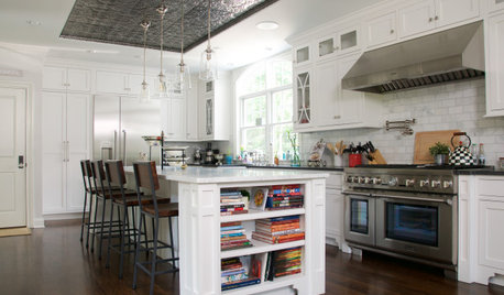
HOUZZ TV LIVEA Houzz Editor Highlights 4 Unexpected Kitchen Design Details
In this video, Mitchell Parker talks about shiplap-style cabinet fronts, pressed-tin ceilings and other kitchen details
Full Story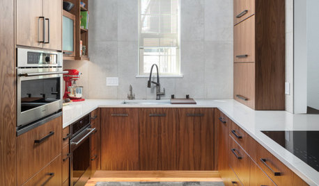
HOUZZ TV LIVEFresh Makeover for a Designer’s Own Kitchen and Master Bath
Donna McMahon creates inviting spaces with contemporary style and smart storage
Full Story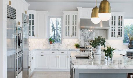
HOUZZ TV LIVEFresh White Palette Brings Joy to Designer’s Kitchen and Bedroom
In Florida, Krista Watterworth Alterman ditches dark faux-Mediterranean style for bright, glossy whites
Full Story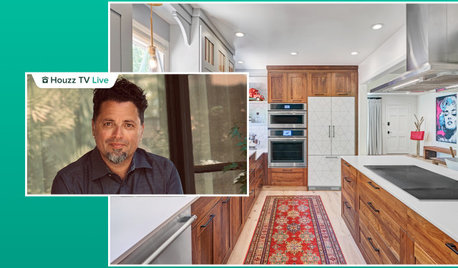
HOUZZ TV LIVEA Designer Highlights His Kitchen’s Stylish Details in 2 Minutes
In this short video, Nar Bustamante shares how two-tone cabinetry and other features create a winning design
Full Story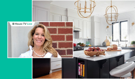
HOUZZ TV LIVETour a Designer’s Stylish and Dramatic Kitchen and Laundry Area
In this video, Joni Spear highlights the colors, tile and other elements that make these two remodeled spaces shine
Full Story
HOUZZ TV LIVETour a Designer’s Colorful Kitchen and Get Tips for Picking Paint
In this video, designer and color expert Jennifer Ott talks about her kitchen and gives advice on embracing bold color
Full Story
HOUZZ TV LIVETour a Designer’s Cozy Colonial-Style Family Room and Kitchen
In this video, Sara Hillery shares the colors, materials and antiques that create an inviting vibe in her Virginia home
Full Story
HOUZZ TV LIVETour a Designer’s Beautiful Low-Maintenance Kitchen
In this video, a pro shares the durable materials and other key features that make life easier in her Houston kitchen
Full Story


cpartist