SHOP PRODUCTS
Houzz Logo Print
kbear_15

Need help with kitchen backsplash ideas...

kbear_15
6 years ago
last modified: 6 years ago

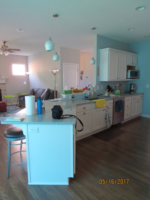
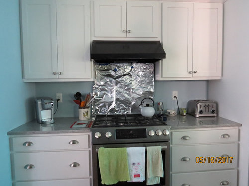
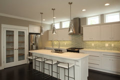
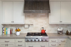
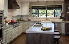
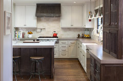
I want to add a tile backsplash to my kitchen...I'd call it a transitional style - not very traditional but definitely not modern.

For the majority of the kitchen, I plan on doing white beveled subway tile staggered in a brick pattern with light-med gray grout. Over the range, however, I'd like to do a small accent framed area....but am having a little difficulty picking something out. I don't want to just do a different pattern with the same subway tile.

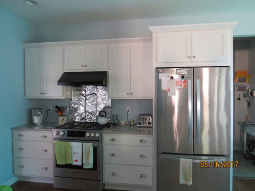
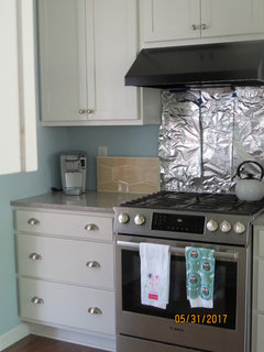
The area above the range is is 30 3/8'' across and 26 7/8'' tall.

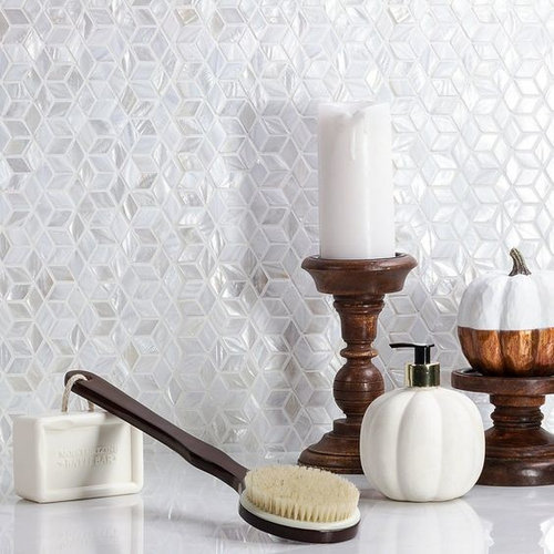
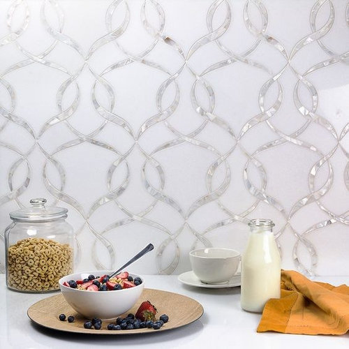
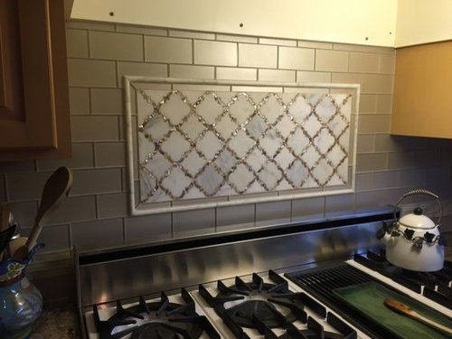
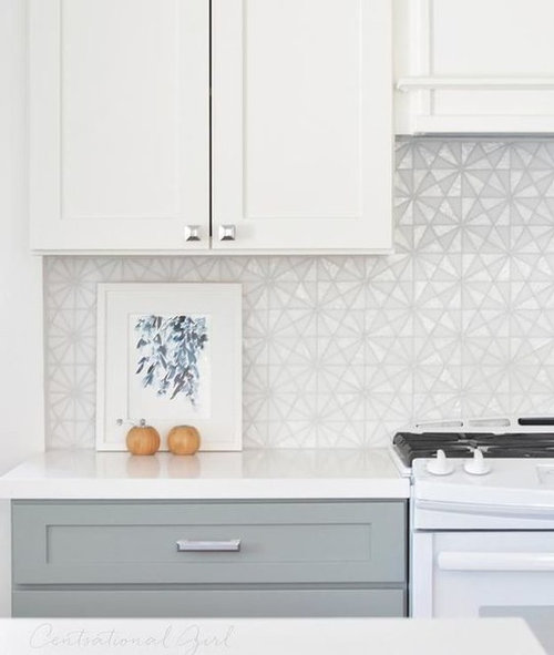
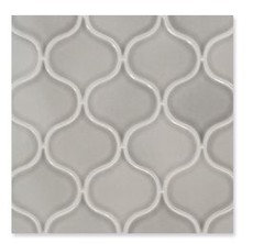
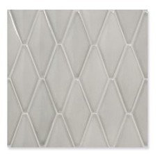
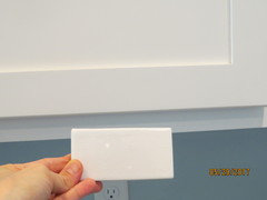
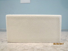
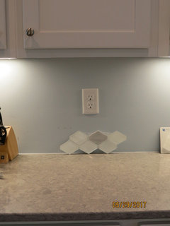
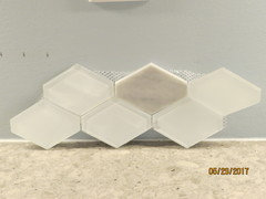
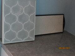
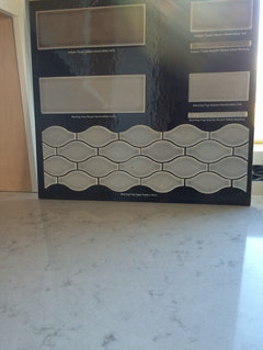
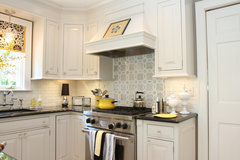
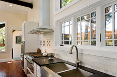
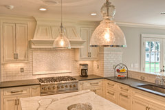
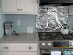
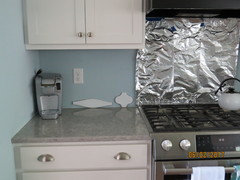
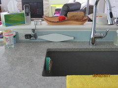
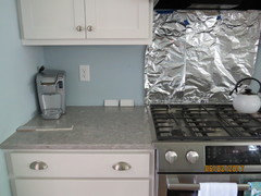
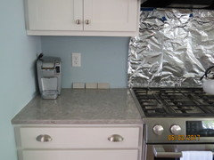
Here are some photos of the kitchen and some tiles/patterns that have caught my eye....

1. Would like to hear people's opinion on the accent tile options above the range. Thank you!

2. Also, any recommended dimensions for the accent framed area given my dimensions?

(don't mind the foil behind the range - builder put cheap flat paint and the foil helps prevent grease spreading all over the wall)

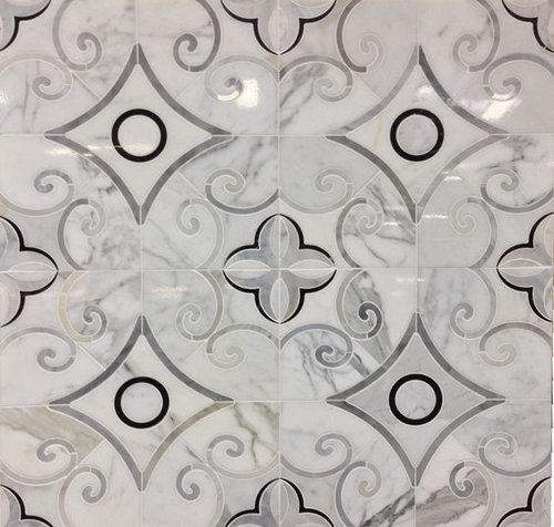
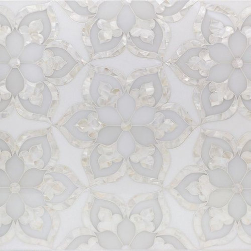
Possible accent tile options for above the range:

1.

2.

3.

4.

5.

6.

7.

Comments (118)

  • kbear_15
    Original Author
    6 years ago

    smm5525

    Regarding the AKDO dewdrop, here's all the color options from their website - think any would work?

  • kbear_15
    Original Author
    6 years ago

    Checked out Sonoma tiles' website....

    I liked their "Stellar" line -

    Shapes I liked: Trestle;
    Aria; Quilted hex (can mix colors? in online brochure, there's a picture using 3 different colors); 2x6 square edge; 3’’
    and 4’’ hexagon

    Trestle:

    Aria:

    Quilted hex:

    quilted hex using 3 colors:


    2x6 square edge

    3'' hexagon


    Colors I liked: ?? dulce de leche
    (crackle): *cirrus (crackle); bossy gray (glossy); seed pearl (glossy);
    ??alpine snow (glossy): cloud dancer (glossy)

    Here's a link to all their shapes & colors in the stellar line:

    shapes: https://www.sonomatilemakers.com/LineList.aspx?prod-line-id=6&line-list-id=24&IsLineList=True

    colors: https://www.sonomatilemakers.com/Palette.aspx?prod-line-id=6&IsColorPalette=True


    Would love input on the above shapes AND recommended colors....If I have the ability to have 2 or 3 different shades of colors, which pattern/which colors?

  • Related Discussions

    Help me choose Pendant lighting! Backsplash ideas also needed!

    Q

    Comments (16)
    Thanks for the suggestions! I will be getting my Vetro B/S sample today (there was a mix up with the supplier.) I really hope I like it because I am really getting kitchen reno fatigue and don't want to keep searching for the right B/S. It's been chaos juggling work, kids and dragging my kids to endless trips to Home Depot, granite, lighting, etc. stores!! Fortunately, we have a much needed vacation next week! The discus pendant is nice, but at 10" in diameter, I think a bit big for my kitchen. Any other ideas? I have no clue what I even like in pendants?? I am considering a brushed nickel b/c of the hardware/SS appliances but also think maybe something glass or crystal would be nice. any other suggestions??? Thanks!!
    ...See More

    HELP!!! Ideas needed for kitchen back splash and lighting fixture

    Q

    Comments (4)
    That is some really nice granite! I decided to take a look at some pendant lights (I assume they'll go over an island, but if you need something else, like a ceiling semi-flush mount, please let me know) and chose to look at pendants with nickel finish to go with the cabinet handles. I can expand the search to include bronze or other finish families too, though! Kichler Crystal Ball Fredrick Ramond Globe Kichler Avery Hinkley Latitude Elan Meridian Elk Hammered Glass Feiss Lexi ET2 Starburst George Kovacs Alecia's Necklace Fredrick Ramond Mime Craftmade Design-a-Fixture Feiss Rubin Elk Kersey Maxim Lighting Ripple Feiss Beso These are just a few ideas! We have thousands more pendants to peruse if none of these strike your fancy.
    ...See More

    I need ideas from great minds for a kitchen backsplash

    Q

    Comments (2)
    I'd go for a glass tile in a light grey. Glass will help bounce light around more to help the kitchen feel bigger and the grey will tie in with the floors. I'll just add that you may want to swap the fridge for a counter depth one because that's a small kitchen and that current one is DOMINATING the room.
    ...See More

    Advice Needed on Kitchen Tile Back-Splash and LVT/LVP Flooring Color

    Q

    Comments (5)
    Hi Chispa, House is a townhouse built in 1996, trying to modernize the look. As far as decorating style, I like modern/contemporary, nothing too funky. Something that would be cohesive with the rest of the kitchen, and bring the kitchen to life a little. It's very white right now.
    ...See More
  • ravencajun Zone 8b TX
    6 years ago

    If you like Dove Gray take a look at MSI Dove Gray it is a crackle, comes in various shapes, and is available at home Depot and Lowe's I believe. Several people here have used it. Very pretty tile.

  • ravencajun Zone 8b TX
    6 years ago
    last modified: 6 years ago

    Here scroll down to the samples of dove gray. You may like the diamond. They also have a morning fog.

    https://www.msistone.com/material-selector/?key=Dove%20Gray

    kbear_15 thanked ravencajun Zone 8b TX
  • mayflowers
    6 years ago

    I am very tired of arabesque as it's now everywhere, but when I look at your original selections, there are a lot of curvy, organic shapes, so you may be happier with something like that than a rigid geometric shape.

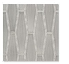
    This is what an elongated hex looks like in a hand-glazed tile that gives it variation within the tile.


    The St. Clair · More Info

    Sonoma colors don't look anything like they appear on their website, but then neither do Fireclay's. The colors we see in your photos aren't what you see at home, so don't overly rely on us to chose colors.


    kbear_15 thanked mayflowers
  • kbear_15
    Original Author
    6 years ago

    Think the dove gray might be too dark/too close to my countertop - but i'll check that website. Thank you.

    Yes, I feel the arabesque is overused and though I'm considering it, I don't know if I'd call it my favorite.

    Agree as well w/ the colors - nothing beats seeing them in person and I'm the only one who can be the final judge...but I do appreciate the recommendations.

  • smm5525
    6 years ago

    I'd try to find something in the lightest shade of grey u have in the countertop or the beigey/white that's in there.


    Fireclay's morning fog and several others have color variation so you don't have to mix different colors.

    MSI Dove grey was too dark in my space. As for shape, you have a pretty neutral kitchen so anything not too ornate would work. It's a matter of preference


  • smm5525
    6 years ago

    For colors, you seem to be on the right track! I just looked up some of the Sonoma ones. I would stick with something lighter like cirrus vs the too dark dulche de leche.


  • ravencajun Zone 8b TX
    6 years ago

    Definitely look at it in person because online it looks much much darker than it really is. I found I really couldn't depend on what I saw on my monitors because it was different on each one. It drove me crazy looking at paint. I spent a lot of money on samples lol. But I got what I wanted finally.

  • kbear_15
    Original Author
    6 years ago

    Thank you again for all the advice/input.

    I am working with a designer at fireclay and samples were sent out today - looking forward to getting those!

    Looked at MSI Dove Grey - yes, too dark for my space.

    Went to another tile store today - will post pictures when I get a chance...I'm really hoping the fireclay will work out.

  • smm5525
    6 years ago

    Someone said in another thread that Fireclay is no longer making the glass tile. Did they tell u that too?

  • kbear_15
    Original Author
    6 years ago
    No, fireclay did not tell me they were not making the glass tile, though yesterday I emailed the designer confirming she was send the hydrangea in gloss and matte...I am hoping to hear her a reply from her later today.
    That would be my luck...seeing something I like and it's no longer available.
  • kbear_15
    Original Author
    6 years ago

    Yes, it is officially true - the designer confirmed they discontinued their entire glass products! :(


  • kbear_15
    Original Author
    6 years ago

    Again, I'm really hoping the fireclay samples I am being sent will work out - but as a backup, anyone know of a similar tile company/brand that sells tile to a similar look of the hydrangea matte/gloss look? just curious.

  • kbear_15
    Original Author
    6 years ago

    So I think I've realized a few things:

    1. I don't want an arabesque pattern. I'm leaning toward a 2x6 subway (in a staggered/brick pattern), 3-4'' hexagon, or "wave/elongated hexagon" type shape.

    2. I also realize I don't like 100% monotony - I prefer some slight variation, in some way.

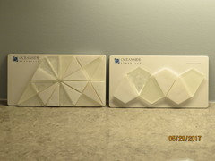
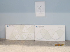
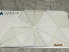
    Having said that, here are a few more pictures of samples I checked out from tile stores...

    Note = the sample on the left is the tile picture that I originally posted as #6 on May 16.

    1. No lights on


    2. Undercabinet lights on

    3. Overhead recess lights on


    4. Close up

    5. Close up


    I think the sample on the left has too much going on (pieces are too little) and makes it a bit too busy for me. Also, in my opinion, the real sample doesn't look as nice as the "inspiration picture" (#6 from May 16).

    The sample on the right (oceanside glass tile tessera veil "pave") is just okay to me. I think the mother of pearl/iridescent looks a little yellow, especially when the lights are on.

    Other's opinions on these two?

  • kbear_15
    Original Author
    6 years ago

    Regarding Sonoma tile Stellar collection:

    1. I'd love input on which shape(s) you think would look best in my kitchen...(see my May 23 post for actual pictures of the shapes)

    Trestle

    Quilted hex

    2x6 square edge

    3’’ and 4’’ hexagon

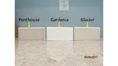
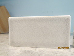
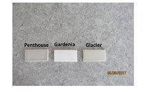
    2. As for colors, I checked out 3 at a local tile store - I realize it's very difficult to comment on color when looking at the computer and a picture taken from a camera (vs looking at it in person), but I'd still appreciate other's opinions.


    Penthouse up close:

    Gardenia near cabinets

    Glacier up close:


  • kbear_15
    Original Author
    6 years ago

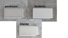
    Glacier up close:


    Feel like the gardenia would work if I want to go the white route.

    Penthouse is a great shade of gray, but sometimes I feel it's a tad bit too dark and would love if there was a shade lighter...

    Glacier seems to be a good "shade" (not too light/too dark), but color wise, it seems to have some cream/beige in it which doesn't looks the best against my counter.

    Thanks in advance for everyone's help!

  • kbear_15
    Original Author
    6 years ago

    Here's the last tile sample I currently have (still waiting on samples in the mail of a few others).

    No lights on:

    Undercab lights on:

    Picture taken further away/shows cabinets:

    closeup:


    I really like this option - I like the variety in "texture" (not monotonous), colors (the white glass seems to go well with cabinets and the random honed carrara matches my counters nicely, not too dark) & shape - not too small/busy, not too big.

    Other's opinions on this option?

    Picture from catalog with it installed:


  • kbear_15
    Original Author
    6 years ago

    Here are 2 other options I found online I was considering (and may request samples)....What do you think about these?

    1. (not sure if the pattern is too busy/shapes too small) but thought the colors would go well and liked how it looked on the wall in the 2nd photo.


    What it looks like installed:

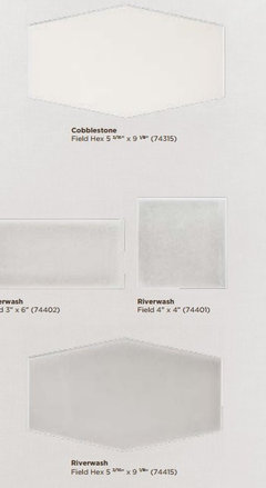
    2. The field hex - thinking cobblestone (riverwash might be too dark)


  • andria564
    6 years ago

    I love the Hexy and also like the mix and texture mix. I also like the 1. that you posted latest. I think you you would need a sample of that because I cannot what the darker tiles would do on the wall.

  • mayflowers
    6 years ago

    The Hexy is nice. I prefer it over the #1 hex. I read a good tip once of how to decide between choices. Compare
    only two samples and chose the one you like best. Then compare that sample to
    the next one and continue until you're down to the last choice.

    I also like the field hex in both colors. The sides are wider than other hexes so it's not too far off from subways, yet it's more interesting. Who makes that tile? I might get a sample. I've been five years without a backsplash!

    I like the Sonoma Glacier color too. Can you photograph the Sonoma tiles flat on your counter? I keep thinking the counter is cream because often the lighting gives it a yellow cast. I would only post photos where the counter looks gray, like in the photos taken 5/19.


    kbear_15 thanked mayflowers
  • kbear_15
    Original Author
    6 years ago

    mayflowers - The field hex you asked about is made by Jeffrey court atlas.

    Great advice - thank you.

    Yes, i can photograph the sonoma tiles flat on the counter.

  • kbear_15
    Original Author
    6 years ago

    Here are the sonoma tiles flat on the counter...

    Close up of each one:


  • kbear_15
    Original Author
    6 years ago

    Was able to grab a sample of the smaller raised hex....don't think I like it/will work. Colors seem off and hex seems too small.....Agree??


  • mayflowers
    6 years ago
    last modified: 6 years ago

    Agree. I was looking at the gallery on Jeffrey Court and they had a photo of that one I think. It reminded me of fish scales because of the iridescence. They also show the field hex installed in the sand bar color. I think it was in Other in the gallery of Atlas tiles.

    Penthouse is the best color match. You have very little wall space and white cabinets so I don't think it will be too dark. It's kind of predictable in a subway though, and you didn't start this thread settling for predictable.

    kbear_15 thanked mayflowers
  • smm5525
    6 years ago

    I personally don't like the small mosaic type tiles. Put the three subway tiles next to each other against the wall and step back about 10 ft and see which one, if any, works.

    kbear_15 thanked smm5525
  • andria564
    6 years ago

    Ditto Hexy or Subway. I still like the Hexy because it's something different but still traditional. However, I would probably get a larger sample if you can before you order of the Hexy to see pattern repeat. Sonoma makes the Penthouse in a ton of different shapes if you want that color but something other than a Subway. https://sonomatilemakers.com/LineList.aspx?prod-line-id=6&line-list-id=24&IsLineList=True 

  • mayflowers
    6 years ago
    last modified: 6 years ago

    If you went with the Stellar line, you would have a lot of choices of grays and whites to do a mix. You could mix gloss and matte and/or use a different shape. Does this look do anything for you?

    Traditional Kitchen · More Info

    Rustic Kitchen · More Info


    Traditional Kitchen · More Info

  • kbear_15
    Original Author
    6 years ago

    Referring to my post from Monday, May 29 (where I found 2 other tile options online, but wasn't sure how'd they look in person)....

    I found at a local tile store the second tile picture I had posted and took a sample home.
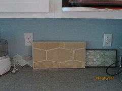
    Here is a picture of it - it is the Field Hex. It is NOT the correct color - but I checked it out to see the size.

    Regarding colors, there is only 1 color they make that could work for this shape: the riverwash (a gray color) which I will post. The cobblestone (though it looked white online), looks very creamy to me in person (will post a picture of that as well) and I don't think the cobblestone would work.

    1. Picture of the Field hex - the sample in the middle in the tan color...(not a color I am considering), just wanted to see the actual shape/size of the tile in the space. (to the left of it is the Hexy).

    The field hex seems a little too big for my space in my opinion. Do others agree?

    2. Colors I was looking at if I went with the Field hex: Picture of Riverwash color on the left (the grayish color) & cobblestone color on the right -

    The cobblestone seems too creamy to me.

    Another photo of the same ....

  • kbear_15
    Original Author
    6 years ago

    andria564 - Re: Hexy - How do I go about getting a bigger sample? (the picture I Posted: that is the sample the store ordered/sent me as they do not loan out anything from their store...)

    mayflowers & andria564 - regarding the sonoma stellar tile collection - (and considering the penthouse color), the size/shape of the tiles I have been taking pictures of is just merely the sample I was given/checked out - the samples to look at colors only come in that shape/size. See my posts from May 23 and 29 regarding all the possible (non-subway) shapes. Would like your opinion on that.

    I agree with mayflowers - I'd prefer to not do 100% 2x6 subway in sonoma stellar penthouse as there'd be not alot of variation with that.

    mayflowers - I do like those pictures you posted and am willing to entertain mixing matte/gloss to make it more interesting, though it's a little overwhelming/I wouldn't be sure where to start. What specific shades of whites/grays from the stellar collection would you recommend I try and check out at my store to bring home and look at? How many different shades of white/gray should I use? I'm not sure how exactly I'd arrange everything...

    I believe their gloss tiles are plain/not crackled vs the matte tiles are crackled. Would this look weird?

    As of right now, I feel I have narrowed the choices down to 3 companies/possibilities:

    1. Hexy

    2. Sonoma Stellar collection - debating color(s) and shape still

    3. Fireclay - still want to see their colors and shape wise, looking at the wave or 2x6

    Thank you again for all the help and input.

  • smm5525
    6 years ago

    Can I suggest when you post samples, you post pics from a distance as well so we can see how they relate to the cabinets and countertop. Put them on the countertop next to the stove


  • smm5525
    6 years ago

    Here is a tile I was considering. It's Highland Park morning fog. You might like the variation and shape. It's about $8 a sq ft I believe .


    These are my Fireclay foggy morning samples. As you can see it has quite a bit color variation. V4 I believe

    kbear_15 thanked smm5525
  • mayflowers
    6 years ago

    What specific shades of whites/grays from the stellar collection
    would you recommend I try and check out at my store to bring home and
    look at? How many different shades of white/gray should I use? I'm not
    sure how exactly I'd arrange everything...

    I believe their gloss tiles are plain/not crackled vs the matte tiles are crackled. Would this look weird?

    I don't have samples of Stellar and their photos aren't accurate online. Ask your tile salesperson if they have sample stock on hand--my saleswoman brought a bunch of the sample tiles from the stockroom and laid them out for me and also drew a pattern on graph paper. I could only bring one tile per color home though.

    I think in the photo I posted they used four different colors but they are close in tone. Your tile setter should know how to lay out patterns like that.

    Sonoma Stellar comes in gloss, crackle, and matte. I would not use crackle in a mix.

    kbear_15 thanked mayflowers
  • kbear_15
    Original Author
    6 years ago

    smm5525 - thanks for the picture taking advice.

    Yes, I like the highland park morning fog ogee - that is kind of neat. I'll see if I can track down a sample and see it's size....

    mayflowers - will work on that next time I can make it out to the tile store. Would a mix of gloss/matte look good with non-subway shapes?

  • kbear_15
    Original Author
    6 years ago

    Here are 2 pictures again of the field hex taken from far away (again, looking at shape, not color)...Each hex is about 5 3/16 tall, so I could fit ~3.4 full hexes vertically in the space. Maybe it's not so bad after all? One issue I'd have is by the 1/2 pony wall near my sink...that wall is only 3.5'' tall, so there'd be no full hexes there.


    Below is a picture of the cobblestone color vs riverwash color taken with the tiles flat on the countertop.

    Cobblestone is on the left, riverwash on the right.


  • mayflowers
    6 years ago

    The Riverwash looks like it might have a blue-green undertone.

    I think the field hex needs a full wall. Maybe that's why they show it in the Other category in their gallery instead of kitchens and baths.
  • smm5525
    6 years ago

    It's too big

  • smm5525
    6 years ago

    We can't advise on color of tile laying flat on countertop. That isn't how it will be installed. Take a far away pic like u did of the large hex
  • kruegesm
    6 years ago

    Here are a couple more ideas.

    Traditional Kitchen · More Info


    Atherton Estate · More Info

  • kruegesm
    6 years ago

    One more- I think some bling brings joy with subway tile!

    Website · More Info

  • kbear_15
    Original Author
    6 years ago

    Received 2 samples in the mail yesterday....Some from fireclay, another from a store I visited.

    Here's one: (ADEX neri decos - ADE NEWH BOA66 6x6 white;


    Another taken further back

    Think the design is pretty - not sure if I want all pure white with no variation. It's also a bit pricey - $15.19/tile

  • kbear_15
    Original Author
    6 years ago

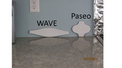
    Here are some of the Fireclay samples (out of 6 colors, they sent me 1 wrong color, so waiting to get one more color, sugar); out of 3 shapes, they went me only 2 (paseo and wave); waiting to get the actual 2x6.

    Here are the 2 shapes: wave and paseo

    One further away:


    Wave only taken at the small pony wall:

    I seem to like the wave more than the paseo; wave also fits nicely on the 1/2 pony wall.

  • kbear_15
    Original Author
    6 years ago

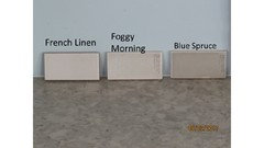
    Here are 5 Fireclay color samples:


    The 1st three:

    Taken further away: (same exact order)


    2 other colors:


    Further away (same order)


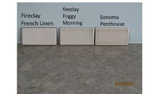
    From the top picture with the 3 samples, I feel blue spruce is too dark. Foggy morning seems like a good match - perfect shade of gray - not too light or too dark and it's a V3. Not sure what to make of French Linen (V2) - seems like it could work, shade seems not too dark and not too light. Weird thing is when there are no kitchen lights on, it seems gray, but when I turn my under cabinet lights on, it turns white.

    Out of the picture with the 2 samples, the frost seems to have a little yellow/cream in it which I don't like. White wash could work, but it's very plain, not crackled and is a V1.

    Just out of curiosity, since I am also considering the sonoma stellar line and if I went with a gray tile, it'd probably be penthouse (I still have to go back to the tile store and look some more), Here's a photo with 2 fireclay colors and 1 sonoma (penthouse)


    If I did fireclay tiles, should I go gray or white and which specific color? and should I do 2x6 or wave?

    I still have the hexy in the running; and the sonoma stellar line (which has all kinds of shapes I'm waiting to look at vs 2x6 with mix of gloss/matte).....

    Too many choices!

    Would love other's opinions :) Thanks!

  • eam44
    6 years ago
    last modified: 6 years ago

    I love the Wave tile shape, and I'm a fan of Foggy Morning or Whitewash.

    Interestingly, to my virtual eye, Frost is a warmer white, but it is closer in color to your cabinets than Whitewash. If you don't like it, you don't like it. You see them in person, so you are the best judge of color. To get an idea of the overall effect a wallfull of either tile will have, you could use the trick oldbat2be used - get color photocopies of your tiles and tape them to the wall. I have no idea whether this will work with the white...

    By the way, there is at least one complaint about Fireclay Tile on this forum. I don't know what's going on over there, but they seem to have mixed up your samples order as well. No company is perfect, and the overall opinion of Fireclay Tile is that they are very good, but if you order from them, be certain to order all the correct trim pieces, keep track of exactly what has been ordered, and absolutely double check your tiles when they arrive.

    kbear_15 thanked eam44
  • smm5525
    6 years ago

    I love foggy morning. For shape, I prefer 2 x 6 but it seems you want something different. If so, wave seems to fit your space nice. I also like the whitewash but it doesn't have crackle or variation.

    I say go with the foggy morning. It has the variation you like, the crackle adds interest and the wave is a clean modern shape that isn't subway (which you don't prefer).

    If you narrrow it down to foggy morning, ask your rep to send you a few more tiles of it so you can see the variation.

    kbear_15 thanked smm5525
  • mayflowers
    6 years ago

    If 11 1/2" is too long in the Wave, Sonoma has the Trestle in 8 5/8". I'd trace the Wave and lay out a few rows.


    Did your tile store not have the cooler grays in Sonoma? United Tile in Portland shows the colors better on their website than Sonoma does. That's where I got all my design help.


    http://www.unitedtile.com/products/HOME/PRODUCTS/PRODUCTS%20-%20CERAMIC/SONOMA%20-%20CERAMIC/SONOMA-STELLAR/SONOMA-STELLAR-COLORS.aspx

  • kbear_15
    Original Author
    6 years ago

    smm5525 - Great idea - I'll email the rep and ask for more foggy morning samples to appreciate the variation.

    I can't decide if in general, a white or gray color backsplash will look better in the space (i.e. whitewash vs foggy morning).

    Not sure where you got the impression I'm opposed to subway looking tiles - I'm definitely open to the 2x6 tile. (particularly given the amount of variation foggy morning has and it's crackled). Once I decided not to do an accent above the stove, I was opposed to doing traditional 3x6 subway in a 0% variation, non-crackled tile.

  • smm5525
    6 years ago

    Maybe put foggy morning next to whitewash and stand back and see what looks better in all different lighting, times of day, etc. That is how I was able to make the final choice on mine.


  • isabel98
    6 years ago

    what did you end up doing? I'm looking at foggy morning myself but have a different space. would love to see a photo!