


New Paint from Benjamin Moore called Century
Lori A. Sawaya
7 years ago
last modified: 7 years ago
Featured Answer
Comments (34)

indygo
7 years agotheclose
7 years agoRelated Discussions
Benjamin Moore Paint - Deep Base
Comments (28)This thread refers to switching bases as though they are interchangeable - but I am finding that they subtly but noticeably change the color. Am I the only person who sees this and finds it to be a real problem. I found a Janovic paint that I liked, which has a Benjamin Moore pastel base. While I would have preferred to use Aura, my experience, through MANY tests, was that the color would change significantly. Since I was concerned that the Janovic paint was an unknown brand, I had the color I picked made in Benjamin Moore Matte. I had a momentary, and costly, memory lapse and forgot to ask about the base. I just had my 900 square foot loft painted and the color is a really ugly yellow under halogen light. I took out the large board I had painted and the color is slightly, but noticeably, warmer. I may now need to redo the paint job. I have the following questions: - How many coats will I need? My painter says 2, but, given how slight the difference is, I am wondering if one will do. - Does anyone have experience with the Janovic line? - I'd like to do Matte, but, given the comments above about the washability of the BM Matte, I am concerned. Thanks....See MoreBenjamin Moore or Kelly Moore
Comments (4)This might be late, but if it's Super Spec, maybe see what they'll charge to go up to Regal. My house was professionally painted out completely in Super Spec Barely Beige to put it on the market. It looked ok when we moved in, but it quickly went downhill. Over the course of a few months, the walls were very marked up from day to day use. Forget scrubbing, the paint comes off the wall. When I began repainting, I started to notice that there was fine cracking on the surface. It was probably painted over dirty walls. If you're going to spend the money to have a professional paint, make sure it's good quality paint. The upgrade cost isn't that much, what you're paying for is labor. Don't pay someone to apply inferior paing otherwise, you'll end up paying more to have it all done over, or doing it yourself. Here's something I found online explaining the different levels of paint. It references an even lower level called Super Hide, which didn't apply to what you were asking. "Super Spec is the next step up. Benjamin Moore Super Spec is definitely better than Super Hide. It was developed for commercial uses where cost is a factor and durability or quality isn't as important. Low-end painters will also substitute Super Spec for Regal products, too, and is also something to be wary of. Super Spec comes in flat, eggshell and semi-gloss and can be tinted to any color. The Regal line is Benjamin Moore's premium paint line, and before Aura it was their best. The Regal products built Benjamin Moore into the reputable paint company it is today. And these products do keep changing. Benjamin Moore has reformulated these products numberous times over the years to keep improving them. Overall, the Regal products are fantastic and compare well to any other premium paint brand on the market. Benjamin Moore Regal comes in flat, matte, eggshell, pearl, semi-gloss and high-gloss and can be tinted to any color. Benjamin Moore Matte and Benjamin Moore Eggshell are the most popular interior finishes for walls because they are washable and Benjamin Moore Semi-Gloss is the most popular finish for trim, baseboards and doors. These finishes are also referred to as Regal Flat, Aquavelvet (eggshell), Aquapearl (pearl) and Aquaglo (semi-gloss). Finally, the finest paint Benjamin Moore makes is Aura. Aura is unlike any other paint on the market. Benjamin Moore Aura paint is super-durable, does not require primer, will cover any color in no more than two coats, is low-odor and environmentally friendly and just looks richer for any color. Popular Science dubbed it one of the best new products of 2007. Aura comes in interior matte, eggshell and satin finishes. In the spring of 2008 Benjamin Moore will add an interior semi-gloss and exterior Aura products. With this information you will be better informed about the various paint quality options. Unless you are a builder trying to cut costs, you should use the best paint available. Relative to the overall cost of painting -- selecting your colors, tearing your home apart and living with the inconvenience, and expending the effort or expense of actually painting -- the paint itself is the least expensive part, and the difference between the best can of paint and the cheapest often only amounts to the cost of lunch or dinner one day. So given that on average you will live with the paint in your home for seven years, cutting corners on the paint quality doesn't make much sense."...See MoreNew help choosing a Benjamin Moore paint ASAP!
Comments (1)Try "Carrington Beige" (HC-93) -- a light and neutral beige from Benjamin Moore. For a slightly darker tone -- try "Northhampton Putty" (HC-89) Jan...See MoreBenjamin Moore’s white opulence paint color
Comments (75)It has been a while since the last activity on this thread, and I felt it might be beneficial to give my updated perspective on White Opulence #879 from Benjamin Moore as a paint color for main areas. Having lived with this color for a bit longer now since my last comment, I am beginning to understand how tightly it regulates what other colors can be placed with it for anyone who cares about a homogeneous scheme and also how undeniable the pink tone can be when applied over large surface areas. White Opulence is a tint of red, but it is so light that in ample daylight or under bright white lighting it can "read" as white. In average daylight, it produces a whisper-light pink hue. The effect of this is magnified the larger the area that is covered by it. Using this color on the walls in the main space of a large, open-plan layout with high ceilings, for example, will imbue the area with a light, yet undeniable, pale pink cast in average lighting. It would be a good idea to prepare not only yourself but also any other significant users of the space of the pink tinge before selecting this color because some people truly dislike pink, and it is courteous to work with all regular users of spaces during design planning to try to ensure no one will be overly uncomfortable with the final effect. One thing that hasn't been discussed is how White Opulence can cast a peach tone under warmer lighting colors, especially in the absence of any compensating daylight, meaning nighttime in most home spaces. If peach is a color you want to avoid and you utilize warm lighting -- that is, progressively orange-tinged the further under a 4000K color temperature you go -- then this is a paint color to avoid. The general recommendation is that 4000K is quite cool for home environments, so if you don't know what color temperature your home lighting is, you can probably assume it is warmer than 4000K if you selected average bulbs from your home supplies provider. White Opulence as a red-based white was an attractive choice for my main space because I already had a red accent in a permanent finish and personally prefer the fresh look that a red-white lends versus common alternate choices for main area wall colors like yellow-based beiges or blue-based grays. The problem is that so many home goods available are manufactured in colors that go with beige and gray wall colors rather than the faint red-white of White Opulence that color coordination requires more work than may be expected. Of course, you could decorate using pure white items, but what you really need are options for whisper pink basics which are hard to find. Adding stronger pink or red items is not always the solution either because you cannot feasibly fill the room with accents; you need some basics that blend with the wall tone. Then there is the issue of coordinating White Opulence with colors for auxiliary rooms if you wish to have some variety throughout the home while still maintaining the feel that all of the home's colors work together. Most blues coordinate with White Opulence, but if you have already used red accents in rooms painted with White Opulence, then red is challenging to pair with blue in most instances unless it is a dark, cool blue like navy. Where this has been a dilemma for me has been my hallway colors connecting the main open space to the bedrooms which are all different pastels. The color plan I have will work, and I'll enjoy the variety of colors that I have been able to make flow together, but to be honest, at times I have wondered how much easier the design process might have been if I had picked plain white for the main space. White is the ultimate neutral some might say. At the very least, a basic white for the main area would have given me more freedom in selecting fabrics and other home products for the main space as well as coordinating colors for other rooms. It is all too easy to second-guess decisions that will affect your life long-term. I am using Benjamin Moore's durable Aura formula in a satin finish, so I expect the new White Opulence paint will last decades. Had I selected a plain white or yellow- or blue-based off white, I might be back on this very forum wishing I had gone with White Opulence to add appeal beyond the standard choices. I hope this is helpful to anyone still considering this color....See More
daisychain Zn3b
7 years ago PRO
PROLori A. Sawaya
7 years agolast modified: 7 years agoBoopadaboo
7 years agolast modified: 7 years ago- PRO
Lori A. Sawaya
7 years ago 
sochi
7 years agoBoopadaboo
7 years ago- PRO
Lori A. Sawaya
7 years agolast modified: 7 years ago 
Bluebell66
7 years ago- PRO
Lori A. Sawaya
7 years agolast modified: 7 years ago 
4boys2
7 years ago
Michael
7 years ago
lazy_gardens
7 years ago- PRO
Lori A. Sawaya
7 years ago - PRO
Lori A. Sawaya
7 years agolast modified: 7 years ago Moonshadow
7 years ago
hoovb zone 9 sunset 23
7 years agoMichael
7 years ago- PRO
Lori A. Sawaya
7 years agolast modified: 7 years ago Boopadaboo
7 years agohoovb zone 9 sunset 23
7 years agolascatx
7 years ago
Love stone homes
7 years ago- PRO
Lori A. Sawaya
7 years ago maddie260
7 years ago
Fun2BHere
7 years ago
Olychick
7 years ago- PRO
Lori A. Sawaya
7 years agolast modified: 7 years ago  PRO
PROcolorific
6 years ago
Related Stories

COLORBenjamin Moore Floats Breath of Fresh Air as Its Color of 2014
Touted as a new neutral, this baby blue can stand on its own or support bolder colors. Here's how to use it
Full Story
Houzz Call: Show Us Your Paint Makeovers
Let your newly repainted house or room do the "How d'ya like me now?" strut right here — it might just be featured in an upcoming ideabook
Full Story
MUDROOMSHouzz Call: We Want to See Your Hardworking Mudroom
The modern mudroom houses everything from wet boots to workstations. Proud of your space? Inspire us with your photos and tips
Full Story
COLORPaint-Picking Help and Secrets From a Color Expert
Advice for wall and trim colors, what to always do before committing and the one paint feature you should completely ignore
Full Story
COLORWhen Color Could Kill: Stories From the History of Paint
Delve into paint's storied past — what you learn about its history and modern incarnations may surprise you
Full Story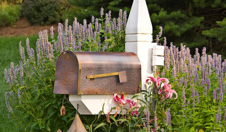
CURB APPEALHouzz Call: Show Us Your Mailbox!
Celebrate the U.S. Postal Service’s 240th birthday by uploading photos of your fabulous mailbox
Full Story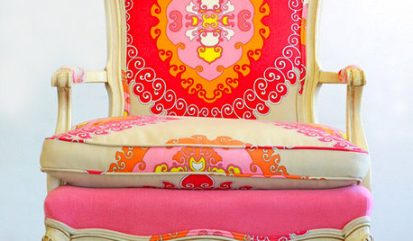
FURNITUREHouzz Call: Show Us Your Furniture Makeover Project
Have you reupholstered a tattered chair, transformed a dresser or revitalized bookshelves? Share your handiwork!
Full Story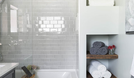
BATHROOM MAKEOVERSHouzz Call: Tell Us About Your Bathroom Remodel!
Did you recently redo your bath? Please tell us about your upgrade and what it took to get there
Full Story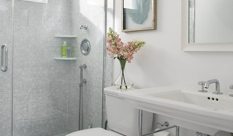
HOUZZ CALLHouzz Call: Show Us Your 8-by-5-Foot Bathroom Remodel
Got a standard-size bathroom you recently fixed up? We want to see it!
Full Story
EVENTSTop Trends to Inspire You From the London Design Festival
What’s going to be next season’s biggest paint trend? Is midcentury still in? Discover the answers to these questions and more
Full Story


Nothing Left to Say