


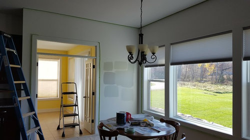
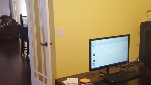
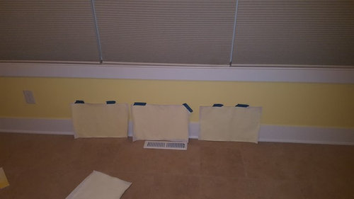
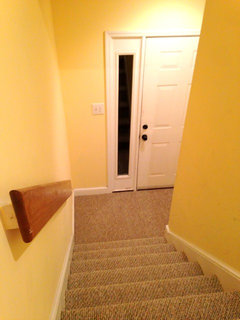
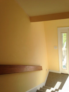
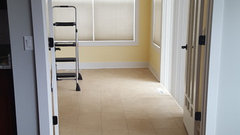
x-post Help for a Yellow Sunroom
goosie8360
7 years ago
Featured Answer
Comments (83)
 PRO
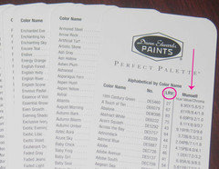
PROLori A. Sawaya
7 years agolast modified: 7 years ago
allienc
7 years agoRelated Discussions
Sun-room floor, can I paint?
Comments (11)Jane, I was not attempting to discourage you from painting your floor. I just wanted to share what I learned through my own experience, because you had mentioned that you once considered using tile. Also, whoever buys the house might choose a floating floor and the paint wonÂt make a difference. Although I decided not to use paint on my porch/sunroom, I plan to go ahead with painting the plywood floor in the finished basement. Like you, I am contemplating a beachy (or summery) look, especially since I am on the coast. I thought about a distressed white or a gray similar to weathered shingles or weathered wood (ThereÂs so much of it around here). The patterned floors look great and seem like fun. The possibilities are endless. You can use stencils or sponging. You can also paint a faux area rug. This year I donÂt have the time or patience to attempt a pattern, but I am trying to learn decorative painting and maybe soon I can acquire the skills to attempt a pattern. For now, the painted floor is something inexpensive to go under area rugs. IÂm no help with a color scheme, but your wicker serving cart is great and will probably look good no matter what colors you choose. With area rugs, lots of plants and that lovely wicker cart, the floors donÂt have to be noticeable unless the paint looks really good....See MoreWe wish to have help with our Florida beach front sunroom ~10x20
Comments (2)Post a picture and extend the HVAC duct to the lanai if you plan to keep the doors open or your AC will never turn off....See MoreNeed help with inspiration (and functionality) for sunroom
Comments (13)What a cute space! I agree, lots of potential. It must be pleasant to sit there in the early evening and get a pulse of the neighbourhood. Is there any room in the garage for the strollers and wagon? That's where I parked mine. Otherwise, could you confine them all to one wall and perhaps use a curtain (or a screen) to hide them? (Your lights gave me the curtain idea.) As @AnnKH mentioned, those daily necessities aren't forever and I wouldn't invest much in storage solutions for them. Here's an Apartment Therapy feature on stylish shoe storage for entries. You know your family's habits best: would closed storage work or is open easier/better? A bookcase might be all you need for the shoes. Bookcases are usually 12 inches deep. (What size are your largest shoes?) Find an inexpensive vintage one with style you like or buy an inexpensive new one at Ikea and transform it to your liking. Not sure if the chairs are too big for the space but they don't look that comfy to me....See MoreSunroom decorating help
Comments (10)I would definitely white wash the brick. I would also hang your curtain rods all the way up to the ceiling with a linen curtain. I would get the couch and love seat you mentioned in Conversation Capri. This color and natural colors to created a nice serene and comfy space. Natural jute rugs. More posts coming...See More
Bunny
7 years agogoosie8360
7 years agogoosie8360
7 years agolast modified: 7 years agoBunny
7 years ago- PRO
Lori A. Sawaya
7 years agolast modified: 7 years ago 
House Vixen
7 years agogoosie8360
7 years agogoosie8360
7 years agogoosie8360
7 years agolast modified: 7 years agoBunny
7 years agogoosie8360
7 years agolast modified: 7 years agoallienc
7 years agogoosie8360
7 years agoallienc
7 years agoindygo
7 years ago- PRO
Lori A. Sawaya
7 years ago goosie8360
7 years agogoosie8360
7 years agolast modified: 7 years agogoosie8360
7 years ago
Olychick
7 years agoHouse Vixen
7 years ago
eastautumn
7 years agogoosie8360
7 years ago
just_terrilynn
7 years agoallienc
7 years agoBunny
6 years ago- PRO
Lori A. Sawaya
6 years ago 
Laurie Gordon
6 years agoBunny
6 years ago- PRO
Lori A. Sawaya
6 years ago Bunny
6 years agolast modified: 6 years ago- PRO
Lori A. Sawaya
6 years agolast modified: 6 years ago Bunny
6 years ago- PRO
Lori A. Sawaya
6 years ago lexy_02
6 years agolexy_02
6 years ago- PRO
Lori A. Sawaya
6 years agolast modified: 6 years ago lexy_02
6 years agolexy_02
6 years agolexy_02
6 years ago- PRO
Lori A. Sawaya
6 years ago lexy_02
6 years agolexy_02
6 years ago


Related Stories

DECLUTTERINGDownsizing Help: How to Edit Your Belongings
Learn what to take and what to toss if you're moving to a smaller home
Full Story
COLORPick-a-Paint Help: How to Create a Whole-House Color Palette
Don't be daunted. With these strategies, building a cohesive palette for your entire home is less difficult than it seems
Full Story
COLORPick-a-Paint Help: How to Quit Procrastinating on Color Choice
If you're up to your ears in paint chips but no further to pinning down a hue, our new 3-part series is for you
Full Story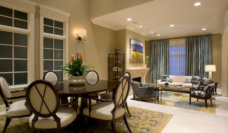
SELLING YOUR HOUSE5 Savvy Fixes to Help Your Home Sell
Get the maximum return on your spruce-up dollars by putting your money in the areas buyers care most about
Full Story
PETSHow to Help Your Dog Be a Good Neighbor
Good fences certainly help, but be sure to introduce your pup to the neighbors and check in from time to time
Full Story
BATHROOM DESIGNKey Measurements to Help You Design a Powder Room
Clearances, codes and coordination are critical in small spaces such as a powder room. Here’s what you should know
Full Story
SELLING YOUR HOUSE10 Tricks to Help Your Bathroom Sell Your House
As with the kitchen, the bathroom is always a high priority for home buyers. Here’s how to showcase your bathroom so it looks its best
Full Story
COLORPick-a-Paint Help: 11 Ways to Mine Your World for Colors
Color, color everywhere. Discover the paint palettes that are there for the taking in nature, shops and anywhere else you roam
Full Story
8 Ways Dogs Help You Design
Need to shake up a room, find a couch or go paperless? Here are some ideas to chew on
Full Story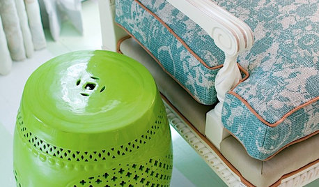
DECORATING GUIDESThe Most Helpful Furniture Piece You May Ever Own
Use it as a table, a seat, a display space, a footrest ... and indoors or out. Meet the ever-versatile Chinese garden stool
Full Story

Lori A. Sawaya