


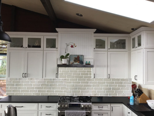
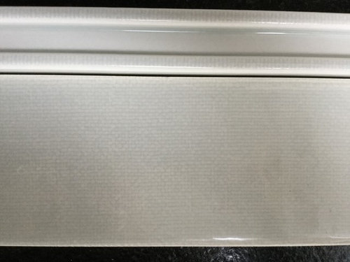
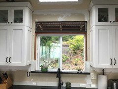
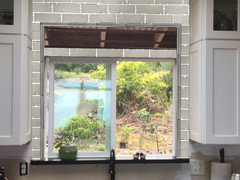
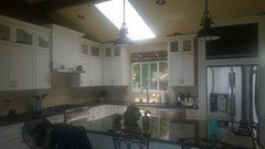
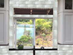
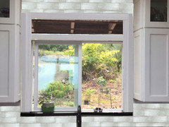
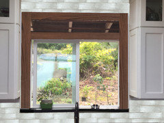
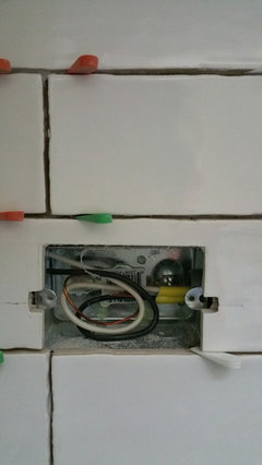
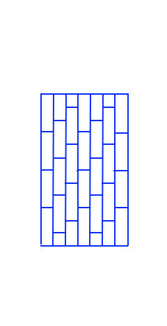
Does this 1/3 offset tile pattern work for my backsplash?
rebunky
7 years ago
Featured Answer
Sort by:Oldest
Comments (36)
Related Discussions
Random pattern (not grid) of ceramic subway tile backsplash
Comments (5)Yes, it can all be done. It just matters how much you want to spend. You can even cut a hole right in the middle of a tile, but would cost a lot of time to have someone do it. And there's a great chance for accidental breakage which increases the time involved. You do it the way you would with wood, by drilling, then carefully filing and nipping out the area, then grinding and sanding to make clean edges. It would be better to just cut the tile in two L shapes, over the inset, but a hole can be made. I have a lot of tile in my kitchen which is randomly set without grid. The big problem with cutting tiles occurs if they're cut out (in the making) before firing. Then they have rounded edges, which are very nice, but which go away when they're cut. That makes the cut show a lot more. There are also "rectified" tiles, which are cut after firing, which have perfectly straight sides. You can cut those any which way and have the edges match. The main thing for doing things that the person in the tile shop thinks can't be done is to have a master tile setter. A lot of people think they know how to install tile, who can do a perfectly acceptable job of putting a grid on a floor, who cannot cut difficult shapes. My tile setter can freehand a circle on a tile saw. It's not perfect (being that only straight cuts can be made), but it's pretty darned impressive. He does complex, double L cuts with aplomb. Oh. I should say that the quality of the tile matters too. The actual clay used can have an effect on how well it cuts, and some glazes are more prone to cracking when cut than others....See MoreDoes a marble backsplash work w/ Cambria Torquay
Comments (22)I realize this is a late posting, but just in case in might help anyone, we just finished our kitchen remodel and the backsplash we used with the torquay was a white staggered mosaic opaque glass tile. The tile ended up with a grayish edge after grout was applied (see photo of sheet of the tile). That surprised us but it worked since it complimented the Torquay. I looked at backsplash tiles for a year and a half, including marble subway tiles, but always had trouble trying to find the right shade of white. We're very happy with our results. BTW, those are 20+ year old pickled cabinets that I didn't want to give up! This post was edited by bird2 on Sat, Feb 8, 14 at 8:06...See MoreTile patterns--does your floor and backsplash pattern match?
Comments (9)I'm just trying to keep a more traditional look. My home is a 1920's brick bungalow. I've always thought I would keep the original hardwood floors and have a subway tile backsplash, but...the kitchen floor was in really bad shape. We were unable to save it and couldn't find 1-1/2" wide unfinished red oak strip flooring to match it (and the rest of the first floor), so we put in a slate/quartzite tile in instead. I'm still open to subway tile (and still love it), but frankly, I'm getting tired of seeing it everywhere and was trying to think of other options. I'm loving the hand-glazed tiles lately, maybe crackle glaze, in a 3x6 subway or 4-6" square. Also considering laying the square tile in a diamond pattern. Just trying to get my head around other ideas that would still be appropriate for my home. The floor is rather colorful, so I'd like to keep the backsplash simpler, but with some shine, to contrast with the matte counters and tile floor. I appreciate all your input....See MorePot filler w/ this backsplash too busy? Slab or tile backsplash?
Comments (9)Hi Katie, Demo starts tomorrow, so no pics on progress yet, but I'll post when I have some. I'm working a little bit with a KD, and doing the rest myself with cabinetmaker. KD suggested open shelving like in the inspiration pic (but in stainless, specifically). I think it would stress me out though, lol! Having all of my bottles and stuff right out there (the range area is the focal point to basically my whole downstairs living area). My pantry rarely looks fabulous, and I'd be moving the pantry out into the open. So, I think we'll be making the vertical column things on either side of the mantel style range area into pull-out shelves for sheet pans, spices, small bottles, etc. I considered the open shelving with a pretty display of white bowls and dishes, but then I'd lose the storage space for the stuff I really need at my fingertips. Feel free to email me, too, if you want to exchange more ideas. It's a fun process!...See More
rebunky
7 years agolast modified: 7 years agorebunky
7 years agorebunky
7 years agolast modified: 7 years agorebunky
7 years agorebunky
7 years agolast modified: 7 years agorebunky
7 years agolast modified: 7 years agorebunky
7 years agorebunky
7 years agorebunky
7 years agolast modified: 7 years agorebunky
7 years ago
cpartist
7 years agorebunky
7 years ago
sherri1058
7 years agorebunky
7 years agolast modified: 7 years ago
Related Stories
REMODELING GUIDESBathroom Workbook: How Much Does a Bathroom Remodel Cost?
Learn what features to expect for $3,000 to $100,000-plus, to help you plan your bathroom remodel
Full Story
INSIDE HOUZZHow Much Does a Remodel Cost, and How Long Does It Take?
The 2016 Houzz & Home survey asked 120,000 Houzzers about their renovation projects. Here’s what they said
Full Story
REMODELING GUIDES10 Tile Patterns to Showcase Your Floor
There's more to a tile floor than the tile itself; how you lay out your tile can change the look and feel of the room
Full Story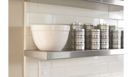
KITCHEN DESIGNHow Much Does a Kitchen Makeover Cost?
See what upgrades you can expect in 3 budget ranges, from basic swap-outs to full-on overhauls
Full Story
FUN HOUZZ10 Truly Irritating Things Your Partner Does in the Kitchen
Dirty dishes, food scraps in the sink — will the madness ever stop?
Full Story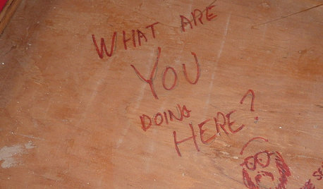
FUN HOUZZDoes Your Home Have a Hidden Message?
If you have ever left or found a message during a construction project, we want to see it!
Full Story
MOST POPULARWhen Does a House Become a Home?
Getting settled can take more than arranging all your stuff. Discover how to make a real connection with where you live
Full Story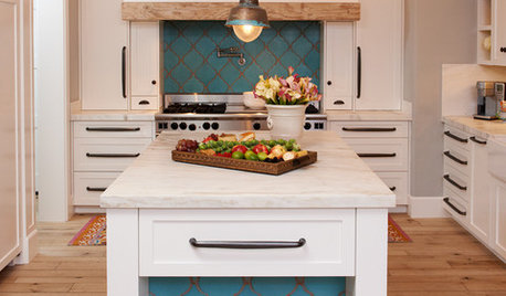
KITCHEN DESIGN10 Gorgeous Backsplash Alternatives to Subway Tile
Artistic installations, back-painted glass and pivoting windows prove there are backsplash possibilities beyond the platform
Full Story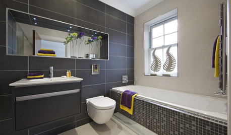
TILECelebrate the Rectangle With This Very Contemporary Tile Pattern
There are so many ways to work with stack bond tile. Here's how to keep the look super sleek — and how to change it up
Full Story
KITCHEN BACKSPLASHESHow to Install a Tile Backsplash
If you've got a steady hand, a few easy-to-find supplies and patience, you can install a tile backsplash in a kitchen or bathroom
Full Story


rebunkyOriginal Author