


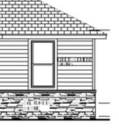
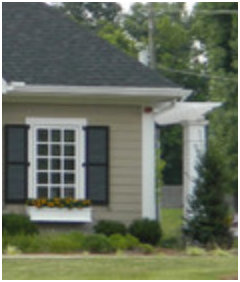
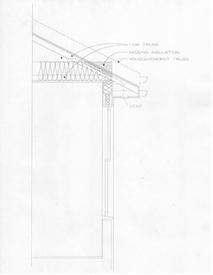
Which elevation, A or B?
sherimcm
7 years ago

Featured Answer
Comments (55)

User
7 years agolast modified: 7 years ago PRO
PROMark Bischak, Architect
7 years agoRelated Discussions
Which subalpine fir for zone 3b, continental cold, long winter?
Comments (3)You cannot depend on identifying homoclimes that make transfers predictable. There are endless cases of species doing well under conditions totally different from those of their home range; and of species doing badly under conditions that seem superficially similar to their home range. But you can select for tolerance of a killing factor, like so much cold. I'd suggest your trying lasiocarpa from a high elevation where it is subject to lots of cold cold wind. Summits in northern Utah and southern Idaho might be about right; or Montana locations like Glacier N.P. Even adapted species can suffer from "red belt" or winterkill during cold dry winters in their home range -- lodgepole is notorious in the northern Rockies for example.So don't plan on miracles....See MorePlease pick your favorite elevations: A or B, C or D, E or F.....
Comments (14)I think the others may be right that the crown in F won't look good in real life even though it's more cohesive on the page (yes, I did get it about the space behind it). B'more has the right of it on the cupboard above the oven. In E, it's too fussy. If the doors were simple, like the pantry door, it would be better, and even better if it were a single, flip up, door. I liked the idea of disguising the small pantry door as cabinetry because the blank wall flanked by the two passage doors looks stark. Having different appearances on either side opens it up, whereas the two matching doors kind of confines the blank wall and makes it a focal point in itself by bookending it. Additionally, it's a visual cue that what's behind is an overgrown cabinet, whereas the other door is for the laundry/BP/large pantry or whatever the next room is. I think your baking area is fine, and so is the oven location. Some people do a lot of stove to oven and vice versa, but many of us do rarely, and I assume it's not a biggie for you either, or that you were going to use the Advantium for those cases. It's the prep path that feels awkward. I really don't know if there's a better path, given the walls. The distances are fine. There's just a lot of moving around the island to do prep. I think if you clean at the sink, then move back around to the end to cut, where you'll be just across from the stove, it'll work fine. It's that extra step that makes it feel awkward to me. Hm... Yes... What I did with a small island is put in a trough sink at the end so that I had the whole width to work on. Similar size to the end of your island. A lot of that is based on how you work. I can dry prep too, or use a bowl of water rather than a sink. The sink is there. It's not a big worry and you have the rest laid out usefully. Don't worry about it. There are compromises in every kitchen. As I said, not impossible. :) It'll be fine....See MoreWhich front elevation do you prefer?
Comments (23)If we don't find an acceptable elevation then perhaps we are back to a new floorplan. Well, yes - just because the two are inextricably linked. Every time we tweaked our floor plan, the elevations changed in kind. Not always just to accommodate the change physically - sometimes things need to change visually. Roof over the main living area went up - roof on front porch goes from gable to hip, in order for balance to be maintained. When I asked, Mark said, "Every line has a reason." So now, when I see change I just ask, "What is the reason for that?" And I learn something, and the design stays balanced. Therefore, in order to get an elevation you are happy with, the floorplan will need to change. What you'll need to keep in mind is that the simple shapes of the elevation are what you need to get right. That's the cake. The styling can then be laid over top - frosting. Then whatever little detail touches *cough* Swedish window trim, if you're me *cough* - think of that (or your cupola) as the "sprinkles." Cake, THEN frosting, THEN sprinkles. But you make the inside of the cake and the outside of the cake at the same time. And you can't fix a bad cake with more frosting. (Go cue up "Nailed It!" on Netflix for visual evidence of this)....See MoreWhich bathroom cabinet elevation looks better?
Comments (19)You can also have the drawers made to look like they are separate, upper lower, but have them be one deep drawer in each set. Like in #1 have 5 drawers that have a split face to look like 10, then the sink cabinet to look like 2 more drawers. Same with the coordinating cabinet if you want...although those drawers look more functional...but you could have a cabinet under the sink then the drawers on each end be quite deep, but look like 2 narrower drawers. You could have sliding trays built inside the drawers for smaller items to remain on top of the deeper drawers. For some reason, maybe based on the mcm cabinets you have elsewhere in your home, I really like #1 the best. My google skills seem to be failing me tonight; I know this is much different than your style cabinet, but a single drawer made to look like a double: not sure if this is a single or two drawers: maybe a shallow drawer in some of them (if you do deep drawers)...See More PRO
PROVirgil Carter Fine Art
7 years agoUser
7 years ago
ILoveRed
7 years agomrspete
7 years ago
golfergirl29
7 years agolast modified: 7 years agojesshs
7 years ago
cpartist
7 years ago PRO
PRODETAILS design studio LLC
7 years ago
littlebug zone 5 Missouri
7 years agocpartist
7 years agolast modified: 7 years ago
Architectrunnerguy
7 years ago- PRO
Virgil Carter Fine Art
7 years ago cpartist
7 years ago PRO
PROPlans by Marcy
7 years ago- PRO
DETAILS design studio LLC
7 years ago 
millworkman
7 years agocpartist
7 years agoUser
7 years agolast modified: 7 years ago
live_wire_oak
7 years agosherimcm
7 years agolive_wire_oak
7 years agolast modified: 7 years agoArchitectrunnerguy
7 years ago
just_janni
7 years agoILoveRed
7 years agoUser
7 years agolast modified: 7 years agocpartist
7 years agolast modified: 7 years agojust_janni
7 years agoUser
7 years agolast modified: 7 years agoUser
7 years agoUser
7 years agolast modified: 7 years agoILoveRed
7 years ago- PRO
Virgil Carter Fine Art
7 years ago 
whaas_5a
7 years agosherimcm
7 years agoUser
7 years agolast modified: 7 years agojust_janni
7 years agocpartist
7 years agolast modified: 7 years agosherimcm
7 years agosherimcm
7 years agosherimcm
7 years agoUser
7 years agolast modified: 7 years agocpartist
7 years agolast modified: 7 years agobeachgirl315
7 years agoUser
7 years agolast modified: 7 years ago
anniebird
7 years agoArchitectrunnerguy
7 years ago


Related Stories
KITCHEN DESIGN12 Great Kitchen Styles — Which One’s for You?
Sometimes you can be surprised by the kitchen style that really calls to you. The proof is in the pictures
Full Story
REMODELING GUIDESWhich Window for Your World?
The view and fresh air from your windows make a huge impact on the experience of being in your house
Full Story
REMODELING GUIDESHome Elevators: A Rising Trend
The increasing popularity of aging in place and universal design are giving home elevators a boost, spurring innovation and lower cost
Full Story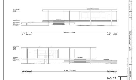
DESIGN DICTIONARYElevation
Capturing a 3-D structure in two dimensions, an elevation is an architectural drawing that puts the line of sight on a vertical plane
Full Story0
WALL TREATMENTSNew This Week: 3 Wall Treatments to Elevate Your Entryway
Use graphic pattern to raise your spirits every time you come home — no matter what your style
Full Story
KITCHEN DESIGNSchoolhouse Style Rocks in the Kitchen
Which class-y idea suits your kitchen best? a) a vintage clock; b) storage lockers; c) chalkboard counters; d) all of the above
Full Story
WINDOWSThe Art of the Window: 10 Ways to Elevate Your Bathroom
These window styles and treatments bring in natural light while creating a restful and rejuvenating ambience
Full Story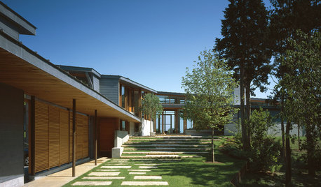
ENTRYWAYSSteps and Stairs Elevate Modern Exterior Entryways
Gently sloped or at a sharper angle, modern ascents on a home's entrance serve both architectural and aesthetic purposes
Full Story
WINDOW TREATMENTS9 Upgrades to Elevate Your Window Treatments
Find out what the pros do to turn an ordinary window covering into a standout design feature — and what it costs
Full StorySponsored
Columbus Area's Luxury Design Build Firm | 17x Best of Houzz Winner!


User