


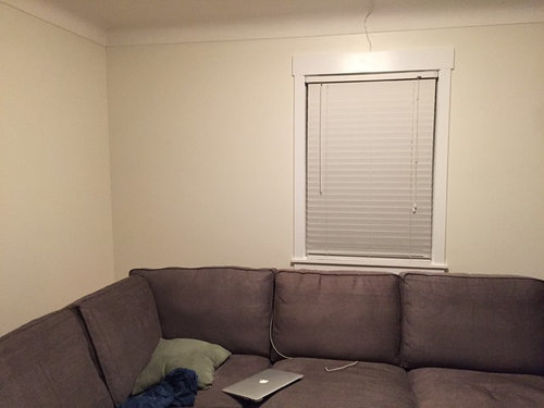
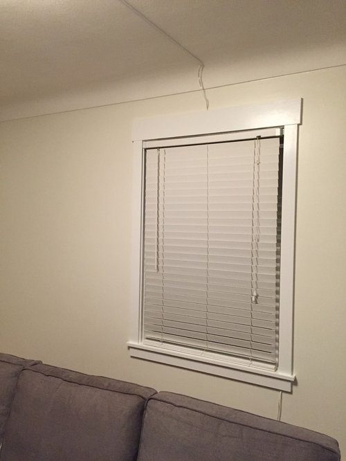
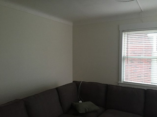
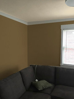
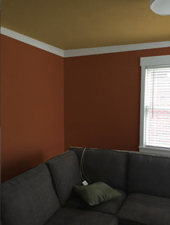
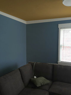
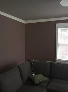
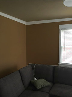
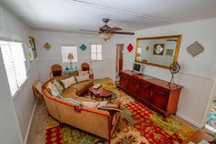
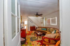
North Facing LR and Warm White Fail
User
8 years ago
last modified: 8 years ago
Featured Answer
Sort by:Oldest
Comments (28)
Related Discussions
Help with ceiling color for north facing LR
Comments (3)So, the ceiling is currently flat white (can't tell on my monitor)? How high are your ceilings? The Tallow and teal combination looks great on my monitor, by the way. What about a richer gold, but sort of in the tallow/custard family for the ceiling?...See MoreNorth Facing LR of south facing Kitchen Paint Help
Comments (0)We are planning to paint our living room and newly renovated kitchen. Kitchen is south facing and we like BM Owl Gray. For living room we are considering BM Arctic Gray. I like a touch of color, not to cold or dark. Definitely not looking for any lavender undertones. Kitchen island is painted sea serpent by SW and cabinets are a soft white. See photos. Any help is appreciated. Oh new sofa in living room is a soft gray med tone fabric. Chairs and rug have not been bought....See MoreBest cream/off-white paint color for north-facing (low light) bedroom?
Comments (3)Hi. I'm starting a master bedroom reno. Getting rid of grandma's traditional dark furniture and swapping in walnut mid-century modern. Also, going for a navy blue headboard/cream linen bedding. Room is currently "tan" and feels dark and masculine and I'm trying to drastically lighten it up with new bedding, curtains and paint color. I like a soft white like BM Simply White (my hallways are this) but wondering if I should go for more of a soft cream to give this low-light room a "warm" feel. Just worried I'll still have a dark feeling room. Any suggestions? A designer recommended BM Alabaster but it has a gray undertone that I don't love. Any advice appreciated!...See MoreWhite paint color for cabinets in a north facing room?
Comments (4)Hi Jennifer! Trim and baseboards are BM Oxford White. I'm thinking about matching it to that but I'm not sure if that will match the Bright White of Cabinets.com or I should just go with Alabaster that is close to BM White Dove. I haven't picked a backsplash or counter yet....See More
User
8 years agoUser
8 years agoUser
8 years ago
amykath
8 years agoamykath
8 years ago
eastautumn
8 years ago
Related Stories
MORE ROOMS8 Colors for North-Facing Rooms
Have a room with little sunlight? One of these vibrant, saturated paint colors will warm it up
Full Story
MOST POPULARMust-Try Color Combo: White With Warm Off-White
Avoid going too traditional and too clean by introducing an off-white palette that brings a touch of warmth and elegance
Full Story
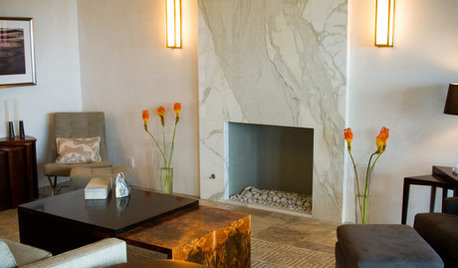
FIREPLACES12 Hot Ideas for Fireplace Facing
From traditional brick to industrial steel, there’s a fireplace cladding here to light up your design
Full Story
DECORATING GUIDESColor of the Week: Decorating With Warm Gray
Tired of tan? Getting gloomy from cool gray? Make warm gray your new go-to neutral
Full Story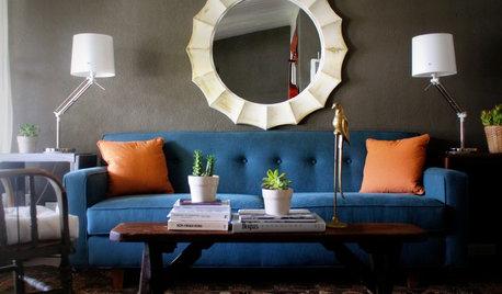
DECORATING GUIDESHot Color Combo: Cool Blues and Warm Brass
It's trending all over, but navy or royal blue with brass or gold just also might become a new classic pairing
Full Story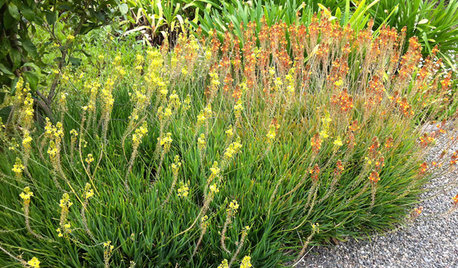
GARDENING GUIDES6 Dependable Ground Covers for Warm Climates
Swap some lawn for these drought-tolerant clumping plants — and watch your maintenance efforts diminish while they easily grow
Full Story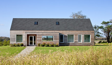
HOUZZ TOURSHouzz Tour: Bright, Sun-Warmed New England Getaway
Country views, flexible living space and a just-right size make for a soothing, comfortable family retreat
Full Story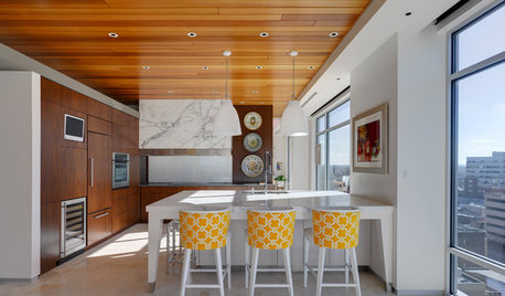
CEILINGSAppealing Ceiling: Warm It Up With Wood
Add charm to any room with a wood-clad ceiling
Full Story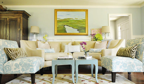
MORE ROOMS8 Colors for South-Facing Rooms
Choose one of these soft, cool colors to tone down the sun shining in
Full StorySponsored
Leading Interior Designers in Columbus, Ohio & Ponte Vedra, Florida


User