


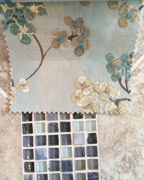
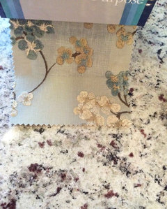
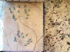
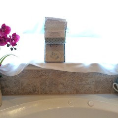
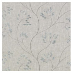
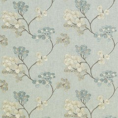
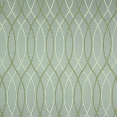
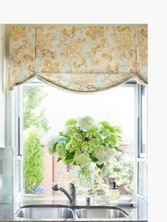
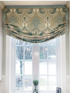
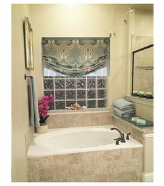
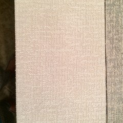
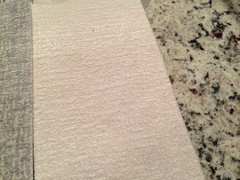
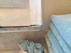
New direction for Roman shade ... Please vote
IdaClaire
8 years ago
last modified: 8 years ago


Featured Answer
Sort by:Oldest
Comments (76)

IdaClaire
8 years ago
amykath
8 years agoRelated Discussions
Window treatment advice please - curtains, roman shades, both?
Comments (19)lovely windows!! i would definitely use panels/curtains only where you don't need privacy or sun protection... i love your master bedroom window seat!!! what a great spot that will be! whatever treatment you put there, i would think you would often want to have the entire window visible... do you need privacy at that window? if so, if i hung a shade, i would want it to be able to cinch up tight at the top, like pleated shades do... or i would just hang short panels that could be swept all the way to one side when the window was being used. with your windows, if i hung any type of blind or shade on any of them, i would definitely do inside mounts--your window wood is much too nice for outside mounted blinds/shades......See MorePhotos of New Drapes and Roman Shades.
Comments (9)Thank you Ladies, I'm glad you like the window treats, Thanks for your lovely comments. CEFreeman...do you mean the jabots -- that flow down the lambrequins or the festoon (swags)? First we start with a chain on a piece of wood to get the size and shape (drop) that we want. Then we cut a pattern from scrap material, pin it up on the wood, then tack it up on the wood. When we are satisfied with the shape we take it down,mark the pleats, take out the tacks and cut away the excess material behind the tacks(so that it's not bulky)...Then this becomes our pattern...after we sew the lining to the actual material, we tack each one up again and hand sew it close. (there is a lot to making things look casual, :) This is not a hard project, it just takes time. For the jabots, that's very easy...you fold a big triangle then sew it shut along the top and side, then fold it. We try like heck to make them casual, not formal and stuffy,like you see all over...to me that is very commercial and old fashioned. If you look at out jabots, they flow out slightly and look somewhat casual. It is overcast today, so I was able to get better photos, that are more true to the color. left side, right side This is not hard to do...I'll look on line for you, for the best directions I can find. This is also more true to the color, because it's overcast and don't have all that light glaring in. Now here is the question???on the end of the roman shades (where the side windows meet the center window) I had originally planned on putting a small double jabot (like I did on the DR & LR between the festoons) I was planning on having the jabot just an inch or two below the shade...My hubby, says no, he thinks it looks nice the way it is...I'm not sure, I sort of agree, but it's still in my head! This is the pattern tacked up. oops. I'll be back, I have to go into photobucket to see if I still have the larger photo....See MoreHelp with fabric for Roman Shade in kitchen...please
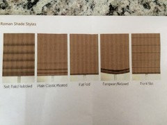
Comments (37)A roman shade isn't that hard - I know you can do it! I like the idea of softer, more muted fabrics - and I really like the blue bubbly looking one you last posted. BTW, Christopher Peacock used a tangerine paisley in his kitchen: This might look nice too. or this: Since you like to shop online, try Hancock's of Paducah. They have a ton of nice quilting and home decorating fabrics. I also like fabriccarolina.com, which is where the scrolly fabric came from. Good luck finding something perfect! Here is a link that might be useful: Hancock's of Paducah link...See MoreHelp finding a relaxed roman shade please
Comments (10)Mom and I wanted more of a print for the relaxed roman shade. We don't want to spend $500 per shade at smith and noble. any other suggestions on a pretty print like the one I posted?...See MoreIdaClaire
8 years agoIdaClaire
8 years agolast modified: 8 years ago
User
8 years agolascatx
8 years agolast modified: 8 years ago
1929Spanish-GW
8 years agoeandhl2
8 years agoIdaClaire
8 years agolast modified: 8 years ago
ingrid_vc so. CA zone 9
8 years agoIdaClaire
8 years agolast modified: 8 years agoshadylady2u
8 years agoIdaClaire
8 years ago
amck2
8 years agoshadylady2u
8 years agolast modified: 8 years agoIdaClaire
8 years agoIdaClaire
8 years agoshadylady2u
8 years agoIdaClaire
8 years agolast modified: 8 years agoshadylady2u
8 years agolascatx
8 years agolast modified: 8 years agoelledi61
8 years agoelledi61
8 years agoingrid_vc so. CA zone 9
8 years agolast modified: 8 years agoUser
8 years agoIdaClaire
8 years agolascatx
8 years agoeld6161
8 years ago
Bunny
8 years agolast modified: 8 years ago1929Spanish-GW
8 years ago
tinam61
8 years agoUser
8 years ago
Kippy
8 years agoeld6161
8 years agoshadylady2u
8 years ago
teeda
8 years agoshadylady2u
8 years agoIdaClaire
8 years agolast modified: 8 years agoIdaClaire
8 years agoBunny
8 years agoIdaClaire
8 years agoIdaClaire
8 years agoIdaClaire
8 years agoIdaClaire
8 years agolast modified: 8 years agosasandfat
8 years agoIdaClaire
8 years agolast modified: 8 years agoIdaClaire
8 years agolast modified: 8 years agoIdaClaire
8 years agolast modified: 8 years ago
winker58
8 years agoIdaClaire
8 years ago


Related Stories
WINDOW TREATMENTSRoller Shades Raise the Curtain on Style
The humble window treatment is stealing the scene with fresh patterns, color and pizzazz
Full Story
MOST POPULAR50 Shades of Gray
Gray is hotter than ever, thanks to a hit novel full of risks and dark secrets. Tell us: Which paint shade possesses you?
Full Story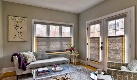
WINDOW TREATMENTSThe Art of the Window: 11 Shades That Add Style to a Room
Expand your view of the popular window treatment with these ideas for styles, materials and patterns
Full Story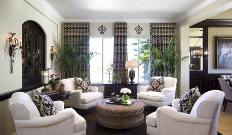
LIVING ROOMS8 Living Room Layouts for All Tastes
Go formal or as playful as you please. One of these furniture layouts for the living room is sure to suit your style
Full Story
WINDOW TREATMENTSBedroom Window Treatments to Block the Light
Sleep tight with curtains, shades and more designed to keep out bright rays while letting stylishness in
Full Story
MOST POPULARRethinking Beige in a World Gone Gray
Gray, the ‘it’ neutral of recent years, has left beige in the shade. But is it time to revisit this easy-on-the-eyes wall color?
Full Story
PATTERN12 Great Decorative Alternatives to Curtains
Filter light and views while drawing the eye by dressing windows in specialty glass, artistic screens or snazzy shades
Full Story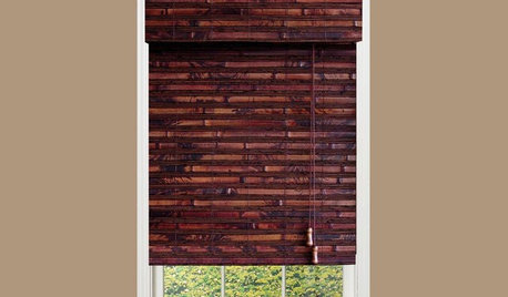
PRODUCT PICKSGuest Picks: A Whole Lotta Wonderful Window Coverings
Blinds, drapes, shades and curtain rods to give your windows a polished, put-together look
Full Story
COLORGet a Soft Spot for Sea-Glass Green
Soften a room's look by washing its walls in this delightfully airy shade, no sand in your shoes required
Full Story
EVENTSDesign Calendar: Where to Go and What to See in July
Gaze at gorgeous Italian glass, wrap yourself in Missoni fashion and grab some shade in a garden installation that adapts to you
Full StorySponsored
Industry Leading Interior Designers & Decorators in Franklin County


IdaClaireOriginal Author