


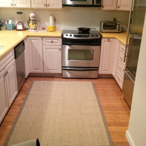
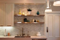
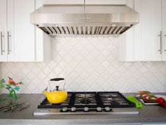
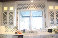
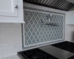
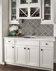
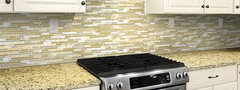
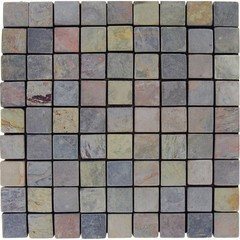
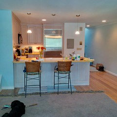
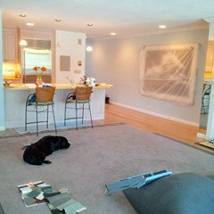
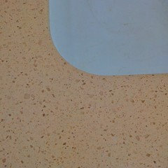
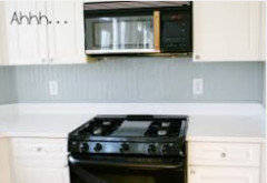
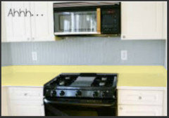
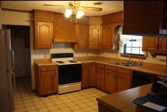
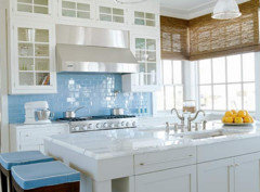
What would you do with this kitchen backsplash?
sabigabatini
8 years ago
last modified: 8 years ago
Featured Answer
Sort by:Oldest
Comments (73)

Yayagal
8 years agoRelated Discussions
What do you think of this backsplash in my kitchen PHOTO
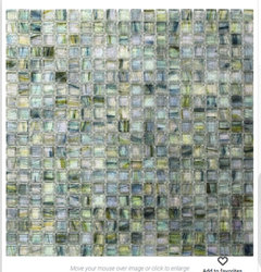
Comments (16)That happens to be one of my all time favorite backsplashes. Unfortunately, I don't believe it works with your cabinets because of the two tone. Two tone cabs (to me) lean toward a more classic traditional feel. That backsplash (again, to me) reads a bit more earthy. It's not that it doesn't go with the individual colors of your cabinets, I believe it's because of the two tone. It's hard to read your countertop color on my monitor, what is it? I see that your uppers (beautiful BTW) have glass fronts and shelves. The shelves look to have a slight greenish cast to them. What if you were to do a mini brick (assuming you like that cause of the Fire and Ice pick) in a very pale green glass? It would tie into your glass shelves? This is from Oceanside Glass, Elevations, Color Midori Matte, 1x2 offset joint (I think). Just as a kinda idea of what I'm talking about. I didn't search a bunch of sites... just went to Oceanside cause I thought they'd have something along of the lines of what I'm talking about....See MoreWhat do you think about this backsplash for my kitchen?
Comments (33)BeeYOOTifulllll!!! I don't know which I like better, for me, I would go with the white ones, but the green is gorgeous! We had green counters in our last house and loved them. However, I love the white because you can change the accent colors of your kitchen much easier. OTOH, the green will be something distinct that not any other house you go to will likely have...that is a plus for me! Whichever way you go, I think it will be simply gorgeous!...See MoreBacksplash Help Needed - What would you do?
Comments (8)Thanks for the suggestion, Davidro1. I think the Schluter edge is a little more contemporary and not sure it will match with my kitchen. Good to know there are other options though. Thank you, Babushka Cat, for putting it into perspective for me. Yes, I am so construction fatigued, I'm willing to put mismatched tiles on the wall! (After being so picky about everything else.) I haven't been able to find any vendors that have crackle tile in stock. Do you have any suggestions? Thanks!...See MoreBacksplash? No backsplash? What kind of backsplash?
Comments (25)didn't have time to read all the answers. I have no backsplash and have never regretted it...been over 6 yrs. It is painted with BM matte...which has ceramic in it. It is as beautiful now as it was when first painted. I love the fact that I can showcase other things ...art etc in my kitchen and no competition. Also if I ever want to change it is as quick as a paint brush...expense is minimal..paint only ! All in all I think it is serene as you point out . Here is one pick. Since I have a lot of high heat cooking in my kitchen..built in deep fat fryer as well as gas cook top I can definitely speak to the longevity of paint only. c ( more at this album )...See More
sabigabatini
8 years agolast modified: 8 years agoUser
8 years agoUser
8 years agolast modified: 8 years agosabigabatini
8 years agoUser
8 years agolast modified: 8 years agosabigabatini
8 years agolast modified: 8 years agosabigabatini
8 years agojoaniepoanie
8 years agoUser
8 years agooaktonmom
8 years agochispa
8 years agooaktonmom
8 years agooaktonmom
8 years agooaktonmom
8 years agosabigabatini
8 years agoUser
8 years agosabigabatini
8 years agoUser
8 years agolast modified: 8 years agosabigabatini
8 years agolast modified: 8 years agochispa
8 years agosabigabatini
8 years agolast modified: 8 years agoUser
8 years agochispa
8 years agoUser
8 years agoclara_sophia
8 years agosabigabatini
8 years ago
Scott Harris
8 years agosabigabatini
8 years agosabigabatini
8 years agolast modified: 8 years agodixiekayp
8 years agosabigabatini
8 years agolast modified: 8 years agosabigabatini
8 years agolast modified: 8 years agosabigabatini
8 years agolast modified: 8 years agosabigabatini
8 years agolast modified: 8 years agosabigabatini
8 years agolast modified: 8 years agodixiekayp
8 years ago

Related Stories
KITCHEN DESIGNHow to Add a Kitchen Backsplash
Great project: Install glass, tile or another decorative material for a gorgeous and protective backsplash
Full Story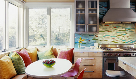
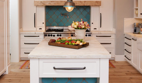
KITCHEN DESIGNKitchen of the Week: Exquisite Artistic Backsplash
Rippling colored glass forms an imaginative wall, while a clever layout embraces practicality in this stunning Texas kitchen
Full Story
KITCHEN DESIGNHow to Pick a Kitchen Backsplash That Wows
Design your ideal backsplash with help from these Houzz guides and inspiring ideas for every kitchen style
Full Story
KITCHEN BACKSPLASHES10 Top Backsplashes to Pair With Concrete Counters
Simplify your decision making with these ideas for materials that work well with concrete
Full Story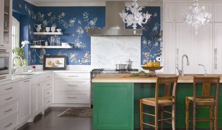
KITCHEN DESIGNTry a Shorter Kitchen Backsplash for Budget-Friendly Style
Shave costs on a kitchen remodel with a pared-down backsplash in one of these great materials
Full Story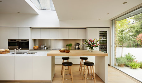
MATERIALSKitchen Ideas: How to Choose the Perfect Backsplash
Backsplashes not only protect your walls, they also add color, pattern and texture. Find out which material is right for you
Full Story
KITCHEN DESIGNCountertop and Backsplash: Making the Perfect Match
Zero in on a kitchen combo you'll love with these strategies and great countertop-backsplash mixes for inspiration
Full Story
KITCHEN DESIGNHouzz Quiz: Which Kitchen Backsplash Material Is Right for You?
With so many options available, see if we can help you narrow down the selection
Full Story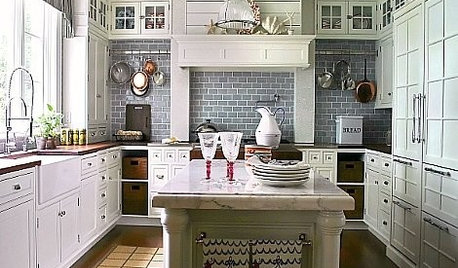
KITCHEN DESIGN10 Gorgeous Backsplash Alternatives to Subway Tile
Artistic installations, back-painted glass and pivoting windows prove there are backsplash possibilities beyond the platform
Full StorySponsored
Columbus Design-Build, Kitchen & Bath Remodeling, Historic Renovations


justgotabme