


Alts to BM Muslin? Less red/pink?
slaurajones
8 years ago
Featured Answer
Comments (46)
Related Discussions
which has more pink? BM Harmony or BM Sea Urchin
Comments (10)Update: I tried 2 samples. I settled on Havana Tan and Carlisle Cream and Bare Essence. The latter is Color Stories and could not be made at the hardware store so I skipped it. Havana Tan made the short list as my "warm" one to try because it had the LRV that I was looking for. However, it was AWFUL. Way too peach. Ugh. Carlisle Cream -- the "safe" choice -- was also disappointing. A sample looked ok in one part of the room with no cabinets or counter. But up against the cabinets and backsplash area, the pink came through. So I hit the books again and went back to that other elmira-white/muslin discussion. I studied those numbers in encycolorpedia and I think Elmira White could be a contender. It is lighter than I originally wanted but I decided I will repaint and brighten up the woodwork for contrast if necessary. The trim is currently China White which turns out is kinda dark. If I use something like WHite Dove or Simply White, these lighter beiges will look better. I didn't want to paint trim, but it is an option. And a lighter beige will help brighten up the room. The other possible ones are Temporal Spirit or Natural Linen. They seem really clean with least red. White Sand keeps popping up too. What's really interesting is now that I see how warm Carlisle cream really is, I can put a contender color chip next to it and quickly get a good sense if it is warmer or cooler....See MoreRed-pink paint color (photo included)
Comments (68)OK, I have the DNA of each color. They are very close, and it might surprise you what the numbers indicate. The main feature is the Hue Angle. Red Tulip has a Hue Angle of 27.8 or 28. That puts this color in the Warm Red family and leaning toward Yellow/Red family. (so more orange possibly depending on your light) It has an LRV of from 20.5-23 depending on the source I use. So intense and low on the "reflective light" spectrum. Spring Tulips has an LRV 20.2-23.7 again two different sources I used so also intense and non-reflective. It's Hue Angle is 21.8. So, it is almost dead on the center of the Red Hue family, slightly into the Warm segment and with this location, it will read most "red". If you look at the Color Strategist Wheel I posted above and look where 21 on the degrees at the edge of the Wheel shows at 15-18 approximately you would be in the Red/Purple-cool segment. So Spring Tulips will "read" less orange and more toward purple. Slightly, but that is the scientific difference. The Lightness factor and the Chroma factors are nearly the same. 55.4; 58 for Red Tulip and 55.8;59 for Spring Tulips. So the difference is in what Hue Family it falls into that will reveal itself once on the wall. Again, these notations are based on readings with a "approved D65*2" Illuminant. Now you know why people trained in this technology and science can pick colors without actually seeing the paint color or testing on site! Of course, color is all "perceived" light so each person sees color differently. Men in particular, tend to be more "color blind" than women based on studies. I often run into this with clients. Once I explain why this is so, they get a real sense of relief that it isn't a competition, but rather a "perception" issue....See MoreDoes this color even exist? BM Navajo but with slightly less yellow.
Comments (11)We have a color in our house that works well with travertine. It’s like Navajo White, but with less yellow and maybe the slightest hint of peach at times of the day. No idea the name of the color, but 1 quart custom BM formula is attached. This color is on walls, ceilings, in bathrooms, main part of house, and hallways. We had no clue it was all the same color until we started testing spots with this....See MoreUpdated post! Wall color to tone down pink red oak floor
Comments (13)It's really difficult to determine how a floor color will really feel with a small sample, especially when you viewed it with warm lights on (vs natural light). I'm sorry you don't like the outcome. I don't really think it's all that bad. You said they are adding a coat of urethane? That will yellow eventually, adding warmth. It might only take about a year or so depending on how much sunlight you get. If you don't want it to become more yellow, choose a water based top coat, not urethane. I honestly don't think your floors look bad at all, and it will be way less noticeable once you have it completely decorated. I think you are suffering from the shock of getting something new. You really can't judge until everything is finished. Again, I cannot stress enough--- I really think these floors look good right now. If you must repaint, go with a color that matches the floor undertone like other mentioned. A complimentary color (such as greens and blues) will bring it out. White with pink undertone doesn't have to be visibly pink looking. Look at SW Paper Kraft. It looks like creamy white, the pinkish undertone is not noticable....See More
slaurajones
8 years ago
tibbrix
8 years agomassagerocks
8 years agotibbrix
8 years agoantmaril
8 years agoslaurajones
8 years agoslaurajones
8 years agoslaurajones
8 years ago
emmarene9
8 years agoslaurajones
8 years agobusybee3
8 years agoslaurajones
8 years agoslaurajones
8 years ago
mom2girls_2008
8 years agoslaurajones
8 years agoslaurajones
8 years ago
Kathy Stuart
8 years ago PRO
PROKim B
7 years agoslaurajones
7 years agoslaurajones
7 years agoslaurajones
7 years agoWendyB 5A/MA
6 years ago PRO
PROLori A. Sawaya
6 years agolast modified: 6 years agokatkoz
6 years ago- PRO
Lori A. Sawaya
6 years ago katkoz
6 years ago- PRO
Lori A. Sawaya
6 years agolast modified: 6 years ago WendyB 5A/MA
6 years ago- PRO
Lori A. Sawaya
6 years agolast modified: 6 years ago katkoz
6 years agomassagerocks
6 years agoUser
6 years agoJ Dub
6 years agolast modified: 6 years agoJ Dub
6 years agoJ Dub
6 years ago


Related Stories
ORANGEColor Guide: How to Work With Red Ocher
Ancient, passionate and warm, red ocher is one of the most elemental colors on earth
Full Story
COLORColor Feast: When to Use Red in the Dining Room
It awakens appetites and spurs conversations, but too much is like a second helping of pie. Find the perfect balance of dining room red here
Full Story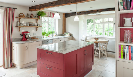
KITCHEN DESIGNKitchen of the Week: Splashes of Red for a Country Classic
Modern touches combine with traditional style in this warmly elegant kitchen in the English countryside
Full Story
COLOR4 Hot Color Trends to Consider for 2013
Bring some zing to your rooms for the new year, with high-energy shades that open the eyes and awaken the spirit
Full Story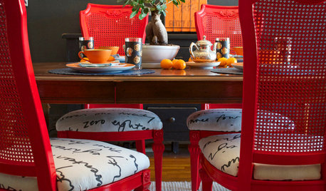
DIY PROJECTSDining Set Makeover: Paint and Tea-Tinted Fabric Make Old Chairs New
Reclaim dated dining chairs for far less than buying new, using spray paint, modern fabric and a handful of tea bags
Full Story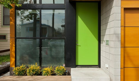
CURB APPEAL9 Daring Colors for Your Front Door
Stand out from the neighbors with a touch of neon green or a punch of hot pink
Full Story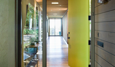
CURB APPEAL5 Bright Palettes for Front Doors
Splash bold green, blue, orange or red on your front door, then balance it with a more restrained hue on the rest of the house
Full Story
NEUTRAL COLORSColor Guide: How to Work With Beige
If you yawn and dismiss it, you're missing out on beige's infinite subtleties and the possibilities it brings to room designs
Full Story
DECORATING GUIDESColor Guide: How to Work With Charcoal Gray
The most modern neutral, charcoal gray looks great in dining rooms, living rooms and even nurseries. Here's how to use it best
Full Story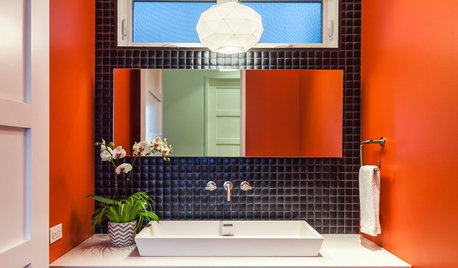
BATHROOM DESIGN7 Striking Paint Colors for Your Powder Room
Whether you opt for a little or a lot, see why the petite bathroom is the perfect place for a fun hue
Full Story


Lori A. Sawaya