


Trying to narrow materials and tones for possible 2 toned kitchen
steph2000
9 years ago
last modified: 9 years ago
Featured Answer
Sort by:Oldest
Comments (36)

steph2000
9 years agolast modified: 9 years agoRelated Discussions
2-Toned Kitchens - Trendy? Too much for small spaces?
Comments (25)How fun to see all the comments and eye candy. Thanks for the conversation on this, it really is something I go back and forth about. @FoozerX - I appreciate hearing from someone who really doesn't like the split. Thanks for your honesty - and for chiming in. @pawa - I'm worried about the gray-dark brown-white thing for more reasons than you know. I've NEVER liked gray and have always leaned to the warmer tones but I find I am really being influenced by the current gray trend. I can't decide if that is because the current grays are more earthy/muddy/warm/zen or if I am just that suggestible afterall... That being said, the dark lowers/light uppers really does seem practical - and easier to keep looking clean. I'm all about that! LOL @palimpsest and jterrilynn - How interesting to learn that this isn't a new phenomonenon, but rather one that is just rarely done. It really does seem to work to ground the kitchen and lighten up the upper half... @MichelleDT - What a great island that is in your inspiration pic. Your kitchen sounds great. I am totally a fan of chunky floating shelves, too. I can't wait to see your kitchen come to life, hope you share lots of pics. @sas95 - There is sooo much to like about your kitchen, including the uppers and lowers working so well together but being different colors. I have always loved that backplash - and those windows are great. @deedles - Those brown doors on white boxes in that picture is not something I would think of, either. While I'm iffy about it, what surprised me is that I didn't despise it. There are other pics that show better how they relate to the island color, but again, not really seeing it for me. If you think of that GW kitchen, please do chime in with it. @rosie - It's a good point about the need to harmonize counter/tile to make something like this work. I just don't see color really working well with it, necessarily. I think the counter would contrast with the lowers and flow more with the uppers, but the backsplash would then need to work with that whole thing to keep it working. I have that backsplash window to work with on the long wall, and remain stumped about how to work with tile PERIOD on the other wall... @chiefy76 - Thanks for the pics. Neat to see all the different ways this can work. My partner isn't sold on this idea, either. Which I find interesting, given I first came up with it as a compromise point between us. @marcolo - Are you saying you think it works as long as there isn't a lot of contrast or that brown/white doesn't work? I often hear the case made to go black/white or brown/cream, so I'm not sure if that's what you are talking about. A lot of the pics posted here by myself and others do show high contrast. Are you saying none of those work or seem intentional? @nap101 - It's interesting to hear you talk about darker lowers to ground the soapstone, and going light above. I don't think I've seen that application and I keep being drawn to light counters on dark lowers/white uppers. If you find pics, please post them. You do make a good point about how dark counters work on white cabinets and soapstone/black granites tend to be the strongest example of that. While I like the look, I've had chocolate brown counters on white cabinets for the past 13 years and am ready for something different. @loves2cook4six - You definitely have the 2-tone thing going and I've been lurking on your BS thread to see what you come up with there. How is that going? You and others show an interesting reverse of what I was thinking with the lighter lowers and darker tones in the uppers. I wouldn't have thought that could work but it seems to! @francoise47 - Egads, that picture really shows how the uppers can fade away into the walls, doesn't it? I love that... but you make such a good point about whether it is too much for the house. If it is too much for your house, it is definitely too much for this little 50's ranch stretching towards 1,000 SF. Hm...but then I look at bossanova's carriage house kitchen and it seems like it really works there without being too much? Same with the little IKEA kitchen with the beam... It's confusing to me, I admit. Thanks so much for sharing your own reasoning process and feedback from a honest friend! (Those are worth gold) @secondhalf - So glad this thread is helping you find clarity! I'm not clear what my house is really suited for, except for simple. lol @sis2two - See, you are making jterrilynn's point! How fun is that? Mixing it up a decade later. Please do share plenty of pics. @jterrilynn - What a neat kitchen. I love that it is shaped so uniquely - and those tall ceilings are great. Love that light fixture! And, the portrait of your FIL is wonderful. You clearly have talent! I like how the lighting fixture plays off the color of the lowers and brings a bit of it upwards. Hm...I was thinking silvery fixtures but this gives pause if I decide to go this direction. I'm going to keep this in the "maybe" pile and when it comes time to put some ideaboards together, I'll likely do at least one with 2 tones. In the meantime, we'll see if this thread has continued eye candy to provide! Thanks again, everyone....See MoreHelp choose the counter colour to go with my two-tone kitchen
Comments (53)Jillius: hiya! Thank you, thank you, thank you for all the time you put in to pulling together those inspiration photos and the collages/mood boards (what do you call those?) While I'm not going to use Bianco Drift, London Grey is very similar to it in colour so your collages are really helpful for getting me started on visualizing what I want for the backsplash. I really like Faith's kitchen. It feels fresh, airy, contemporary, calm, and has a lovely natural feel to it too. She's got gorgeous marble on the counters and backsplash too. It's going into my favourite kitchens folder! Totally agree about the island - it would have looked so great had she kept it wood; but I gotta give her credit for being brave enough to bring in a pop of colour there. I do like having a warm-looking kitchen but I feel like going too warm leads me towards a more traditional look, which isn't what I'd like. The way Faith pulled it off suits me. Love the analysis you did comparing my Shitake collage to the Saint Paul Craftsman photo. I'm getting a better understanding of colour now. Still very mind boggling but I follow when you all help to spell it out for me! Ha ha... You might be expecting too much from the counter selection SO TRUE! I think that's why it's been so challenging. I realize now that I don't really want the counter to shine. It's the backsplash that I'd prefer to stand out. Many months ago, I wrote in my Sweeby Test: "The perfect backsplash will complement the cabinets and work harmoniously with the cabinets to create one well put together look, like they belong together. And possibly provide a pop of colour or visual interest in one section of it. The perfect countertop will be really easy and unfussy. Low maintenance. Just like backsplash, it will complement the cabinets and help connect and tie everything together" I think London Grey will be the right choice to help pull everything together. I do like the Craftsman colour scheme, but not for this kitchen or house. It is too dark and traditional for my 90s home. I was REALLY drawn to the light aqua subway tiles on the bottom right of that collage and the ones that have different shades ranging from light grey to bluey-grey. That just might be how I get in my pop of colour! I'm surprised that blues and greens can look warm - is it because they contrast well with my oak and the floors? I really want to stay away from orange and yellow tones for this reno simply because I don't want it to end up looking too similar to what I currently have....See MoreReady to choose the back splash for my two-tone kitchen!
Comments (50)Ack, sorry again for my very delayed reply. As usual, LIFE got in the way - how annoying! ;) rebunky: I was so disappointed by how pricey the Calacatta tiles were that I didn't even want to take photos of them! Wow - I didn't know that $20/sq ft was on the low end for Calacatta. I think that nixes it for me then. :( namarie: I know your kitchen so well! ;) I didn't realize your tiles were Calacatta Gold - I always thought that CG had more brown tones than grey? I did some Googling and I see lots of tiles with the same colours as your tiles so it looks like I assumed wrong! I think your choice to do tile with very narrow grout lines makes for a nearly-slab-like look! I'd love to get the slab look too but it is WAY too pricey, and I wonder how the heck to remove a slab BS should I ever tire of it?? Kitchen Magic: I did really like the look of some mini bricks I saw at the tile stores I visited. I like how the ones like in your photo have muted colours so it gives me a multi coloured backsplash without being too busy. cpartist: how gorgeous are those cement tiles?? I've never seen cement tiles before and it looks like the design possibilities are endless, if you get them with some graphic design printed on. smm5525: Good idea. I will do that instead of dragging all of you along with me as I think aloud!! Sorry for that... I just really love to see all the different ideas you all share! mayflowers: Hmm... I agree that I can't have both the BS and the counters look busy. The London Grey is staying so I think I'll be going with a solid BS for most of the kitchen... but I'll still consider putting in a more "busy" mosaic tile somewhere, most likely in the hutch area. :) barncatz: I agree - I love the tiles everyone's shared! It helps me figure out and narrow down what I want for my BS tile....See MoreWill it be possible to pull off a two tone in this kitchen? PHOTOS
Comments (211)Hi Beth, absolutely, please go ahead and use the before and after pictures. What do you mean in your last sentence? You want me to add another pic of the before? Thank you, we worked hard, painting the cabinets was no joke. we have a very active 5 year old daughter running around ALL THE TIME, ha! We were up until like 1 in the morning painting the cabinets and she wouldn't go to sleep until we finished! it was a chaos, but we did it!...See Moresteph2000
9 years agosteph2000
9 years agosteph2000
9 years agosteph2000
9 years agosteph2000
9 years agolast modified: 9 years agosteph2000
9 years agoNothing Left to Say
9 years agosteph2000
9 years agosteph2000
9 years agolast modified: 9 years agoNothing Left to Say
9 years agosteph2000
9 years agolast modified: 9 years agosteph2000
9 years agoJillius
9 years agosteph2000
9 years ago
laughablemoments
9 years ago


Related Stories
KITCHEN DESIGNA Two-Tone Cabinet Scheme Gives Your Kitchen the Best of Both Worlds
Waffling between paint and stain or dark and light? Here’s how to mix and match colors and materials
Full Story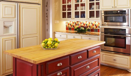
KITCHEN DESIGNTwo-Tone Cabinet Finishes Double Kitchen Style
Love 'em or not, two-tone kitchen cabinet treatments are still going strong. Try these strategies to change up the look of your space
Full Story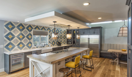
KITCHEN DESIGNKitchen of the Week: Tile Sets the Tone in a Modern Farmhouse Kitchen
A boldly graphic wall and soft blue cabinets create a colorful focal point in this spacious new Washington, D.C.-area kitchen
Full Story
COLORNature’s Color Wisdom: Lessons on Earth Tones From the Great Outdoors
Look to the land for hues that are grounding, soothing and endlessly versatile
Full Story
DECORATING GUIDESHow to Make Wood Tones Work for You
Avoid the ski lodge look by using the rule of three, creating texture, adding pattern and more to expertly mix wood types
Full Story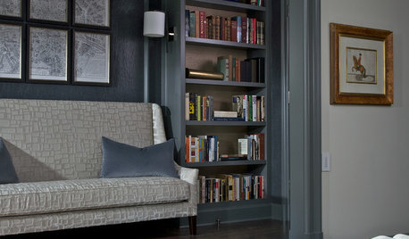
COLORHow to Layer Tones of Gray for Depth and Harmony
Use texture, pattern, contrast and more to create a subtle, sophisticated look with this popular color
Full Story
KITCHEN DESIGNHouzz Quiz: Which Kitchen Backsplash Material Is Right for You?
With so many options available, see if we can help you narrow down the selection
Full Story
MOST POPULARYour Guide to 15 Popular Kitchen Countertop Materials
Get details and costs on top counter materials to help you narrow down the choices for your kitchen
Full Story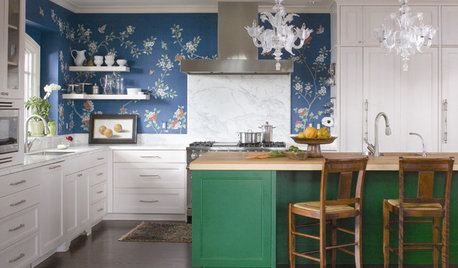
KITCHEN DESIGNTry a Shorter Kitchen Backsplash for Budget-Friendly Style
Shave costs on a kitchen remodel with a pared-down backsplash in one of these great materials
Full Story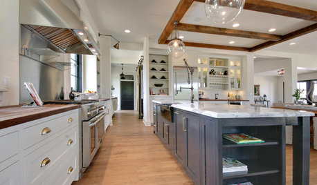
KITCHEN COUNTERTOPS10 Countertop Mashups for the Kitchen
Contrast or complement textures, tones and more by using a mix of materials for countertops and island tops
Full Story

Jillius