


I really need help w/ tan paint color for MBR! lenox tan?
bac717
9 years ago
Featured Answer
Comments (64)

Gracie
9 years ago
bac717
9 years agoRelated Discussions
Is Shaker beige a lighter version of Lenox Tan. Both on same stri
Comments (8)I just painted my kitchen & dining room BM Lenox tan. I really like it - it's the "coffee with cream" color I was looking for. It definitely has a golden hue during the day and a slightly greenish cast at night, but it still works for me. I wanted a lighter shade of the same color, for the windowless mudroom & hallway off of my kitchen. I painted it all BM Shaker beige last evening, as it was the next lighter color on the same strip. I'm on the fence about the color. The Shaker beige IS a beautiful light tan color, but there is not enough of a light/dark contrast between it and the lenox tan - they sort of blend together when viewed from another room. In fact, the Shaker beige almost has a pinkish tone next to the Lenox tan. Wishing now that I had the Lenox tan mixed at 50% but I was afraid the color would turn muddy. Has anyone done this? Are you happy with the 25 - 50% reduction of your color? Dawn, who is SO tired of painting and repainting!...See MoreBM Lenox Tan, etc with White Dove?
Comments (1)Following up on my previous post: We've decided on White Dove as our baseboard, ceiling and door color throughout the apartment, but after painting some sections of wall with various colors, we're back to the beginning. BM's Lenox Tan, Montpelier, Phlipsburg Blue and Blue Echo seemed extremely dark to me while Bleeker Beige was too gray for my husband, and Nimbus Gray read purple to him. We bought even more samples over the weekend and I really like Benjamin Moore's Pashmina, Manchester Tan and Smoke. Has anyone used these colors? Pashmina looks excellent painted on a book shelf in our current rental, but very dark on our new apartment wall. I've paired it with BM Smoke and will eventually paint it side by side with BM Nimbus Gray to see if these two colors can live side-by-side in our living space. Smoke seems very similar to Wedgewood Gray, and Manchester Tan seems perfect, but possibly a little boring? Your experiences with any of these colors would be appreciated!...See MoreLenox Tan 50% still not quite there
Comments (3)The Powell Buff doesn't come across as yellow for me but just a warm cream. For a living area, especially one that will have warm colors in the decor, I would choose a warm, creamy background rather than something on the cool side. It will make the colors of your furniture and accessories glow instead of deadening them. However, I'm not a color expert, it's just a personal opinion....See MorePaint help BM Putnam Ivory, Manchester Tan (MBR - Bath flow)
Comments (2)I agree Todd about them side to side. But the travertine is definitely a yellow tint (with New Venetian Gold granite) so probably calls for a yellow based color. The bathroom is its own room so I'm not sure if the paints in both areas have to flow or be the same/complimentary?...See More
tibbrix
9 years ago
pps7
9 years agotibbrix
9 years agobac717
9 years agoannkh_nd
9 years agotibbrix
9 years agobac717
9 years agoMags438
9 years agotibbrix
9 years agoGracie
9 years agoGracie
9 years agobac717
9 years agotibbrix
9 years agobac717
9 years agotibbrix
9 years agobac717
9 years agotibbrix
9 years agobac717
9 years agosis2two
9 years agopps7
9 years agoGracie
9 years agobac717
9 years agotibbrix
9 years agobac717
9 years agotibbrix
9 years agoLaurie
9 years agopps7
9 years agopps7
9 years agobac717
9 years ago
lisa_mocha
9 years agotibbrix
9 years agoGracie
9 years agobac717
9 years agobac717
9 years agolast modified: 9 years agobac717
9 years agotibbrix
9 years agosis2two
9 years agobac717
9 years ago
Annie Deighnaugh
9 years agotibbrix
9 years agosis2two
9 years agobac717
9 years agobac717
9 years agobac717
9 years agotibbrix
9 years agoGracie
9 years agobac717
9 years agobac717
9 years agolast modified: 9 years ago

Related Stories

COLORPick-a-Paint Help: How to Quit Procrastinating on Color Choice
If you're up to your ears in paint chips but no further to pinning down a hue, our new 3-part series is for you
Full Story
COLORPaint-Picking Help and Secrets From a Color Expert
Advice for wall and trim colors, what to always do before committing and the one paint feature you should completely ignore
Full Story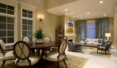
SELLING YOUR HOUSE5 Savvy Fixes to Help Your Home Sell
Get the maximum return on your spruce-up dollars by putting your money in the areas buyers care most about
Full Story
TURQUOISEHow to Pick the Right Blue Paint
Periwinkle, Turquoise, Midnight or Sky? Here's Help Choosing the Blue for You
Full Story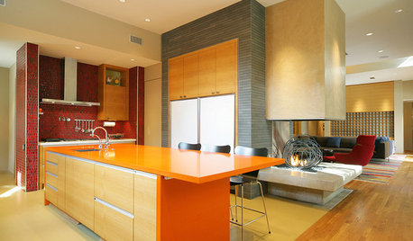
KITCHEN DESIGNPalatable Palettes: 8 Great Kitchen Color Schemes
Warm and appetizing or cool and relaxing? These 8 paint palettes can help you choose the best colors for your kitchen
Full Story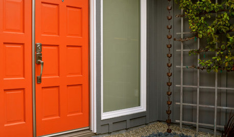
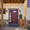
MOST POPULARHow to Choose a Front Door Color
If choosing a door paint isn't an open-and-shut case for you, here's help
Full Story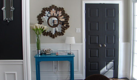
MOST POPULAR11 Reasons to Paint Your Interior Doors Black
Brush on some ebony paint and turn a dull doorway into a model of drop-dead sophistication
Full Story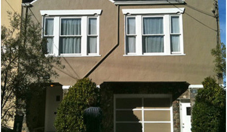
COLOR3 Exterior Paint Dilemmas, 7 Palette Solutions
Houzzers ready to repaint their home exteriors get custom color advice from a design pro
Full Story
HOUZZ QUIZHouzz Quiz: What Color Should You Paint Your House?
Is white right? Maybe dark blue-gray? Take our quiz to find out which color is best for you and your home
Full Story
WHITEHow to Pick the Right White Paint
White is white, right? Not quite. See 8 white paint picks for 8 very different effects
Full Story


sis2two