


Need help finishing kitchen/family room
isixpacku
9 years ago
Sort by:Oldest
Comments (45)
Related Stories

UNIVERSAL DESIGNMy Houzz: Universal Design Helps an 8-Year-Old Feel at Home
An innovative sensory room, wide doors and hallways, and other thoughtful design moves make this Canadian home work for the whole family
Full Story
KITCHEN DESIGNHere's Help for Your Next Appliance Shopping Trip
It may be time to think about your appliances in a new way. These guides can help you set up your kitchen for how you like to cook
Full Story
KITCHEN DESIGNKey Measurements to Help You Design Your Kitchen
Get the ideal kitchen setup by understanding spatial relationships, building dimensions and work zones
Full Story
BATHROOM MAKEOVERSRoom of the Day: See the Bathroom That Helped a House Sell in a Day
Sophisticated but sensitive bathroom upgrades help a century-old house move fast on the market
Full Story
SELLING YOUR HOUSE10 Tricks to Help Your Bathroom Sell Your House
As with the kitchen, the bathroom is always a high priority for home buyers. Here’s how to showcase your bathroom so it looks its best
Full Story
LIVING ROOMSA Living Room Miracle With $1,000 and a Little Help From Houzzers
Frustrated with competing focal points, Kimberlee Dray took her dilemma to the people and got her problem solved
Full Story
DECORATING GUIDESDecorate With Intention: Helping Your TV Blend In
Somewhere between hiding the tube in a cabinet and letting it rule the room are these 11 creative solutions
Full Story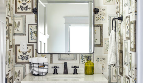
BATHROOM DESIGNKey Measurements to Help You Design a Powder Room
Clearances, codes and coordination are critical in small spaces such as a powder room. Here’s what you should know
Full Story
LIFEDecluttering — How to Get the Help You Need
Don't worry if you can't shed stuff and organize alone; help is at your disposal
Full Story


BeverlyFLADeziner
BeverlyFLADeziner
Related Discussions
Please help me finish family room -- especially windows!
Q
Painted kitchen and family room gray, need help with cabinets!
Q
Help finish family room
Q
Need help with family room off of kitchen
Q
amykath
amykath
arcy_gw
Annie Deighnaugh
Annie Deighnaugh
BeverlyFLADeziner
Annie Deighnaugh
Annie Deighnaugh
k9arlene
decordummy_gw
isixpackuOriginal Author
jlc712
tibbrix
outsideplaying_gw
msrose
kristinekr
kidrowlam
k9arlene
busybee3
Gracie
powermuffin
patty_cakes
isixpackuOriginal Author
isixpackuOriginal Author
isixpackuOriginal Author
grapefruit1_ar
k9arlene
chloenkitty
Gracie
isixpackuOriginal Author
isixpackuOriginal Author
bbstx
k9arlene
Gracie
emmarene9
kidrowlam
zorroslw1
Gracie
msrose
isixpackuOriginal Author
isixpackuOriginal Author
msrose
isixpackuOriginal Author