


Input please on how to pull kitchen together (pics now work)
LottieS
12 years ago
Related Stories
HOUSEKEEPINGAll Together Now: Tackle Home Projects With a DIY Co-op
You're in good company when you pair up with a pal to clean, organize, repair and replace
Full Story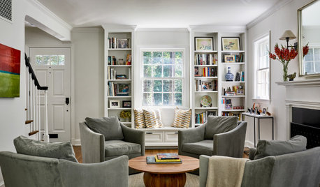
ENTERTAINING10 Steps to Pull Together Your Living Room Before the Holidays
Boost comfort, flow and visual appeal in your main entertaining room to make guests feel more welcome
Full Story
KITCHEN DESIGNTrending Now: 25 Kitchen Photos Houzzers Can’t Get Enough Of
Use the kitchens that have been added to the most ideabooks in the last few months to inspire your dream project
Full Story
KITCHEN DESIGNGet a Grip on Kitchen Cabinets With the Right Knobs and Pulls
Here's how to pair the right style, type and finish of cabinet hardware with your kitchen style
Full Story
LIFESo You're Moving In Together: 3 Things to Do First
Before you pick a new place with your honey, plan and prepare to make the experience sweet
Full Story
DECORATING GUIDESHow to Love Your Kitchen More, Right Now
Make small changes to increase the joy in your kitchen while you cook and bake, without shelling out lots of dough
Full Story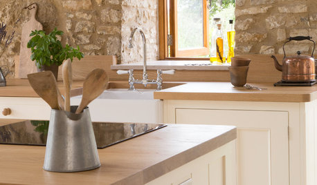
KITCHEN DESIGNHistoric Stone Barn Now a Country Farmhouse Kitchen
A designer carves out a cooking and dining space while carefully preserving the protected 17th-century structure
Full Story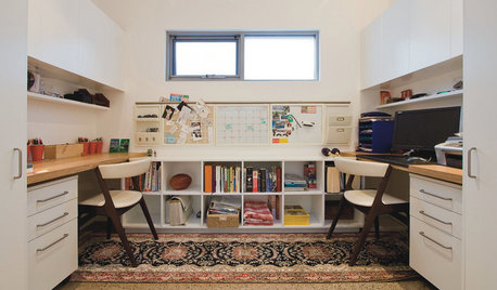
HOME OFFICESWorking at Home Together (and Apart)
One is easy. Two, not so much. Here are ways to make room for two to work at home
Full Story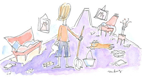
LIFEWe Can Work It Out: Living (and Cleaning) Together
Run a household without fussing and fighting with these ideas for how to work together on household chores
Full Story
HOME OFFICESQuiet, Please! How to Cut Noise Pollution at Home
Leaf blowers, trucks or noisy neighbors driving you berserk? These sound-reduction strategies can help you hush things up
Full Story


TxMarti
live_wire_oak
Related Discussions
Help me pull my room together...please?
Q
Please help me pull this bath redo together? (Lots of pics)
Q
Help me pull this crazy room together (pic)
Q
Please help me pull this pulled from dumpsters' bedroom together
Q
jane__ny
honorbiltkit
cawaps
remodelfla
mpagmom (SW Ohio)
LottieSOriginal Author
sombreuil_mongrel
chris11895
TxMarti
roarah
moonspinner7
lawjedi
_sophiewheeler
kellienoelle
bellsmom
LottieSOriginal Author
CEFreeman
roarah
rosie
mmhmmgood
Samantha111
LottieSOriginal Author
roarah
clubcracker
Samantha111
GreenDesigns
Sharon kilber
mudhouse_gw
doggonegardener
GreenDesigns
GreenDesigns
Fori
fks3
Samantha111
GreenDesigns
GreenDesigns
susanlynn2012
brianadarnell
LottieSOriginal Author
angie_diy
susanlynn2012
susanlynn2012
Fori
LottieSOriginal Author
susanlynn2012
Samantha111