


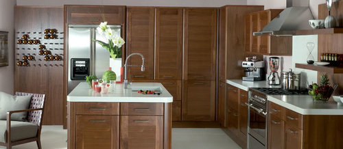
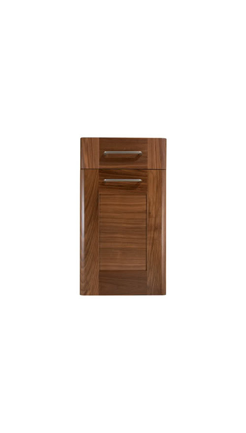
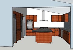
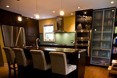
Which of these counters do you like with walnut?
kaysd
12 years ago
Featured Answer
Comments (35)

mamadadapaige
12 years agolast modified: 9 years agobrianadarnell
12 years agolast modified: 9 years agoRelated Discussions
Which stools do you like?
Comments (25)Wow! How nice to log in and find compliments on a half-finished kitchen! I'm always in awe of everyone else's space so to read any interest on my own obsession is awesome. @cathy725 - my peninsula is 85" long and the farthest it goes out is 16". @buildinva - those are "country" hickory - the rest of our downstairs already had hickory so I felt we should stick with that. It has a slight variance from the rest of the original hickory so my dad came up with the idea of a walnut threshold to separate the floors - you can see it somewhat in that photo where the tile and wood meet. I've considered bringing that walnut in by finding some stools that have that type of finish but most are too wide or too traditional for my space. I need 4 stools so anything wider than 16.5" would be too tight. I love those kind @homeimprovementmom posted but every one I've found is 19" wide or more. FWIW, I am worried about the scratching with the Vapor. I have a 3 year old boy and for those of you who have boys, that's all I have to say. :)...See MoreWhich heath tile do you like for midcentury shower
Comments (26)I like the oval much better. On the tile color samples I love the first one at the top that blue, what is the name of the color do you know? I decided to go with blues in my flood make over. I second using the grout with sealer in it. We used the Mapai flex color cq it's wonderful stuff. Definitely not cheap but very worth it. I made them use it everywhere. I thought of you when I was at my granite and tile shop. He had a new display of this very large format ceramic in the marble color you are looking for your bathroom it is amazing comes in multiple finishes just like marble the honed was gorgeous. I believe it was in 24 x 48 slabs. It is called Eleganza. The website doesn't do it justice. If you can find it locally go look at it. I wish I had found it before I did my master bathroom! http://www.eleganzatiles.com/ It is the calacatta series...See MoreWhich terrazzo floor tile sample do you like?
Comments (64)@rockybird Also would like to know how @Kate Balsis tiles are holding up. I just ordered 4 samples and each one was a different thickness (they also shipped only 4 of 5...). The colors are gorgeous, but I had friends get some of CC's made to order tile and the thicknesses were so all over the board their installer almost quit on them and it was a huge pain. The thicknesses were beyond the tolerances stated on their website, and they had a really tough time getting help from their customer service. They eventually shipped them more... when it was too late for the project. It's a bummer because they're so beautiful, but hard to justify between bad customer service, poor quality control and cost. So want to know if I should be practical or crazy?...See Moredo you like your Duraseal dark walnut floors?
Comments (11)If you like dark and dramatic floors (and a dark home that needs ++ lighting) then go for it. Remember: dark floors = dark home. If you have HUGE amounts of windows and HUGE amounts of lighting (house is already lit like an art gallery) then dark floors won't have much of an impact. Yes dark floors SHOW the dust and the dirt (just as Patricia points out). The dust/dirt will be there whether or not can SEE IT is another matter. A natural coloured floor HIDES the dust that is there. Again, this comes down to PERSONALITY traits and likes rather than 'harder to keep clean'. They are just as easy to clean. The difference being harder to keep LOOKING clean. Yes dust can settle inside of an hour...making you feel like you haven't done a darn thing (even though you just swiffered). I like Bona Traffic HD for the finish. It is tough as nails and will not yellow or amber. The finish is what causes 'orange'. The water based stuff like Bona Traffic HD will not turn the orange tones you are trying to avoid....See More
live_wire_oak
12 years agolast modified: 9 years agorosie
12 years agolast modified: 9 years ago
plllog
12 years agolast modified: 9 years ago
gr8daygw
12 years agolast modified: 9 years ago
suzanne_sl
12 years agolast modified: 9 years ago
sochi
12 years agolast modified: 9 years agomarcolo
12 years agolast modified: 9 years agoblfenton
12 years agolast modified: 9 years agokaysd
12 years agolast modified: 9 years agokaysd
12 years agolast modified: 9 years ago
Bunny
12 years agolast modified: 9 years agosochi
12 years agolast modified: 9 years agoplllog
12 years agolast modified: 9 years agovsalzmann
12 years agolast modified: 9 years agokaysd
12 years agolast modified: 9 years agokaysd
12 years agolast modified: 9 years agompagmom (SW Ohio)
12 years agolast modified: 9 years ago
Fori
12 years agolast modified: 9 years agogr8daygw
12 years agolast modified: 9 years agolavender_lass
12 years agolast modified: 9 years agolavender_lass
12 years agolast modified: 9 years agofks3
12 years agolast modified: 9 years agoplllog
12 years agolast modified: 9 years agocarybk
12 years agolast modified: 9 years agokaysd
12 years agolast modified: 9 years agosochi
12 years agolast modified: 9 years agokaysd
12 years agolast modified: 9 years agoremodelfla
12 years agolast modified: 9 years agosochi
12 years agolast modified: 9 years agovsalzmann
12 years agolast modified: 9 years agokaysd
12 years agolast modified: 9 years agovsalzmann
12 years agolast modified: 9 years ago


Related Stories
KITCHEN DESIGN12 Great Kitchen Styles — Which One’s for You?
Sometimes you can be surprised by the kitchen style that really calls to you. The proof is in the pictures
Full Story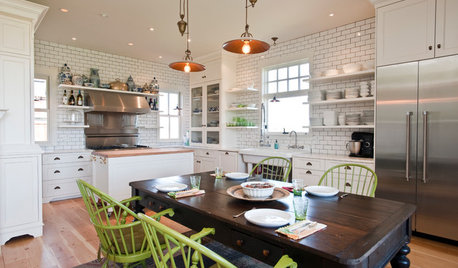
KITCHEN ISLANDSWhich Is for You — Kitchen Table or Island?
Learn about size, storage, lighting and other details to choose the right table for your kitchen and your lifestyle
Full Story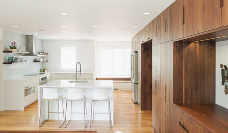
INSIDE HOUZZInside Houzz: A Walnut Wall of Storage Opens Up a Kitchen
A 30-foot wall of storage frees up cooking areas and counters for food prep and entertaining
Full Story
KITCHEN DESIGNHouzz Quiz: Which Kitchen Backsplash Material Is Right for You?
With so many options available, see if we can help you narrow down the selection
Full Story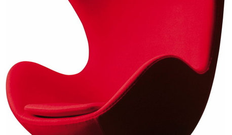
FUN HOUZZHouzz Quiz: Which Midcentury Modern Chair Are You?
Have a seat for a little fun. Better yet, have a seat that has you written all over it
Full Story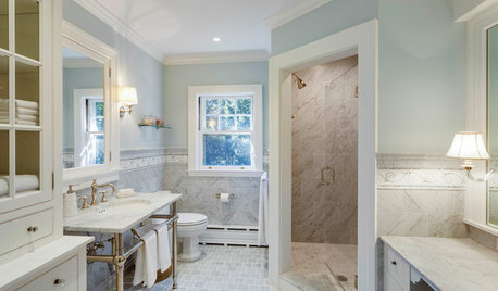
BATHROOM DESIGNWhich Bathroom Vanity Will Work for You?
Vanities can be smart centerpieces and offer tons of storage. See which design would best suit your bathroom
Full Story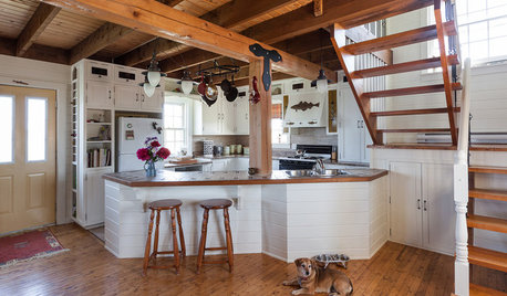
KITCHEN DESIGNOpen vs. Closed Kitchens — Which Style Works Best for You?
Get the kitchen layout that's right for you with this advice from 3 experts
Full Story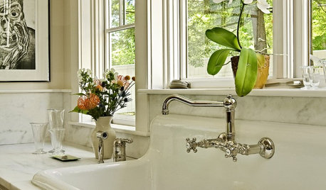
KITCHEN SINKSWhich Faucet Goes With a Farmhouse Sink?
A variety of faucet styles work with the classic farmhouse sink. Here’s how to find the right one for your kitchen
Full Story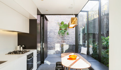
FURNITUREWhich Dining Table Shape Should You Choose?
Rectangular, oval, round or square: Here are ways to choose your dining table shape (or make the most of the one you already have)
Full Story


Cloud Swift