


please critique this design
victoriajane
15 years ago


Sort by:Oldest
Comments (21)
Related Stories
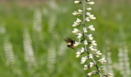
GARDENING GUIDESGreat Design Plant: Please Bumblebees by Planting Baptisia Lactea
Plant wild white indigo in central and southeastern U.S. gardens for its large white flower heads and early-spring interest
Full Story
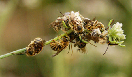
GARDENING GUIDESGreat Design Plant: California Buckwheat Pleases Pollinators
Beneficial insects go wild for this drought-tolerant plant’s summer flowers, while seed heads feed critters foraging in the cold
Full Story
DECORATING GUIDES10 Bedroom Design Ideas to Please Him and Her
Blend colors and styles to create a harmonious sanctuary for two, using these examples and tips
Full Story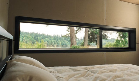
ARCHITECTUREDesign Workshop: Just a Sliver (of Window), Please
Set the right mood, focus a view or highlight architecture with long, narrow windows sited just so on a wall
Full Story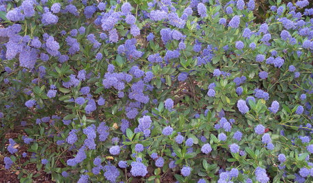
GARDENING GUIDESGreat Design Plant: Ceanothus Pleases With Nectar and Fragrant Blooms
West Coast natives: The blue flowers of drought-tolerant ceanothus draw the eye and help support local wildlife too
Full Story
GARDENING GUIDESGreat Design Plant: Silphium Perfoliatum Pleases Wildlife
Cup plant provides structure, cover, food and water to help attract and sustain wildlife in the eastern North American garden
Full Story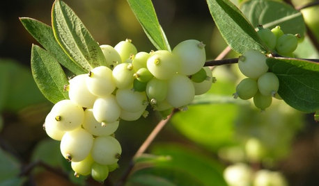
GARDENING GUIDESGreat Design Plant: Snowberry Pleases Year-Round
Bright spring foliage, pretty summer flowers, white berries in winter ... Symphoricarpos albus is a sight to behold in every season
Full Story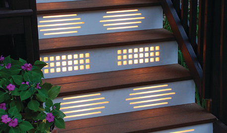
GARDENING AND LANDSCAPINGNo Fall Guys, Please: Ideas for Lighting Your Outdoor Steps
Safety and beauty go hand in hand when you light landscape stairways and steps with just the right mix
Full Story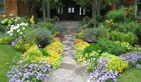
GARDENING GUIDESPathway Plantings That Please the Senses
Add some color, life and intrigue beside your sidewalk with these 7 suggestions
Full StorySponsored
Central Ohio's Trusted Home Remodeler Specializing in Kitchens & Baths


rhome410
remodelfla
Related Discussions
Please critique this design plan.... but go easy on me!
Q
please critique this design
Q
Kitchen remodel-please critique the first design plan
Q
Please critique our kitchen design!
Q
victoriajaneOriginal Author
victoriajaneOriginal Author
remodelfla
mom2lilenj
victoriajaneOriginal Author
victoriajaneOriginal Author
rhome410
Buehl
rhome410
tetrazzini
mom2lilenj
victoriajaneOriginal Author
rhome410
tetrazzini
victoriajaneOriginal Author
rhome410
victoriajaneOriginal Author
rhome410
mom2lilenj