


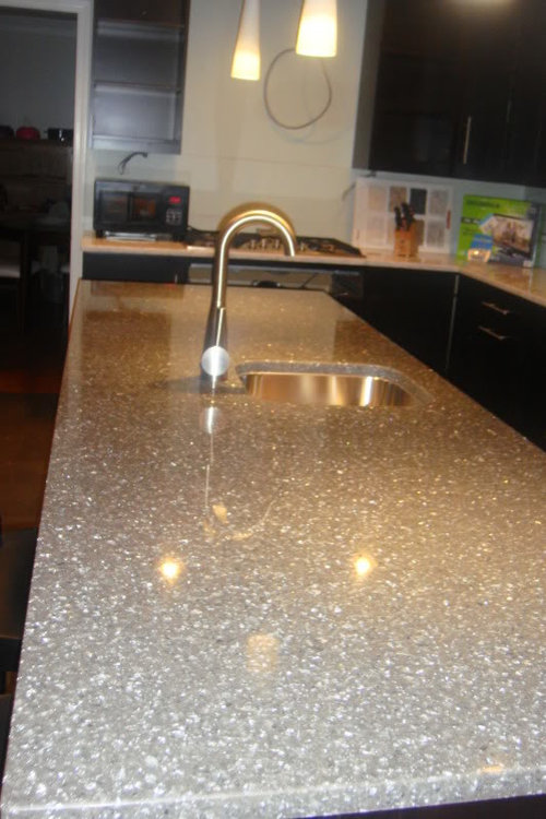
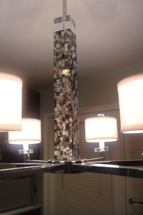
Need Design Opinions -How much is too much sparkle??? Pics
azlee6574
12 years ago

Featured Answer
Comments (43)

BlueKitten
12 years agorosie
12 years agoRelated Discussions
Too much of a good thing? Design advice needed!
Comments (1)Can we see photos?? That will help us be able to offer better advice....See Moretoo much wood
Comments (10)Hi Faye, I have dark stained alder wood cabs also. I used them on the perimeter cabs only, with ivory/glazed cabs on the interior. I've had many compliments on the combination. I didn't want the kitchen to be too dark OR too light. I have dark hand scraped floors, and all my furniture is medium to dark wood. As for the interior doors/trim, it's 3 shades darker than the warm tan walls, and I love it! I didn't want white trim/doors since I tend to think of it as 'colonial', but that's just me since it seems to be the norm with older homes as well as new builds. I've thought of replacing w/dark stained doors, which I think would also be pretty with the trim color. I'm not a fan of white trim w/stained doors, again, just my taste. I know it's not easy making decisions. ;o)...See MoreOpinions wanted! Backspalsh advice much needed
Comments (5)kitchenette sounds fun...and looks cool. I'd do something different along the lines that acm suggested, would be a perfect small spot to play with pattern etc but if you're not a fan-maybe do a shorter splash in matter white, and hang an art on top:) something not too precious, of course or yes, take it to the top(or don't)-and install shelves PS re-read your post..you're doing Carrara..ok you can still try and find pattern but harder with Carrara since it already has a pattern. but even moreso, reclaimed wood spells different aesthetic than Carrara, to me somehow..I wouldn't mix them. Besides other reasons like cleaning etc also once I found termites in cool reclaimed wooden lamp I bought for my DD nothing helped to get rid of them, but at some point we were treating termites(preventive measure for a new house) and left the lamp in the house for three days..))...See MoreProblem with too much hot sun -- query
Comments (5)notice that placement depends on angle of sun at mid day ... so you might want to figure out best placement.. which might not be directly above ... this is what i built for the kids back int eh day.. do you think they played up it??? its going on 20 years.. thru MI winters ... ken notice that placement depends on angle of sun at mid day ... so you might want to figire out best placement.. which might not be directly above ... in this pic we are standing due south ... so its morning when i took this shot.. so presume evening is the opposite.. and mid day would be right under about one third of the way back ... hey deb... my kids got dirty here .. what do you make to that ... we ran a hose on it from the far side.. up hill and they would wallow in the mud pit 6 to 8 hours a day ... ken...See Moreazlee6574
12 years agomaybeiloveyou
12 years agoAdrienne2011
12 years agoAdrienne2011
12 years agobeaglesdoitbetter1
12 years agoazlee6574
12 years agoblfenton
12 years agoazlee6574
12 years agosingingmicki
12 years agolascatx
12 years agoriverrocks
12 years agobabs711
12 years agorosie
12 years agoNewSouthernBelle
12 years agoAdrienne2011
12 years agoAdrienne2011
12 years agoformerlyflorantha
12 years agopeach32
12 years agoazlee6574
12 years agodianalo
12 years agoNewSouthernBelle
12 years agoblfenton
12 years agoazlee6574
12 years agoazlee6574
12 years agoazlee6574
12 years agolascatx
12 years agoblfenton
12 years agosue_b
12 years agoazlee6574
12 years agolazydaisynot
12 years agoblfenton
12 years agocalimama
12 years agoazlee6574
12 years agoazlee6574
12 years ago
Susan
12 years agommhmmgood
12 years agoNewSouthernBelle
12 years agopondlily
12 years agoNewSouthernBelle
12 years agoNewSouthernBelle
12 years ago


Related Stories

DECORATING GUIDESNo Neutral Ground? Why the Color Camps Are So Opinionated
Can't we all just get along when it comes to color versus neutrals?
Full Story
DECORATING GUIDESAdd Some Sparkle to Your Style
Discover 15 ways to bring glitter and glam into your home
Full Story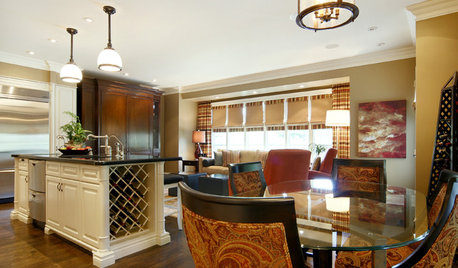
FURNITUREGlass Tabletops Make a Room Sparkle
Understated Translucent Tables Reflect the Best of a Space
Full Story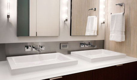
BATHROOM DESIGNUniversal Bath Design: Light Your Bathroom for All Ages and Abilities
Learn about uplighting, downlighting, visual cueing and avoiding glare for a bathroom that's safe and works for all
Full Story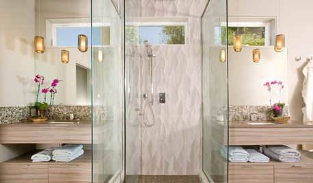
BATHROOM DESIGN8 Stunning and Soothing Shower Designs
Step into these brave bathroom designs, from Roman inspired to supermodern, and let the ideas wash over you
Full Story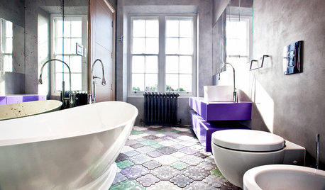
BATHROOM DESIGN14 Bathroom Design Ideas Expected to Be Big in 2015
Award-winning designers reveal the bathroom features they believe will emerge or stay strong in the years ahead
Full Story
HOUZZ TOURSDesign Lessons From a 10-Foot-Wide Row House
How to make a very narrow home open, bright and comfortable? Go vertical, focus on storage, work your materials and embrace modern design
Full Story
KITCHEN DESIGNA Designer Shares Her Kitchen-Remodel Wish List
As part of a whole-house renovation, she’s making her dream list of kitchen amenities. What are your must-have features?
Full Story
DECORATING GUIDESBring a Taste of Italy Home With 12 Design Touches
No vacation plans abroad? You can still get the feel of old-world Italy with these ideas from an Italian designer
Full Story
BATHROOM WORKBOOKStandard Fixture Dimensions and Measurements for a Primary Bath
Create a luxe bathroom that functions well with these key measurements and layout tips
Full Story


azlee6574Original Author