


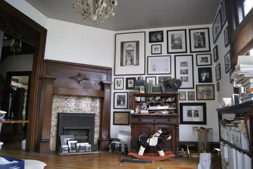
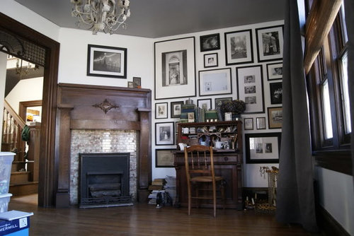
Fireplace Art Update....Photoshop Req.?
ttodd
12 years ago

Sort by:Oldest
Comments (16)
Related Stories
HOUZZ TOURSHouzz Tour: Visit a Modern Update in Oakland
See how a "hacked together" home became an urban neighborhood jewel
Full Story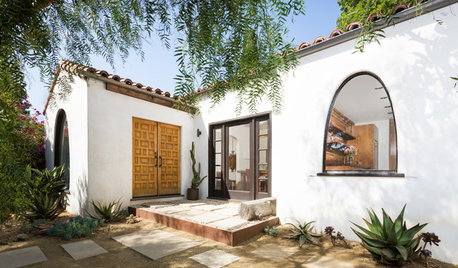
BEFORE AND AFTERSHouzz TV: See Recycled Walls and Cool Cassette Art in a Woodsy DIY Home
Walnut countertops join hardwood floors and pieces made from leftover framing in a bright Spanish colonial
Full Story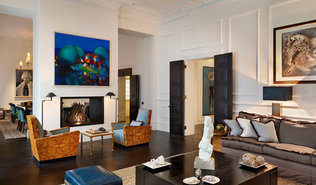
TRADITIONAL HOMESHouzz Tour: 2 London Apartments Join to Become a Luxe Family Home
Spacious rooms, luxury materials and elegant furnishings create a dream home for a family with a love of art and entertaining
Full Story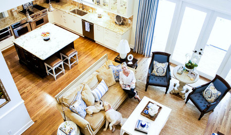
HOUZZ TOURSMy Houzz: Refined Comfort on a Florida Island
Relaxed coastal style gets a tailored touch in a cheerful, peaceful family home
Full Story
CONTEMPORARY HOMESRoom of the Day: Traditional Living Room Gets a Contemporary Spin
Strategic changes transform a dated living room into a sleek space made for relaxing and entertaining
Full Story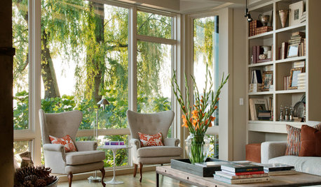
MOST POPULAR12 Key Decorating Tips to Make Any Room Better
Get a great result even without an experienced touch by following these basic design guidelines
Full Story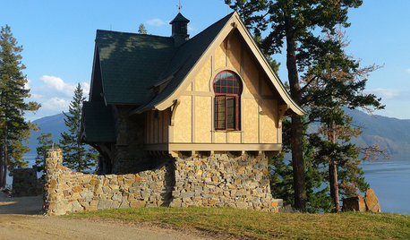
ARCHITECTUREHow to Design a Storybook Cottage
A client’s request: “Build me a house where Disney meets Tudor.” The architect explores the details that make the style
Full Story
TRIMWhat Color Should You Paint Your Trim?
Learn the benefits of painting your trim white, black, neutral, a bold color and more
Full Story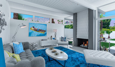
MIDCENTURY HOMESHouzz Tour: Pools and Martinis Inspire a Palm Springs Remodel
Weighed down by black-heavy ’80s style, a California desert home gets a fun and lighthearted look just right for its midcentury roots
Full Story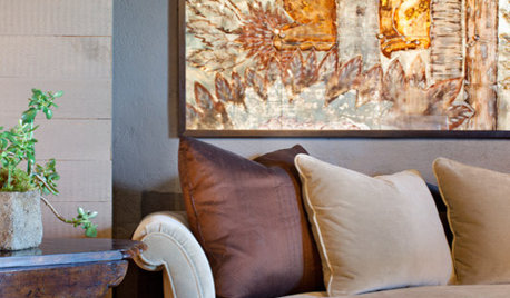
DECORATING GUIDES13 Home Design and Decor Trends to Watch for in 2013
It's predictions ahead as we find out what's on the radar of designers and makers for the coming year
Full Story


CEFreeman
gwbr54
jan_in_wisconsin
nancybee_2010
ww340
yayagal
Oakley
ttoddOriginal Author
bungalow_house
bungalow_house
Diane Smith at Walter E. Smithe Furniture
ttoddOriginal Author
CEFreeman
Diane Smith at Walter E. Smithe Furniture
ttoddOriginal Author
jea2007