


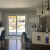
Suggestions for our dated kitchen (pics)
canuck88
12 years ago


Sort by:Oldest
Comments (26)
Related Stories
HOUZZ TOURSMy Houzz: DIY Love Reforms a Dated Cape Ann Home
Handmade touches and classic neutrals transform a dark Massachusetts house into a beautiful home fit for a family
Full Story
BATHROOM COLOR6 Bathroom Color Schemes That Will Never Look Dated
If you’d love to splash some color around your bathroom but fear it won’t stand the test of time, stick with these fail-safe combos
Full Story
INSIDE HOUZZHouzz Prizewinners Take a Bathroom and a Laundry From Dated to Dreamy
Janine Thomson enters a Houzz sweepstakes and wins a $50,000 design package from Lowe’s. See the ‘before’ and ‘after’ photos
Full Story
LIFEInviting Kids Into the Kitchen: Suggestions for Nurturing Cooks
Imagine a day when your child whips up dinner instead of complaining about it. You can make it happen with this wisdom
Full Story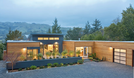
GREEN BUILDINGEfficient Architecture Suggests a New Future for Design
Homes that pay attention to efficient construction, square footage and finishes are paving the way for fresh aesthetic potential
Full Story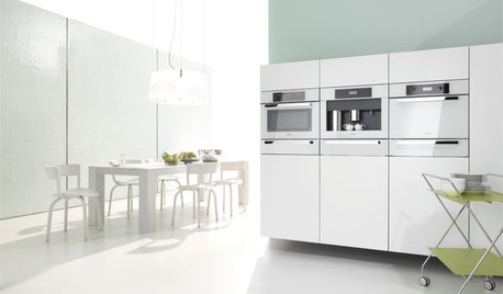
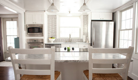
KITCHEN DESIGNWhite Appliances Find the Limelight
White is becoming a clear star across a broad range of kitchen styles and with all manner of appliances
Full Story
KITCHEN DESIGN3 Steps to Choosing Kitchen Finishes Wisely
Lost your way in the field of options for countertop and cabinet finishes? This advice will put your kitchen renovation back on track
Full Story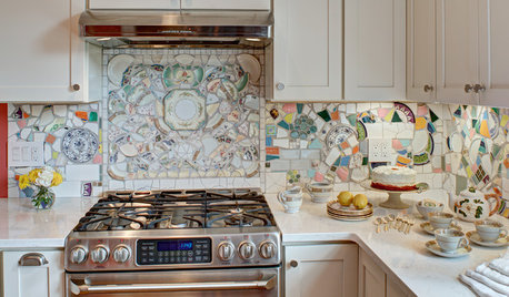
MOST POPULARKitchen of the Week: Broken China Makes a Splash in This Kitchen
When life handed this homeowner a smashed plate, her designer delivered a one-of-a-kind wall covering to fit the cheerful new room
Full Story
KITCHEN DESIGNKitchen of the Week: A Fresh Take on Classic Shaker Style
Quality craftsmanship and contemporary touches in a London kitchen bring the traditional look into the 21st century
Full Story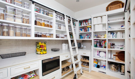
KITCHEN DESIGN9 Questions to Ask When Planning a Kitchen Pantry
Avoid blunders and get the storage space and layout you need by asking these questions before you begin
Full Story


canuck88Original Author
suzanne_sl
Related Discussions
Our DIY kitchen -Countertop Color Suggestions?
Q
Any suggestions for our layout? Lots of pics.
Q
Suggestions, Advice, Details to add before we order our IKEA Kitchen?
Q
Need help with kitchen remodel ideas and suggestions of our new layout
Q
canuck88Original Author
marcolo
canuck88Original Author
chocolatebunny
canuck88Original Author
nancybee_2010
canuck88Original Author
honorbiltkit
canuck88Original Author
canuck88Original Author
function_first
northcarolina
ghostlyvision
dianalo
honorbiltkit
BlueKitten
Happyladi
marcolo
SusieQusie60
nellie820
maybeiloveyou
advanced
debbie1000
formerlyflorantha