SHOP PRODUCTS
Houzz Logo Print
peach32_gw

Peach's Typhoon Bordeaux - BS revisited with new pics/ideas

peach32
12 years ago

Hi! The last post got so long that I decided to uncomplicate things and start afresh. I picked up some tumbled stone and reddish/brown glass but I still fear the variation in the tumbled stone would appear too busy. But's it's much more affordable than another stone I fell in heavy like with at $92.00/sq. ft. Pics below. So, thought it couldn't hurt to revisit the tumbled stone option.

{{!gwi}}

{{!gwi}}

My granite has a LOT of red (and even pink) in it. Does anyone like the idea of a red accent wall over my stove? Either with the tumbled stone or w/crackled subways?

{{!gwi}}

My china is cream colored and so I do think Candlelight or Butter (pictured) crackled Subways would be pretty with it. I think the red is pretty with it, too. Which one do you like w/the china? Butter is on the left. Candlight on the right.

{{!gwi}}

{{!gwi}}

{{!gwi}}


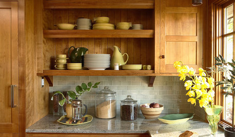
You can see my china cabinet from the kitchen in this pic which is what got me thinking that cream subways would tie in the two rooms. My Dining Room chair cushions are light, also. You can see one of them in the pic.

{{!gwi}}

I also fell in love with a hand made tile by Architerra that costs $92/sq. foot! But I love the "roughness" and matte finish and the "Tuscan" look.

It's coming across greener in this pic than it is.

{{!gwi}}

It's more this color:

{{!gwi}}

So, that's where I am! All opinions welcomed!!!!

Comments (59)

  • peach32
    Original Author
    12 years ago

    Thanks y'all! (Yes, I'm from GA-- thus,the name "Peach"). Senator13, the wall color is SW "Tea Biscuit" and my DR is one shade lighter, "Portabello." I'm really happy with them if you are looking for a brown. Sande, what color is the Sonoma "Martini" IRL? It's going pink on my monitor?? Butter is definitely "less yellow" that Candlelight but Candlelight is warmer in my kitchen. I wish I could find a cream I like as well as Candlelight in the Star finish since Stellar is so much more! What kind of prices are you finding on Sonoma tile out West, Sande? Here, the Star is $13.80/sq. ft. for the 3x6 and the Stellar is $22.08/sq. ft. for the 3x6.

  • ptamom
    12 years ago

    I like the "butter." Also, revisit "Tipperary"? I liked that one. I definately don't like the red. It's way to much. If you love the Tuscan look the way to go is travertine. However, the look of your cabinets and hardware are more contemporary and work best with the glazed ceramic tile. Overall, my vote is for the less yellow "butter." Good luck.

  • Related Discussions

    Sneak peek - typhoon bordeaux green is in!

    Q

    Comments (45)
    i had to chime in--just invested in netuno bordeaux that i'm praying looks not too wild with my simple-style canvas kraftmaid cabinets and wood floors. nothing is installed yet and i went for it on the granite. after starting looking at all the whites and grays out there, i went in the opposite direction. i also ordered champagne bronze faucet and cabinet knobs as we have a traditional house with lots of brass doorknobs. i hope it's not "too much" but think i will love it. here are some poorly lit photos of our slabs (Why don't granite places invest in better lighting?) which are much lighter in person. hoping for a warm, not too contemporary look in the end.
    ...See More

    Please vote on BS for Typhoon Bordeaux

    Q

    Comments (56)
    Hey Sande--I think Martini is the only one I do not have a sample of! I'm going to go online and look it up. No, no decisions. I picked up some tumbled stone and reddish/brown glass but I still fear the variation in the tumbled stone would appear too busy. My china is cream colored and so I do think Candlelight or Butter crackled Subways would be pretty with it. If I did any red glass, it would be over my stove, but I'm not sure I want an accent wall. My granite has a LOT of red (and even pink) in it, though. I fell in love with a hand made tile by Architerra that costs $92/sq. foot! But I love the "roughness" and matte finish and the "Tuscan" look. So I may be happier with that look, ultimately. I just don't know. You can see my china cabinet from the kitchen in this pic which is what got me thinking that cream is really the way to go and that it would tie in the two rooms. My Dining Room chair cusions are light, also. You can see one of them in the pic. So, that's where I am! All opinions welcomed!!!!
    ...See More

    New kitchen- Granite Ideas

    Q

    Comments (18)
    Crescent50, The wonderful thing about CB is that the movement can be carried with varying stones. If you find two slabs that are similar and a third that is a distant match it will still look amazing, because the colors really flow. Of course be sure you like all three slabs, that way you won't feel like you are trying to make it work but will find you enjoy the patterns together. Here are a few images... I am so glad you said CB because I was just about to post some more yellow river until I saw that you visited the Granite shop to find a new love. Hope these help. ~boxerpups I am a huge fan of Chloe"sMom's kitchen. She chose Creama Bordeaux in her amazing kitchen. Here is a tiny preview. Creama Bordeaux CB from Stoneshub CB from Legendary Stone CB from Rocky Top Here is a link that might be useful: Your granite name (old GW post)
    ...See More

    Mellie's Kitchen -- Typhoon Bordeaux -- Backsplash Decisions!

    Q

    Comments (21)
    I have Typhoon Bordeaux in my new kitchen and I also love it. We used a marble subway tile called Bursa Beige with glass accent tiles similar to the ones you are considering. We did a row 2 deep of the accent tiles and it looks great. Since the granite is so beautiful the backsplash needs to be simple but elegant. Attached are photos of my kitchen. Here is a link that might be useful: kitchen pictures
    ...See More
  • sandesurf
    12 years ago

    peach, I'm holding the Martini color, and while I did think it looked pink in my other kitchen, under florecent lights, I really don't see pink here, with natural light. I'll take a closer look tonight, but we don't have florecent lights here, so maybe that's the difference. There is definitely no yellow, which I want to stay away from. It's just a really nice match to the light color in my TB, but it only comes in gloss. I THINK I prefer Matte. ?
    I can see why you like the Candlelight, but my floor is very "busy", then the granite...I just think with a whole wall of the crackle, it will look busy too. ??

  • blfenton
    12 years ago

    No to the red, definitely no to the tumbled stone. If you do that your granite and BS will fight, (they will never be friends) and you will wind up dizzy.
    I do like the candlelight because it's warmer (which is probably why it reads a little yellow) but the butter is good as well.
    Your granite needs to be and is the center of attention and there is no getting away from that. so let it be the center of attention. Besides - it's stunning.

  • kitchendetective
    12 years ago

    I like the butter because it seems to offer a bit of contrast to both the granite and the cabinets. Of course, that's on my monitor, so who knows?

  • peach32
    Original Author
    12 years ago

    Thanks so much. I am not going with any red tile anywhere. Seems to be the consensus and I was told it would make my kitchen look smaller to break up the tile. Here are some more pics. I included Tipperary for ptamom in the first two pics. Sande, I don't think crackle is too busy. I think it's a very subtle finish...unlike "veining." Maybe someone else who has it already installed can say for sure.

    L-R: Butter, Candlelight, Cream City (matte), Tipperary, Trigo (matte), and Vanilla

    w/o flash

    w/flash

  • breezygirl
    12 years ago

    Oh candlelight, oh candlelight....I'll vote for you till the end, my friend!

    (I think this is my fourth time voting for it!)

  • blfenton
    12 years ago

    I don't remember you showing us your cabinets before, just the counter. The tipperary and and Trigo are going to give you the look of an almost monochromatic look (oh boy this is going to sound like I'm a little nuts) as they all seem to have the same base colour. However, the counter, backsplash (Tipperary and Trigo) and cabinets all seem to be variegated in colour as well which is going to give you a lot of business in your space..
    I would want the counter to stand out and it won't happen if the look becomes monochromatic.
    None of your elements have a smooth restful place for your eyes to rest. You might be able to get away with a crackle finish.
    So either the Butter, Candlelight, Cream City or Vanilla. Then it will depend on the undertones in each of them as to which is best.
    Don't suppose you want to show a close-up of the Cream City and Vanilla with your china do you?

    My 2c worth.

  • peach32
    Original Author
    12 years ago

    blfenton--I thought the monochromatic thoughts, also. Makes sense to me. Not sure why my designer person likes Trigo and then said Architerra "was the one" when I brought it home. In her defense, she also liked Candlelight. LOL at you breezy girl. It seems to be really hard to photograph "creams" but here are more cell phone pics. No time for the real deal. I think Vanilla is too yellow; still like Candlelight because there is a lot of that particular color in the granite (as well as so many others), but I'm also liking Butter and Cream City for the contrast w/the cabinets they would provide by being the lightest of my four finalists. Bottom row, L-R, Candlelight and Butter. Top row, L-R, Cream City and Vanilla. Breezygirl...we know you have better things to do. You don't have to vote on Candlelight a 5th time, sweetie. LOL

    {{!gwi}}
    {{!gwi}}
    {{!gwi}}
    {{!gwi}}
    {{!gwi}}
    {{!gwi}}
    {{!gwi}}
    {{!gwi}}
    {{!gwi}}
    {{!gwi}}
    {{!gwi}}
    {{!gwi}}
    {{!gwi}}
    {{!gwi}}
    {{!gwi}}

  • chicagoans
    12 years ago

    Counters and cabinets are beautiful! And both are strong so I'm another fan of the simple crackles. Like them all but I think Candlelight is my fave. I also love the color of that brown wall. Makes me want to eat chocolate. (oh wait... everything makes me want to eat chocolate.)

  • blfenton
    12 years ago

    I didn't like the way the cream city and vanilla are showing. I don't think the vanilla works with your DR furniture.

    You have quite a bit of red/pink in your room. Certainly your counter, your china has pink in it and your floor looks like it has red undertones as well (could be my monitor) and so I would avoid anything with a pink undertone to it.
    The candlelight and butter look like good options to me. Can you get more of the two of them and see what they look like in your kitchen. I'm still a little concerned about the crackle finish in that it might be a little much when there is a lot of it in the room. But that is also my personal taste coming into play.
    More tile together in your room with your lighting will show up the undertones as well.

    thanks for all the pics.

  • peach32
    Original Author
    12 years ago

    Thanks, guys! This forum is so helpful. I have 3 samples of Candlelight from the same tile store--one from 2010, one from 1/11 and one from 6/11. They are all slightly different. I agree with the "no pink undertones." Or peach. Or yellow. Your monitor is reading my floor correctly. But that is the only room, to me, where the floors look that "red." Butter is probably the only one with ZERO pink undertones. I'll have another look tonight. Sande, I saw a sample of the "Martini" at lunch. Definitely has pink undertones and with your cherry cabinets, might read even pinker.

  • rhome410
    12 years ago

    LOVE your wall color. Candlelight looks like the winner all the way down on my monitor. So glad you've moved away from the tumbled stones.

  • NatalieChantal
    12 years ago

    I like the Candlelight and Cream City. It's hard to choose between them without seeing them in person and catching all the undertones, though.

    Good luck! And no, I don't feel the mental urge to re-do your kitchen when I see the pics, lol.

  • sandesurf
    12 years ago

    No wonder there are so many people on GW who have a problem choosing their bs, or wait a few years before doing it. I think we'll be the latter.
    Our tile guy, friend, came over today and said, "Oh, that looks pink.", about the Martini. Darn... I'll go take a look at butter and toast when I'm home next week. I went to a local store (no one sells Sonoma around here), and they showed me a tile by Interceramic, in a color called Canvas, in matte. Unfortunately, the sample was a 2X2 size. They need to order a whole box, at $40 a box, to get any in. No returns. Yep, it's going to be awhile...
    Keep those pictures coming! But, you realize, the colors just don't show up well.

  • Mellie0803
    12 years ago

    Hi Peach,
    I'm not crazy about the tumbled look, I think maybe it takes away from the granite. I really do think the granite needs to be the star of the show here. Have you thought about a metallic accent? I see the silver in your dish edge and also in the drawer hardware. I saw some decorative ones and others that were plain, they might be just what you need to punch up the cream tile. (which looks very pretty with your china!)
    I'll be at the tile store later today!

  • ptamom
    12 years ago

    I must admit that in your new pics my eye went directly to bottom left....Candlelight! I tried not to let names influence me and looked first. I like the crackle. It is not busy. It really just reflects the light differently. Honestly, the four ceramic tiles are all so nice that there isn't a wrong choice. It just gets so confusing when you have been looking at them for so long.

  • peach32
    Original Author
    12 years ago

    Mellie, a metallic accent--I'm intrigued! Yes, definitely not going w/the tumbled stone. I like it; just not with my granite. Thanks ptamom! It feels like I have been staring at tile for months! Ready to bite the bullet and buy something. But, Candlelight will take about 5 weeks. AND, my tile guy now tells me I need 45 sq. feet, not the 30 he has told me all along!

  • ptamom
    12 years ago

    Holy cow! What are you going to do? Can you wait that long?

  • peach32
    Original Author
    12 years ago

    I don't know....I'd rather not, but I'm pretty patient.

  • peach32
    Original Author
    12 years ago

    Ok, after seeing all the creamy white, tall cabinets on here, I officially hate my cabinets. I don't know if sinking $1,000 into a backsplash makes any sense at this point. Maybe I should put it into new cabinets on top and reface the bottom ones (again). The soffetts above the upper cabinets can go. I've seen it done in other condos where I live.

  • peach32
    Original Author
    12 years ago

    Ok, I'm over wanting to re-do the cabinets. For now. I finally got enough samples of some tile to get a better visual. Brought home some glass tile that everyone at the tile store seemed to love with my stuff. They said I need a contrast w/my cabinets. And, have to say, I'm not loving the cream look, now that I have seen 5 samples together. It's not Candlelight, just this particular store's bone crackle tile.

    Here's the glass tile board in the store and then the samples in my home.

    {{!gwi}}
    {{!gwi}}
    {{!gwi}}
    {{!gwi}}
    {{!gwi}}

    And here's the cream.

    {{!gwi}}
    {{!gwi}}
    {{!gwi}}
    {{!gwi}}

    This hand made matte tile is really growing on me. Wish I had more samples to photograph. It's an "in-between" color to me, yet still a neutral.

    {{!gwi}}

    Please let me know where you all stand after these pics. Thanks!!!!!!!!!

  • NewSouthernBelle
    12 years ago

    Well, I was going to say candlelight too but now I like the hand-made matte. It does look like a perfect in-between - warmer and more interesting than the candlelight, but still compliments your granite and isn't such a strong contrast as the brown. The brown also looks too close to your wall paint color, IMO. You have a lot of good options and now it is really just personal preference and what your guts says.

    On a side note, I agree with incorporating red accents via dish towels and the like. Red accents almost always look great in a kitchen and would look especially wonderful in yours - making the reds in the granite pop.

  • sparklekitty
    12 years ago

    Peach - The dark glass tile is a great contrast, but still subdue because it is subway. I think it compliments the counter without outshining it, while the lighter tiles don't really compliment but just fade to the background, which might be the look you are after. The darker tile is a little more contemporary look, if you are comfortable with that. The handmade matte is my distant second choice because I find the bone/cream/candlelight choices too monochromatic for my taste. BUT...if the darker glass is not not your thing don't try convince yourself. It is your taste that matters, not mine or anyone else on GW.

  • blfenton
    12 years ago

    I really like the dark tile but I agree with Newsouthernbelle that you would probably have to address the paint colour.

    Now it's about the look you're after. A very serene calm kitchen which the lighter tiles would give you or one with a contemporary punch that really livens the place up.
    Definitely your call.

  • peach32
    Original Author
    12 years ago

    Thanks y'all. I don't like the fact that the dark tile is the same as the paint color, either.

  • enduring
    12 years ago

    I love the dark tile with your light granite and cabinets. It really is lovely with your floor too.

  • uroboros5
    12 years ago

    The light off-whites are splendid - I'd have a hard time picking which, too!

    This is my favorite of the lot:

    {{!gwi}}

  • marieskit
    12 years ago

    I am debating backsplash for my TB also. I am still waiting for cabinet install (dark ebony with red tones)and am wondering why everyone steers away from reddish backsplash?

  • bigjim24
    12 years ago

    Peach, I'm trying to weigh in here but, for me at least, BS choice has been the agonizing. I like the candlelight, but agree with the mono nature. Which does not bother me personally. IMHO I think the dark is very specific. Boxerpups is right on, as alawys :) Your accent pieces can give you the pop of colors and textures.

  • advanced
    12 years ago

    I am loving the brown tiles. I thought that candlelight or butter would stay my favorites but the brown is just so very rich and highlights the beauty of the granite. Really tough decision. I am still on hold with my TB granite selection with my creamy white cabinets but I am holding back because of the red tones that I am seeing in all slabs. GOOD LUCK!

  • annac54
    12 years ago

    I like the brown tiles, but it may be darker than you were wanting. I found this with just an accent of the brown. Maybe something like this would work for you (except using the subways, for the main tiles of course).

    [traditional kitchen design[(https://www.houzz.com/photos/traditional-kitchen-ideas-phbr1-bp~t_709~s_2107)

  • peach32
    Original Author
    12 years ago

    Thanks for the suggestion Anna. I'm thinking all brown tiles with my brown walls is darker than I want, too.

  • Mellie0803
    12 years ago

    Hi Peach!
    I am feeling your agony. This is hard! I think I've lost track of whether or not you wanted to contrast with your cabinets. (Or maybe you have too, lol). Maybe think about a combination of the light and dark. The picture from Anna is a great jumping off point.

    I remember reading in a kitchen book at the start of our remodel that so many homeowners are full steam ahead with their project until they hit backsplash and then come to a screeching halt. We've spent money and time deciding on things like flooring, or cabinets, appliances and/or granite that this just seems to stop us in our tracks. I think the most reassuring thing I read is that in the grand scheme, BS is not as expensive as most of those other things and is the easiest to change (besides paint). Not that we will WANT to change it, just that we COULD. So take a deep breath, and trust your instincts. You have already chosen beautiful granite and lovely paint colors. You can do it!

  • peach32
    Original Author
    12 years ago

    Thank you, Mellie! I think a contrast with my cabinets, either lighter or darker, would be better than mono. At this point, I'm still leaning towards lighter. Don't know if you saw fromthesouth's kitchen but I love her WZ Tuileries BS in Chloe. Hoping to get a sample today. What color are you thinking with your TB?

  • Mellie0803
    12 years ago

    Since my cabinets are cherry, I am definitely going the cream route. I have sample boards of Granada Crackle Cream (from Cobsa USA), Jerusalem White and Bumpy Pergamon. The bumpy was eliminated immediately when we got it home, not good at all.
    So far the leader is the Crackle Cream. After investigating some online, I want to see if the store has the Granada Marmi in cream. It has a matte finish. That's where I am now: shiny or matte?

  • sandesurf
    12 years ago

    Hi my felleow TB sisters! I'm on vacation and had to pay for Internet service, but I'm keeping my eye on this thead! :)
    My DH keeps pushing the "Why do we need BS?" idea, and I have to say, I'm okay with that. At least until I see how beautiful yours turn out!
    p.s So far, I like the cream idea too, but my cabinets are dark. Peach, I really like the dark brown, at least for an accent color for you.
    BTW, what are you guys using for cleaning the TB? I found a product, in the market, called Granite Gold. It's okay, but have you found anything great?

  • Redhead47
    12 years ago

    My granite fabricators/installers left us a can of GranQuartz 3-in-1 spray. They instructed us to use just soap & water most of the time, and use this cleaner/polish/protector once in a while when we felt the granite needed more intensive cleaning.

    They said whatever you do, never use an ammonia product on the granite (I think it might damage the sealer.)

    Here is a link that might be useful: Granite cleaner

  • peach32
    Original Author
    12 years ago

    Sande, haven't really been cleaning mine since I have such a mess in my condo still. Just a wet rag seems to be all they need to remove the layer of fine dust or spills, though.

    Started looking for pics using brown tile. Here's a picture I found of brown subways....but the cabinets are white, not maple like mine. Not sure I like how much it looks like brick.

    It reminds me a lot of my friend's kitchen:

    Here's another dark BS:

    And a lighter Taupe glass:

    Beautiful deep red (Bordeaux) color:

    Lush Almond (LOVE it w/the dark cabinets):

    Anyway, this link was VERY fun to look at, whether you like glass, or not. It actually has me seeing glass in a new light. Just not sure about it with my cabinets.

    http://www.modwalls.com/kitchenideas.aspx

  • sandesurf
    12 years ago

    Did you guys see this gmps's kitchen? I really like it. Not TB, but close.

  • brianadarnell
    12 years ago

    Peach, I think you could avoid the brick look with brown subways by choosing a grout color other than white. Perhaps something that blends better with the tile as opposed to making the grout part of the design. I've been following your thread, but was waiting to vote. I *still* like the candlelight subways best.

  • lavender_lass
    12 years ago

    Peach- Your granite is beautiful! I like the cream tiles, but I also think the beadboard in the picture above, looks amazing, but gives you more of a cottage look. Best of luck with your backsplash choice :)

  • peach32
    Original Author
    12 years ago

    Sande, those look like your bar stools! It's hard for me tell what the BS is in this pic. Some sort of tumbled stone maybe with dark insets. Counter does look like TB, though! Thanks, brianadarnell. I like darker grout, too. Can you elaborate on why you are leaning towards the Candlelight subways?

    Here was my design consultant's "two cents" on the brown glass: "I really like the brown glass tile. It does not matter that the color is close to the wall color, that actually makes it interesting since the color is close but the texture totally different. The crackle finish is nice but not much of a "pop". The glass tiles trend in and out but since this tile is a solid color rather than a busy pattern it is a bit timeless."

    She has also liked Trigo ("the matte gives you another texture") Candlelight ("will keep your cabinets 'warm'") and the $95/sq. foot tile board w/the ropey looking trim ("ties everything together...floors, etc.").

  • Mellie0803
    12 years ago

    Can anyone tell me how to post pictures to the forum or the link that explains it? I know I saw one when I joined, but now I can't relocate it! Thanks!
    Mellie

  • peach32
    Original Author
    12 years ago

    Thanks LL - I just saw your post. Ours must have passed each other in cyber space. :) Never thought about bead board as a BS. Very pretty. SO creamy. Love that.

    Mellie, the informational post you are talking about is usually near the top, or at least on the 1st page. If you don't have one, open a free photobucket account at photobucket.com. Upload your pics to it, then copy each pic by clicking on the HTML code (3rd one down). You can then paste each picture directly into your post. Can't wait to see what you've come up with!

  • Redhead47
    12 years ago

    Mellie0803, here is the link for posting photos ---

    Here is a link that might be useful: New to Kitchens? Posting Pics? Read Me!.

  • peach32
    Original Author
    12 years ago

    Does this subway tile (JUST the subway) look "busy" to you? It doesn't to me. I took my granite, floor, cabinet and wall color samples to one of my favorite tile stores in Atlanta today (which I have visited a dozen times but w/o any of my samples) and she immediately went to this subway. It was all very beautiful and elegant together. She thought Candlelight (and I got the sample from this store) did not pop enough with my cabinets. I love the shading but absolutely do not want to introduct another "pattern." Would I be??

    Senio Tuscania Beige

    Tried to get an up-close of the gorgeous antique crackle finish. And no, it's not peach IRL.


  • sandesurf
    12 years ago

    Wow, I really like the colors in that! In the sample pic, it looks very glossy, but in your pics, it doesn't. ?

    Have you noticed that in the finished kitchen blogs, if you look at "catogories", there isn't anyone with TB! (I'm sure there are, but they didn't claim it?) Can't wait until we're all on there! :)

  • peach32
    Original Author
    12 years ago

    Sande, it's very glossy. Just hard to photograph w/a cell phone. I know it's looking sort of "mono" in the pics, but it's a really, really gorgeous tile in person. I had a very similar crackled one before (way back in one of my first posts) but it was definitely too peach.

  • Mellie0803
    12 years ago

    I like the subtle other colors you can see in the crackle. This looks really pretty with the granite. Will def have some "depth" on the wall