


Backsplash - Round 2 - Am I on the right track?
coffeebreak
15 years ago


Sort by:Oldest
Comments (49)
Related Stories
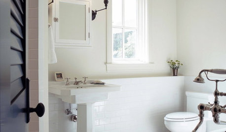
BATHROOM DESIGNSubway Tile Wainscoting Puts Bathrooms on the Right Track
It repels water. It looks clean. It works with many architectural styles. Looks like bathrooms have a ticket to a no-brainer
Full Story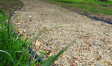
GARDENING AND LANDSCAPINGDIY Pathway Puts Landscapes on the Right Track
Create a road more traveled in your backyard, and save your lawn from foot traffic, with this easy, affordable gravel path
Full Story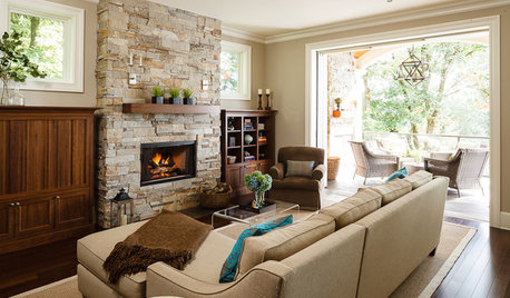
LIVING ROOMSRoom of the Day: Just Right for 2 and a Crowd
Cozy enough for a couple but welcoming to extended family, this Portland home has lots of design tricks up its sleeve
Full Story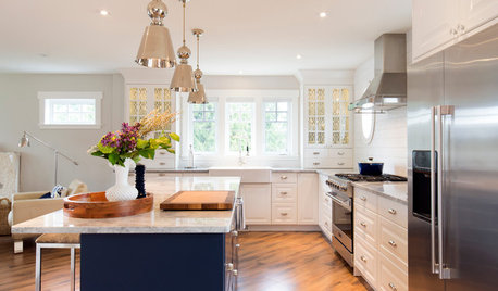
LIGHTINGHow to Get Your Kitchen Island Lighting Right
Here are some bright ideas on when to use chandeliers, pendants, track lights and more
Full Story
WINDOW TREATMENTSHow to Hang Your Curtains Just Right
Learn key methods and measurements for fullness and stacking to get your window treatments on the right track
Full Story
WHITEHow to Pick the Right White Paint
White is white, right? Not quite. See 8 white paint picks for 8 very different effects
Full Story
KITCHEN DESIGNHouzz Quiz: Which Kitchen Backsplash Material Is Right for You?
With so many options available, see if we can help you narrow down the selection
Full Story
KITCHEN DESIGNKitchen Islands: Pendant Lights Done Right
How many, how big, and how high? Tips for choosing kitchen pendant lights
Full Story
KITCHEN APPLIANCESFind the Right Cooktop for Your Kitchen
For a kitchen setup with sizzle, deciding between gas and electric is only the first hurdle. This guide can help
Full Story
PENDANT LIGHTINGChoose the Right Pendant Lights for Your Kitchen Island
Get your island lighting scheme on track with tips on function, style, height and more
Full Story


writersblock (9b/10a)
writersblock (9b/10a)
Related Discussions
Another post: Am I being picky about our backsplash??
Q
Can someone help me track down backsplash marble?
Q
The backsplash install began and I am questioning myself
Q
Help! I am not sure what to do with this backsplash
Q
rhome410
redroze
chinchette
iris16
remodelfla
writersblock (9b/10a)
msrose
sweeby
writersblock (9b/10a)
writersblock (9b/10a)
alku05
bluekitobsessed
louisa_smith03
coffeebreakOriginal Author
raehelen
bluekitobsessed
rhome410
jenseattle
coffeebreakOriginal Author
rhome410
pbrisjar
nats-md
coffeebreakOriginal Author
msrose
rhome410
alku05
bluekitobsessed
raehelen
remodelfla
coffeebreakOriginal Author
lisa226
nats-md
coffeebreakOriginal Author
joanie_b
cran
sweeby
dutchy7
igloochic
linley1
remodelfla
coffeebreakOriginal Author
wascolette
Sue Brunette (formerly known as hockeychik)
kren_pa
Sue Brunette (formerly known as hockeychik)
coffeebreakOriginal Author
kiturah