


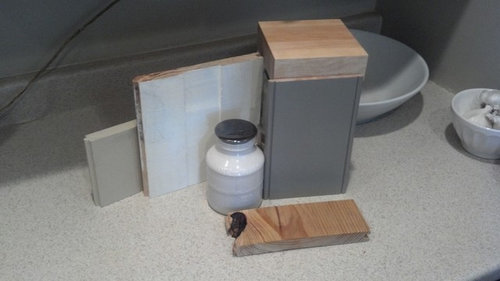
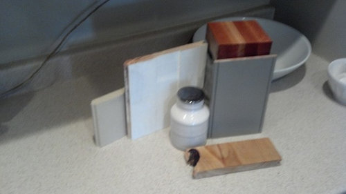
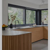
Vote on your favorite sample for my wood countertop
mermanmike
11 years ago

Sort by:Oldest
Comments (58)
Related Stories
KITCHEN DESIGNKitchen Layouts: A Vote for the Good Old Galley
Less popular now, the galley kitchen is still a great layout for cooking
Full Story
KITCHEN DESIGNWonderful Wood Countertops for Kitchen and Bath
Yes, you can enjoy beautifully warm wood counters near water sans worry (almost), with the right type of wood and sealer
Full Story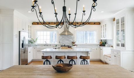
WHITE KITCHENS4 Dreamy White-and-Wood Kitchens to Learn From
White too bright in your kitchen? Introduce wood beams, countertops, furniture and more
Full Story
MATERIALSWoodipedia: Walnut Wows in Traditional and Modern Settings
With its rich color and lustrous polished finish, walnut is a favorite wood for all kinds of millwork
Full Story
KITCHEN DESIGN10 Creative Kitchen Backsplashes
Patterns, bold colors, natural wood, beveled mirror — even a favorite photo — sub for standard white behind the counter
Full Story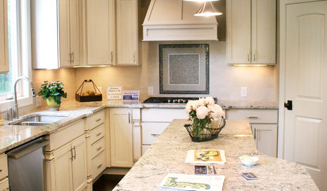
KITCHEN DESIGNKitchen Countertops 101: Choosing a Surface Material
Explore the pros and cons of 11 kitchen countertop materials. The options may surprise you
Full Story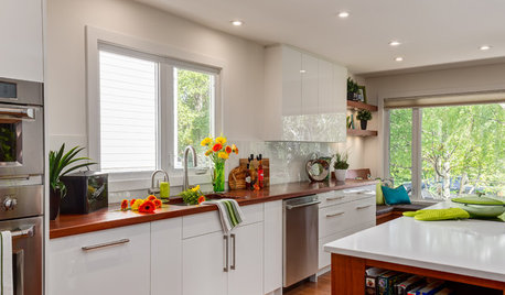
KITCHEN DESIGNThe Best Backsplashes to Pair With Wood Counters
Simplify your decision-making with these ideas for materials that work well with wood counters
Full Story
KITCHEN DESIGNCountertop and Backsplash: Making the Perfect Match
Zero in on a kitchen combo you'll love with these strategies and great countertop-backsplash mixes for inspiration
Full Story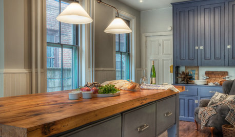
KITCHEN DESIGNEco-Friendly Materials: Kitchen Countertops
Going green in the kitchen opens the door to unusual countertop materials that are beautiful, durable and kind to the planet
Full Story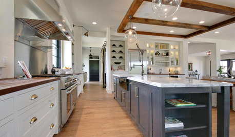
KITCHEN COUNTERTOPS10 Countertop Mashups for the Kitchen
Contrast or complement textures, tones and more by using a mix of materials for countertops and island tops
Full Story

writersblock (9b/10a)
Jumpilotmdm
Related Discussions
Your favorite kitchen countertop accessory
Q
Choice #1 Vote for your favorite countertop w/Arabesque
Q
Vote for your favorite counter stool?
Q
Please post pictures of your counter-tops
Q
remodelfla
beeps
jerzeegirl
vsalzmann
rmtdoug
lavender_lass
northcarolina
zackin
chiefy
badgergal
caminnc
mermanmikeOriginal Author
gone_south
pawa
lavender_lass
sochi
jessicaml
mtnrdredux_gw
steph2000
mtnrdredux_gw
breezygirl
rosie
annkathryn
jessicaml
ghostlyvision
amykath
localeater
Bunny
pentimento
bahacca
bahacca
deedles
andreak100
mermanmikeOriginal Author
mermanmikeOriginal Author
lavender_lass
chiefy
breezygirl
mermanmikeOriginal Author
northcarolina
deedles
breezygirl
enduring
gone_south
hobokenkitchen
Annie Deighnaugh
francoise47
mermanmikeOriginal Author