SHOP PRODUCTS
Houzz Logo Print
slonewby_gw

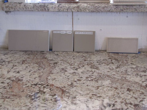
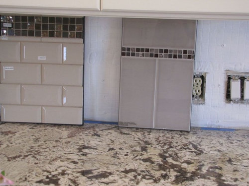
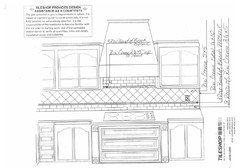
FINAL B/S options? (will I ever get this done?)

slonewby
11 years ago

You guys have been so helpful in narrowing my backsplash options. I was just about to order the grey tile but I realized that I don't LOVE it, it doesn't make my heart sing....so I just couldn't justify spending that kind of money ($27/sq ft) on something that was just "eh."

I went to a new tile store yesterday and brought home yet another batch of options. I know you folks NEVER get tired of looking at BS options (haha)..so, would you care to lend some thoughts (again?)...

Here's the kitchen (again):


Here are several new options. Try to envision the darker brown subway without the glass stripe (I kind of like the tiny stripe at the top though...maybe)...and set in a staggared brick pattern...

Comments (73)

  • thrauli
    11 years ago

    I have a really hard time visualizing so when I was trying to decide if I wanted to use a boldly patterned tile I made photocopies of the tile and taped them all over the backsplash and left them up for a week or so to get a sense of what it would feel like in real life. It was very useful to work out the pattern/placement of the tiles. Maybe if you make color copies you'll be able to tell which you prefer and if it's right for your space.

  • slonewby
    Original Author
    11 years ago

    thrauli, so do I. I don't know how to use photoshop and I'm not great at cut and pasting...but here is my attempt. (and I learned alot in the process!)

    Here is what I learned.....things in my head look nothing like what I think they will!!!! I know it would look different in real life..but I like the bright, airy feeling of the cream bevelled tile and the brown looks like a dark 70's kitchen.....

    I'm sorry to labor you all with my decision making process... but I can only imagine how many others have struggled with this same problem. I hope we can all grow and learn through it! This is my first EVER kitchen to remodel and it has been a wonderful, albeit, challenging project!

  • Related Discussions

    I suspect Metacam side effects--other option(s)?

    Q

    Comments (47)
    We almost lost our 15 month old Cockapoo and we fear it was due to this drug 'Metacam'. We brought our dog to the vet with a slightly sore paw, nothing we were overly concerned about as he was putting weight on the foot and in good spirits. Reluctantly we agreed to our dog being given an antibiotic and an injection of Metacam (we felt this was a bit unnecessary but we trusted the vets opinion and that we were doing the best for our dog). That same day the dog was groggy and lethargic. By that same night our dog was groaning with pain so we gave him half a painkiller prescribed by the vet. The next morning our poor dog couldn't move, he lay unresponsive and couldn't lift his body weight upright. He wasn't eating or drinking a thing! If we touched any part of his body he was in severe pain. Our dog is very energetic with a great appetite and we were very worried! We returned to the vet and found our dog was running a very high temperature. The vet was adamant that this was as a result of his sore paw and possible bone infection and was very critical of the dog breed. Our dog was kept in over night and medicated with paracetamol and an IV antibiotic. Within 24hours our dog was returning to normal. The vet insisted we do an x-ray and nothing showed up. Thankfully we were able to discharge our pet after two nights but found the vet very reluctant to talk about what and how much medication he had prescribed our dog. We have no way to ever know for sure the reason our dog fell unresponsive within a couple of hours but we can't shake the feeling that it has a strong connection with the Metacam he was administered on first meeting the vet. We have also noticed our dog's weight is not correct on his medication label - it is double his weight! Finally, when leaving the vet practice with the prescribed medications, the vet had to call us back as he has prescribed double painkiller doses. The vet carried out a blood test without our knowledge and still has not disclosed the result of this blood test. When asked to discuss our concerns the vet became extremely defensive and condescending towards us. We would love to put our minds at ease and find out if any other dog owners experienced this reaction to Metacam or if it sounds like a over dosage of Metacam?
    ...See More

    Design Finalization is So Close - Option 1 or Option 2 - Thoughts???

    Q

    Comments (3)
    Frankly, all I see is a barrier island which is an island blocking the major paths. You either need a smaller island or a small work table there to make things more functional and to gain better traffic flow. We cook from fridge to prep/sink to cooktop. (Do a search for a Ice Water Stone Fire for more info.) To go from the fridge to sink, you have to walk around the island. You also have to walk through the cooking area. It's better to eliminate or at least minimize walking through work zones. I don't think you have room for such a big island. And it looks like your aisles are only about 42" behind the range which aren't wide enough for people to walk behind the cook. Aisles should be minimum of 48" for that. Note that is a minimum. I can't read the aisle widths between island/fridge and island/sink but they look quite narrow. Again, you should really have 48" aisles, minimum. People often want wider in front of the fridge to allow for door swing. I don't think you have room for an island bigger than this. To be honest, in your situation I would probably go for a smaller, mobile work table/cart/butcher block. This gives enough width for someone to walk behind the range safely and to not have to veer to walk around a barrier island to prepare a meal.
    ...See More

    Did I finally find "The One"? Am I actually getting out of ABB?

    Q

    Comments (78)
    Oh my gosh, it's gorgeous! I love the linen texture shown upthread. I had chosen a green tile and then chickened out and so like kksmama, I have way more than a touch of green jealousy! This tile just looks so right in your kitchen.
    ...See More

    Anyone ever camp in campervan/Class B?

    Q

    Comments (30)
    @Localeater, Yes, I've been on Outdoorsy and RVShare. There are quite a few locally, but some do not allow music festivals. IDK if they could drop something off there, but I could also search at the destination site. @summersrhythm_z6a, thanks so much. We have no experience driving a larger vehicle or towing, so I am thinking the class B is a better size for us to manage. I realize 4 nights could be a lot. But most of the day we will be at the festival. I've got so much grading to do, but maybe we can work on this over the weekend. Oh well, we have the concert tickets, the hotel, and lockers, and I think car parking. They keep announcing new bands every day, so it is getting a little exciting, thinking about going somewhere again. That this is in driving distance is good vs. having to book a flight.
    ...See More
  • hermajesty
    11 years ago

    I worry that the dark tiles will bring a heaviness to your overall look. I also get that you want something special for your backsplash.

    When I look at your kitchen it leans a bit towards French country to me. If that's the look you're going for I really think 4" square tiles set on the diagonal would finish off your kitchen with just the right look. If not white or cream then look for taupe, but the dark brown just doesn't feel right.

  • oldbat2be
    11 years ago

    I like the lighter look so much better but many of my inspiration pictures involve contrast, understand your conflict. I find your kitchen extraordinary, definitely mean to compliment you! Perhaps the contrast your floors give is what grounds the kitchen. Try searching Houzz for dark floors and white kitchens to see if you can find options. The dark color is what I didn't like.

  • hermajesty
    11 years ago

    Just saw the photo shopped pics. YES, definitely the lighter tiles, looks gorgeous!

  • Snbtwins
    11 years ago

    The lighter tiles for sure. Gorgeous kitchen!

  • williamsem
    11 years ago

    Well, i'm going to stir the pot and say I really like the darker tile. I think it highlights the cabs and counter by providing a little separation so they each shine. And it does balance the floor nicely as well as highlight the darker accents you have.

    Not really a fan of the white accent tiles, but I do love that little accent strip in the darker tile.

    But I am not known for making popular choices, and I am not good with the design stuff either!

  • KBSpider
    11 years ago

    I like the lighter tile that's NEXT to the beveled subway. Seems to be a "happy medium" between the white beveled and the darker tile, which seems too dark in the photoshopped pic. Can you photoshop that one to see how it would look?

  • carp123
    11 years ago

    Your kitchen is so so pretty!!
    I may not be of much help...but please go with the white subway tile with a darker grout (not too dark). Try a 2x6 not too bright white subway tile.
    I don't care for the dark tile with the strip detail at all.

  • carp123
    11 years ago

    Your kitchen is so so pretty!!
    I may not be of much help...but please go with the white subway tile with a darker grout (not too dark). Try a 2x6 not too bright white subway tile.
    I don't care for the dark tile with the strip detail at all.

  • slonewby
    Original Author
    11 years ago

    Isn't this funny? Everyone has a differing opinion. I love it. Thank you all for the nice comments. I appreciate everyone's thoughts so much!

    Hermajesty: I love French country and think it does have a bit of that feel. I have not thought about doing square tiles on a diagonal at all..I'm going to have to google that.

    Carp: I'm thinking hard about whites and creams again but I don't think I want contrasting grout..at least not much of a contrast.

    KBspider: here is the tile next to the bevelled subway. Unfortunately, it only comes in that large sized subway.

    I think it kind of blends in too much? Almost looks like the hardiebacker that's on the wall right now. I think I'd like a smaller tile...

    Williamsen: thanks for your vote for the darker tile but I really don't think it's going to work. I thought it might but I really didn't think it would darken the kitchen up so much...more than I'd like.

    Oldbat: Thank you so much for encouraging me to photoshop/cut paste!!! It makes a big difference when you look at it like that. Extraordinary is a very big complement..thank you.

    I'm off to google some more images~

  • glo1751
    11 years ago

    Slonewby, I like the subway (4th) tile in the 3rd picture. It could be a happy medium. Try that with your cut and paste. You could still add a small row similar to the one you are considering, there are alot of options there. On the other hand the grout color you use can lighten up any dark tile you get and you do have 2 windows. I understand your fustration, I'm still looking for my bs. I would really like a ceramic, crackle with a subtle variation in color and I know they are out there I just can't find any around here in my price range so I keep going back to glass subway. I just love dragonfly08's kitchen.

  • pawa
    11 years ago

    I slowenby - Did you see a2gemini's post called "Tile design and colour" or something like that? She posted a picture of a tile arrangement that I think would look nice in your kitchen. It seems like it's the right style. The arrangemtn itself adds enough interest, so I think you could do a plain colour (white-ish?). The little pencil line could be white-ish glass, if you want to get fancy, but a simple porcelain tile in the same colour as the rest of the bs would look great too. In fact, I think that's what I'd do, to keep it simple.

    My eye goes straight to the chandeliers, so I wouldn't worry too much about your floor.

    Here it is:

  • carp123
    11 years ago

    I had to come back! I was on Pinterest and as soon as i saw this i remembered your kitchen.

    http://pinterest.com/pin/255438610085444522/

  • glo1751
    11 years ago

    slonewby, after my post last night, I was telling my husband about the 2 of us with the same granite, cabinets and our same problem trying to find the right bs. I told him the one you liked was really pretty, so I thought to myself why didn't I tell you that. I like the color that I see in the closeup picture. What shade exactly are the tiles? Do you mind telling me what brand? I like how the mauve, tends to pull out certain colors of the BA granite. I saw a glass tile that I may be leaning toward by Legacy Glass called orchid. It was on a display similar to the one you are considering and was done with grey grout, they had it mounted with grey stone tiles, but I probably would just use the glass, and it did look beautiful with ny piece of granite I had with me. You know its funny, I brought a sample of the orchid home but sent it back as not the right color but after seeing the display sample and grout they used it changed my mind and I ordered a larger sample. With that aside, if the tiles you are considering are not too dark and pull on the colors of the granite then I would go with it, they are really pretty. I also love your chandeliers.

  • Mugsy42
    11 years ago

    I'm a huge fan of a dark floor with white cabs! While in photos it can look like a "black hole," I don't think it's the same in person. I love your floor tile. What did you use?

    I'd love to see what a polished travertine subway tile would look like. I think the colors would pull from the granite. Creams, grays, whites. I don't like the dry look of a lot of travertine, but the polished stuff looks really great with granite.

    Your kitchen is so pretty. I think the mosaic stripe is too masculine for your space. Otherwise I like the second tile better than the dark.

    Such difficult choices! Good luck.

  • beeps
    11 years ago

    With the smaller samples I thought the darker might be nice. Once you photoshopped it - what a difference. Now I'd say lighter, and to make sure it goes with the floor tile. I don't think the dark worked with the floor - at least from the pic where I can see the two together. Good luck with your decision.

  • dakota01
    11 years ago

    I like the lighter tiles - I also liked those decorative cream tiles that you had in one of the pics. It seemed to mimic your trim.
    Have you thought about a pretty tin tile? It could be too many different elements - but, maybe not...

  • gr8daygw
    11 years ago

    I like the second picture down far right tile, and if I have a vote at all I would beg to leave out any accent tiles especially those railroad tie looking treatments. I really don't like that with such an elegant countertop and kitchen. A classy simple complimentary barely there splash is all you need. Something that you don't even really notice but just makes the overall picture more perfect. With a granite this spectacular your eye needs to rest on it when you come in the room not darting around looking at many different accents. FWIW IMO : )

  • slonewby
    Original Author
    11 years ago

    You guys are awesome. Love the ideas.

    Jeannie: I did order tin samples but once they came, I decided against them. I liked one of them but the relief in the tin wasn't as strong as I like and overall, it came off too busy of a pattern.

    Beeps: I don't know if I used a poor photo to do the cut and paste but I didn't like the dark tile w/ the floor either in the picture. The tones are just "off"

    Mugsy: I have travertine throughout the rest of the entire downstairs. I put some tiles up on the counter and the look is just not clean enough. I think the random movement of both the granite and the trav is just too much.

    Glo: are you referring to the dark tile? I'm not sure of the name as the sample isn't labelled. I can ask when I take them back. There are at least two others who have our very same dilemma...maybe we should start a support group ! lol I wouldn't have thought of mauve w/ b. antico...I don't think hubby would go for that. You should show us some pictures of the combination! The 4th tile in the 3rd photo is the most expensive option. It has a crackle finish that we aren't wild about either. It could work though...

    Carp: My heart sang with that pinterest pin! Yes! I love it. Maybe there is hope for me with a white bs afterall. I re-pinned that picture and am now following the original pinner. She has some lovely kitchens on her boards!

    Pawa: That is an interesting tile design. I think doing something like that might be just right! The design would add enough texture and interest to spiff up a plain colored b/s. I'm going to play with that idea a bit.

    It really does take a village to design a kitchen. I know ultimately, it will be my decision and some will hate it, some will love it but I SOOOO appreciate the ongoing dialog of ideas. You guys are bringing up things I wouldn't have though about!

    Thanks also for the compliments on my lighting. I love my pendants....after looking at over 3000 lights (online and in stores), they were just perfect!

  • chiefy
    11 years ago

    Pawa might be on to something! Is there another mosaic that's not as dark that coordinates with the lighter tiles to add some bling. In your 2 photoshopped options, the dark just seems so heavy, but the light just seems too plain.

  • slonewby
    Original Author
    11 years ago

    chiefy: I'm sure I could find a clear glass or white glass mosaic strip to add a little bling to plain or bevelled subway. I'm actually kind of excited about this option! It's kind of like adding jewelry to the backsplash...lol.

    I'm leaning toward more of the plain white/cream with some decorative accents (also in white/cream) now! I agree...the dark is DARK..and, though it does look rich with the granite, it brings it all down, away from that light, airy feeling I love so much.

  • MIssyV
    11 years ago

    I told you to keep it light! (As you can see, I am still following your BS saga and living vicariously through you now that we just sank $$ into a vehicle that we did not plan to purchase ...who knew a 6 year old car would last just that, six years?! UGH...)

    I agree with the others, keep it light, really nothing that is eye catching like a dark color or strips of something different. I think that pinterest pic is enough for you to confirm the tone of the room you want. It needs to be light colored. gr8day said it best!

  • pricklypearcactus
    11 years ago

    I'm with glo, I really like the fourth tile in the third picture. It looks great with your granite and cabinets. Like some of the others, I dislike the very darkest tile. I like the lighter colors and I think there is a range in there of cream like your cabinets to slightly muted gray.

  • slonewby
    Original Author
    11 years ago

    Hi Missy! I knew you'd eventually chime it! :-) Sorry about the car.

    I'm liking the idea of bevelled.....and I kinda like the idea of a glass strip...do you really think it would be too much? I have alot of BS and my builder really thinks I'm going to want something to break it up......not necessarily with color but perhaps with texture?

    I'm going to play with some accent tiles (not the ones I have in the photo) and maybe a glass strip and see if it's too much.....

    Prickly and glo: really? I do like that tile but it isn't my favorite so far. I think a plain gloss would work better but I do like the "classiness" of that tile. I want to use the decorative switchplates and that tile doesn't look great with them...wait. I'll take a few more photos.

  • slonewby
    Original Author
    11 years ago

    okay....took some closups of each option with the same lighting, same place, with the switchplate...also included a tin tile: Here goes: I'm not going to tell you which is which so you can get an open minded opinion.....I just realized I picked an area in the granite that has alot of the cinnamon color in it...not the greatest example and not the color I want to emphasize.

  • phiwwy
    11 years ago

    Holy long thread batman, but i too will have Bianco Antico and will be encountering this same decision! Kudos to the person who photoshopped - wow does that help. Based on those photoshopped pix, here are my thoughts: the dark tile clashes with the floor. The large format light (almost white) tile is too large. I love the look of the subway - and i would say try to work in a little accent. Maybe one thin strip of the dark mosaic in the one sample? I like the light accent tiles too, that you showed on a diagonal. Your hardware is Oil rubbed bronze - so i would stick with that tone accent.

    what i think i will be doing is using a tile called wooden beige, from soho studios, in a 4x12 (but may need help photshopping once it's all in :-) ) with accents in a tile in like a pewter tone. Stay tuned on that much later (we are VERY delayed).

    Love, love your kitchen - it's stunning!

  • ellendi
    11 years ago

    There is a kitchen here that used a dark tile. Beekeeper recommended it as it was a choice before she went with her whit tiles. Can't remember the name of it. Sting Ray? If we can figure out whose it is, you can see a white kitchen with BA and this dark tile.
    My vote is the cream. But I am a vanilla type person. Here is my fear with some of the dark tiles that you have shown.: When they are instlled together and up on the wall, I am afraid the overall color will not blend with the colors in the granite and look off.

  • ellendi
    11 years ago

    Found the rest of the info! Mandala Tiles, SINU collection in the color Stingray. srg215 has this tile with BA. Take a look.

  • Kathy Rivera
    11 years ago

    Of the new pictures:
    First one
    Last one

    I think the first looks really nice with the switchplates. Especially b/c of the lighter edges - it makes the switchplates 'fit in' a bit more I think without trying to 'match' their color.

  • slonewby
    Original Author
    11 years ago

    ellendi: I've seen the stingray tile from the sinu collection. I did't like it at all..it was dark and, for lack of better term, gave me that "70's" feeling.

    I agree, Kathy....the last one is plain white and the first is that expensive tile of the bunch. It isn't *that* bad in price, about $12/sq ft.....many of the taupey colored tiles are just a bit "off"....as for the switchplates, I LOVE the white ones but they have a rubbed bronze that is identical that I might use instead in keeping with my hardware and faucet. The bronze would lend itself to more tile options.

    I'm having a designer friend come over on Saturday to talk it over. I'll let you know how it goes!

    This *is* getting to be an ultra long thread...wonder if I should start fresh after my friend comes over so you all don't get lost? thank you so much again for the help! I sincerely think you've helped me avoid quite a few poor choices!

  • MIssyV
    11 years ago

    I actually think Bee's arabesque tile would suit your space perfectly! It has a feminine touch to it, its solid but will give visual interest without adding a strip of something else. I really think with BA you need one solid color for a BS but you can vary on size of the tile.

  • MIssyV
    11 years ago

    you seem to be getting good at photoshopping...so for my enjoyment, photoshop the arabesque tile in there for us to see :-)

  • Jody
    11 years ago

    After your mock up, I LOVE the white subway tiles. Gives your kitchen such a fresh, clean look to it .... and BTW, your kitchen is GORGEOUS!!!

    I, too, had a difficult time finding BS tiles. Went with 6x6 Jeffrey Court, french crema, set on the diagonal and just love them.

    jody

  • slonewby
    Original Author
    11 years ago

    First off, I'm HORRIBLE at this cut and pasting stuff! But, this is for you, Missy....

    Hmmmm....I actually think I prefer the look of the regular subways. I think with all of the detail I have, the arabesque is a bit too patterned. What do you think?

  • chitown_remodel
    11 years ago

    Picture number 1
    Picture number 7

  • williamsem
    11 years ago

    Maybe something very monochromatic but a little variation of medium beige and grey might work? It seems like grey matches the floor and is a little cool for the counter, but beiges match the counter but are a little warm for the floor.

  • slonewby
    Original Author
    11 years ago

    Tonight I'm leaning heavily toward white bevelled edge 3 x 6 subway with perhaps accent pieces only under the two windows.......small grout lines in matching white. Crisp, clean......

    Update tomorrow after a long discussion with a good designer friend!

    My GC was here today...he knows not to pressure me into a BS decision but he sure wants to get this job finished!!!!

  • KBSpider
    11 years ago

    Thanks for photoshopping that one kind of tile. You're right, it's a shame in only comes in the bigger size, plus the color doesn't look as good all over as the sample did.

    Out of the second set of pictures you took, I like the first pic. Still think white would be too light, and this tile is just enough off white, and has a nice subtle texture look with the crackle, that it could work. Perhaps another photoshop session? :)

  • slonewby
    Original Author
    11 years ago

    KBSpider...here is the tile you suggested. Unfortunately, I only have the one tile so it doesn't cut and paste well...you can't see any sort of brick pattern or fluctuation in coloring with just one brick.

    Here's another interesting thought. We have LED lighting in our overhead recessed lights but our UCL is halogen. The UCL has a bit of a yellow cast to it which tones the starkness out of the white tiles...making them look almost beige.

    Thanks for bearing with me, guys....even *I'm* getting tired of looking at my kitchen!!!!!!!

  • catlover5
    11 years ago

    Slone, I haven't been following all of the BS posts but came across your beautiful kitchen while doing a search for the Kohler Riverby sink. Was it discussed to use your granite for the BS? I love the tin switchplate cover. You'll get there soon!

  • Ann Scheley
    11 years ago

    Without a doubt the white beveled subway tile! Keeps your space light bright and elegant just like your pendants!

  • bonesoda
    11 years ago

    @slonewby: It's interesting you are somewhat struggling with backsplashes. I have similar colour kitchen and have been struggling with the same for about 3 weeks now.

    All the stone looks beautiful but you don't want marble to compete with the granite.

    Subway tiles it is... here in canada nearly impossible to find subway tiles the right size and colour.. i wanted 2x4 which comes in two colours and wrong shades.

    I am finally giving up and going with 3x6 in somewhat of a cappuccino colour. You posted this tile which should work well:


    Plain white is good but i wanted to give some colour to backsplash then the cabinets my cabs are sky white and granite has beige, black, yellow/orange (delicatus superba).

    Once my backsplash is done i will post some pics...

  • ellendi
    11 years ago

    I hope slone sees your idea of a cappuccino color, jmith.

  • slonewby
    Original Author
    11 years ago

    Update ! Bevelled subway it will be. I have two options.....go with the cappuccino color alone, or, they have a linen color that I would use with a 6X6 accent tile under the windows. I need to go back to the tile shop to get the linen color tile to see how it goes with the accent (the capp. color was too much of a contrast with it.)

    Either way, I will be using the white switchplate covers.....might paint them to better match the tile if we do the capp color.

    I'll post another pic when I get the other tile! I'm SOOOOOO close!!!!

    Catlover: I don't care for granite b/s....it would have been a super easy option if I liked it! Sidenote...I hear my riverby sink is being discontinued. Don't know why...I LOVE it.

  • bonesoda
    11 years ago

    @slonewby: having a accent is personal preference for me i don't want to take away from the granite so i am doing just plain subway all the way. If you think the accent works for you then it does but look at the accent with the subway in various lights and different times of day to see what you think.

    As for receptacle and covers you can get them in many colours to go with the tile (plain ones).

    In your case perhaps get a recepticle that is coloured and use the plate you have will give some contrast.

  • whocareswhoiam
    7 years ago

    What is the brand of the cappuccino tile you selected? Where is the final photo? I realize this thread is old but hoping you respond.

  • Ann Scheley
    7 years ago

    WHOCARESWHOIAM, I'm not sure to whom you are directing this question...

  • barncatz
    7 years ago
  • slonewby
    7 years ago

    Thank you, barncatz, for linking the final thread! I haven't been on gardenweb for ages! I still love my kitchen!! :-)