


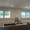
Boring kitchen w/ Cambria Cranbrook quartz(Pics)
sammi06
13 years ago


Sort by:Oldest
Comments (23)
Related Stories
KITCHEN DESIGN3 Steps to Choosing Kitchen Finishes Wisely
Lost your way in the field of options for countertop and cabinet finishes? This advice will put your kitchen renovation back on track
Full Story
KITCHEN DESIGNNew This Week: Moody Kitchens to Make You Rethink All-White
Not into the all-white fascination? Look to these kitchens for a glimpse of the dark side
Full Story
KITCHEN DESIGNCountertop and Backsplash: Making the Perfect Match
Zero in on a kitchen combo you'll love with these strategies and great countertop-backsplash mixes for inspiration
Full Story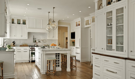
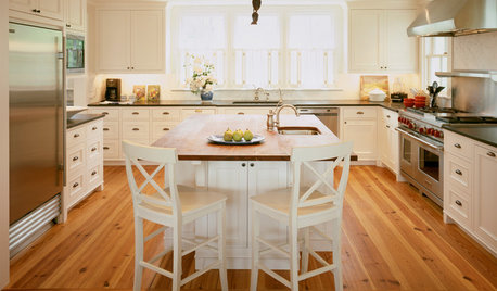
KITCHEN DESIGNDream Spaces: 12 Beautiful White Kitchens
Snowy cabinets and walls speak to a certain elegance, while marble counters whisper of luxury
Full Story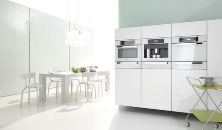
KITCHEN DESIGNWhite Appliances Find the Limelight
White is becoming a clear star across a broad range of kitchen styles and with all manner of appliances
Full Story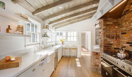
KITCHEN DESIGNKitchen of the Week: Brick, Wood and Clean White Lines
A family kitchen retains its original brick but adds an eat-in area and bright new cabinets
Full Story
KITCHEN DESIGNKitchen Countertops 101: Choosing a Surface Material
Explore the pros and cons of 11 kitchen countertop materials. The options may surprise you
Full Story
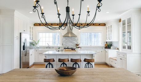
WHITE KITCHENS4 Dreamy White-and-Wood Kitchens to Learn From
White too bright in your kitchen? Introduce wood beams, countertops, furniture and more
Full Story
KITCHEN DESIGNHouzz Quiz: Which Kitchen Backsplash Material Is Right for You?
With so many options available, see if we can help you narrow down the selection
Full Story
User
peytonroad
Related Discussions
Cambria Torquay pics please! Considering canceling my Silestone
Q
Granite vs Quartz: Kitchen design quandry
Q
Cambria “Smithfield” quartz
Q
Difiniti Onda Grigia or Cambria Sutherland Quartz. Please help!
Q
riverspots
kateskouros
remodelfla
paintergirl94
nishka
boxerpups
beekeeperswife
jterrilynn
plumberry
lisa_a
berryfarm
jterrilynn
jeanteach
formerlyflorantha
sammi06Original Author
formerlyflorantha
eastbaymom
kaismom
doraville
michellemarie
wallycat