


What's your favorite warm off-white trim color?
Noma Finney
13 years ago
Featured Answer
Comments (10)

kjmama
13 years agohtnspz
13 years agoRelated Discussions
Pirula, Other Color Gurus, need warm off-white help, please!
Comments (0)Painters will be here in the morning to paint trim and ceiling in dining room. Based on Pirula's and others expertise, I went with Farrow & Ball Pointing for trim. The dining room will be lighter grass cloth with slight gold background; the overall tone is akin to F & B Joa's White toward Archive. I'm a little nervous about the paper since it's a departure from traditional grasscloth which we've used several times and love, but I'm keeping my fingers crossed it will be beautiful and not gaudy. Since the weave is fairly fine, the gold provides just a slight glimmer. Really need help with suggestions for off-white paints that are warm but not yellow. While I love yellow and will probably paint our bedroom yellow (perhaps a soft yellow like BM Soleil -- we've varied over the years between apricot and yellow to awaken to happy colors in the master) strong yellow undertones simply will not work with our furniture in the living (ivory) and family (Dorset Cream) rooms. Currently considering F & B Dimity (slightly pink to my eye), Satin Slipper (slightly grey) but both may lean very slightly toward yellowish once on 4 walls, no?, D & K # 82 (absolutely complex and beautiful in our light), B & M Sand Dollar (may be wonderful but may be better with F & B Wimbourne White trim) for open 2-story floor plan. I'd definitely like to avoid all tans and taupes, and whites with very obvious pink, yellow, grey or green casts. Almost impossible, but I know a rich but light true neutral exists somewhere! I would really love a luminous soft creamy tone. My ideal is tone on tone, but my husband likes lighter (or darker) trim, so I'd like a slight contrast with Pointing or Wimbourne. We have lots of northern light, but colors look totally different here than in our previous homes so some tried and true colors like BM White Dove or SW Dover White look slightly grey or greenish here in northern VA. I've spent hours reading old posts and looking at chips but maybe one of you color gurus can steer me to a great color. I've already spent too much on full-spectrum cards and samples so please, please help narrow the search. Finally, previous owner painted a darker taupe below the chair rail in the foyer and up the stairwell with the lighter taupe of walls repeated in the inset moldings below the chair rail. Also, the rear walls with French doors and lots of windows and trim are actually another barely noticeable deeper tone than the walls which winds up offsetting the trim nicely. You really have to look hard to perceive the deeper tone as first impression is just that the wall color plays differently because its in the shadow, but it truly is a deeper paint. Two other advantages to this concept is it draws the eye to a more human scale and thus comfortable level in the 2 story open floor plan and the darker color (without insets) provides a richer color to anchor our low sofa which is very close to BM Navajo White in color. Any opinions? Thanks so much for your help! I've already learned so much from this site. You're the best!...See MorePost a picture of your favorite off white FORMULA
Comments (4)Kath, this may help you. I read the blog and essentially you have to have an understanding of how colors mixed lean to warm undertones or cool. But what she also neglected to say is every color has a LRV-(light reflective value or how the paint will reflect light) Benjamin Moore Natural Wicker Color OC-1 Paint has a Light Reflectance Value (LRV) of 73.8 and a Cool undertone, while Benjamin Moore Muslin Color OC-12 Paint has a Light Reflectance Value (LRV) of 69 and a Warm undertone. Muslin will appear a bit darker. I'll link my favorite site for BM colors. While it doesn't post formulas, it does give you the undertone and the LRV of the color you are interested in by clicking on the paint name. I have found it very useful for any of my painting because it helps isolate what level of lightness your eye is drawn to. I also like to vist Glidden too because they also list LRV. If you want to read up on LRV over in Home Decorating do a search for it or search for "Funcolors". She is a beloved paint guru. HTH! Here is a link that might be useful: BM paint values...See MoreYour favorite warm off white paint color for the kitchen?
Comments (4)Have you looked at BM Ivory White? After weeks of mental turmoil between Linen White and Ivory White, I picked the Ivory White(still have my fingers crossed) for the kitchen cabs to go with my Colonial Gold granite. The walls in the family room and the little bit of walls in the kitchen will be BM Splendor. The Linen White seemed to be a little pinkish to me. The Ivory White wasnt in a paint deck but behind the counter at the BM store. Number 925-Classic Colors. Picking paint colors is tough!...See Morewhats your favorite white trim paint?
Comments (22)Diana, Are you saying that gray colors are not available in full spectrum color paints? Only colors and browns? Full spectrum paint uses no black. If you think back to your color theory classes I am sure you will recollect that black absorbs all color wavelengths evenly and completely , white reflects all color wavelengths evenly and completely, gray absorbs some of the color wavelengths and reflects some of the color wavelengths, but a pure neutral gray does this perfectly evenly across the color spectrum, giving you a chromatic value of 0. Brown, tan, beige and cream reflect more yellow, red or orange than blue, green or purple. As for my choice of words, I choose to say things in ways that are easily understood by the masses. If we walked into home depot and asked 10 guys buying lumber which white was dirtier, showing them samples of Cotton Balls and White Dove I am betting all 10 would choose White Dove as the dirtier of the two. If we asked them which white was the most saturated or chromatic white I am betting most would incorrectly choose White Dove because it appears slightly darker, but in reality the chromatic value of white dove is lower than the chromatic value of cotton balls. Most people who have not taken a color theory class and don't work with color on a consistent basis don't understand the difference between shade, tint and tone. They think in terms they understand - a light blue gray or a pink beige. I read an article the other day in Forbes. The advice at the end of the article is targeted toward math and science concepts, but is really good advice for anyone trying to communicate information on any topic that may not be widely understood. https://www.forbes.com/sites/marshallshepherd/2020/03/23/is-the-math-too-hard-for-people-to-understand-covid-19-coronavirus/#793f20dd6a9c...See More
Sueb20
13 years agokatrina_ellen
13 years agoUser
13 years agomjsee
13 years agosable_ca
13 years agojanine09
13 years agowi-sailorgirl
13 years ago
Related Stories

MOST POPULARMust-Try Color Combo: White With Warm Off-White
Avoid going too traditional and too clean by introducing an off-white palette that brings a touch of warmth and elegance
Full Story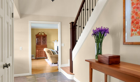
MORE ROOMSWarm Up Your Rooms With a Beautiful Off-White Paint
White paints warmed with a hint of color create radiant backdrops for countless interior design options
Full Story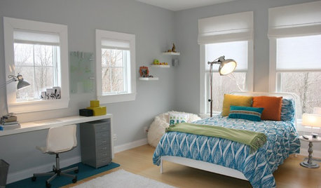
TRIMTrim Color Tips: Get Your White Trim Right
Set off wood tones, highlight architectural features, go minimalist ... white trim is anything but standard when you know how to use it
Full Story
DECORATING GUIDES5 Jumping-Off Points for Decorating a Blank Space
Get your design mojo going by building your entire decor scheme off a single favorite piece
Full Story
COLORColor of the Year: Off-White Is On Trend for 2016
See why four paint brands have chosen a shade of white as their hot hue for the new year
Full Story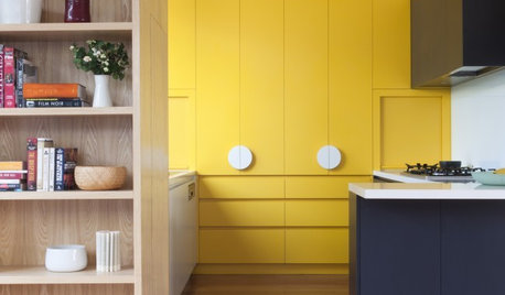
DECORATING GUIDESHow to Pull Off a Minimalist Look Without Sacrificing Your Style
Minimalism doesn’t always mean white and characterless — it’s about playing favorites
Full Story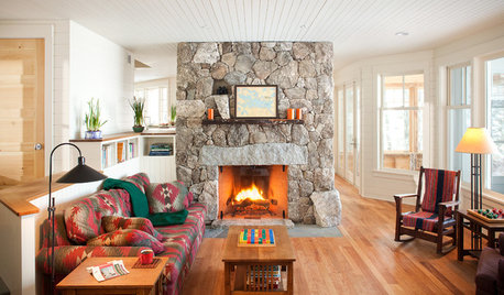
DECORATING GUIDESTake the Chill Off With Cozy Winter Textures
Stay warm this fall and winter with your favorite applications of velvet, wool and knits and plenty of woodsy accents
Full Story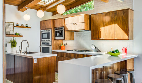
KITCHEN CABINETSNew This Week: 3 Modern Kitchens That Rock Warm Wood Cabinets
Looking for an alternative to bright white? Walnut cabinetry offers the perfect tone to warm things up
Full Story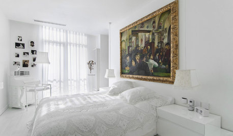
COLORWarm Up to White All Around the House
Explore the many ways to design a white kitchen, bathroom, dining room or bedroom that's far from stark and sterile
Full Story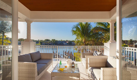
CONTEMPORARY HOMESHouzz Tour: Warming Up in Fort Lauderdale
How do you make a palatial-style home cozier more intimate? With organic touches, a soft color palette and resized trim
Full Story

cctray