


We've really messed up and possibly need new colors
albryant
15 years ago
Sort by:Oldest
Comments (58)
Related Stories
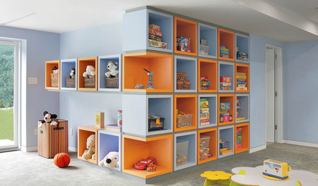
KIDS’ SPACESCreative Ways to Tame the Mess in Kids’ Bedrooms
These cool storage features will keep your children’s rooms tidier — no threats or bribes required
Full Story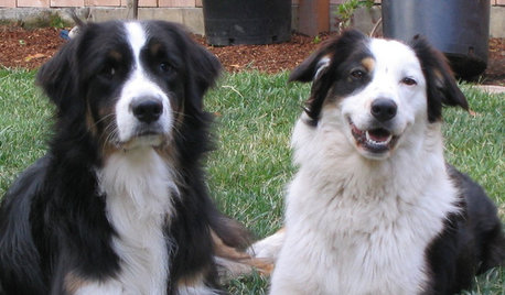
PETSDealing With Pet Messes: An Animal Lover's Story
Cat and dog hair, tracked-in mud, scratched floors ... see how one pet guardian learned to cope and to focus on the love
Full Story
HOUSEKEEPINGHow to Relax and Put Housework in Its Place
If household disarray is making you stressed and unhappy, try approaching it with a different point of view
Full Story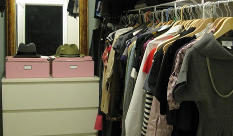
MOST POPULARHow to Finally Tackle Your Closet's Critical Mess
It can be tough to part with reminders of your past, but your closet needs space for who you are today
Full Story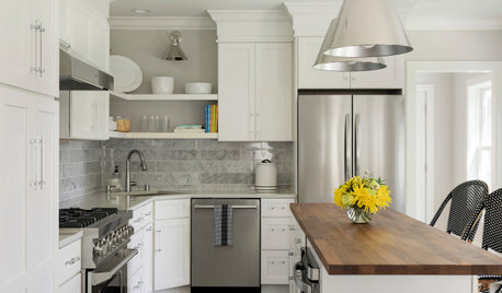
HOUSEKEEPINGTackle Big Messes Better With a Sparkling-Clean Dishwasher
You might think it’s self-cleaning, but your dishwasher needs regular upkeep to keep it working hard for you
Full Story
STUDIOS AND WORKSHOPSMaking a Fine Mess in an Oregon Pottery Studio
An addition allows a ceramicist to get as messily creative as she likes, while the rest of the home stays neat
Full Story
MOST POPULARHeads-Up Hues: 10 Bold Ceiling Colors
Visually raise or lower a ceiling, or just add an eyeful of interest, with paint from splashy to soothing
Full Story
DECORATING GUIDESThe Dumbest Decorating Decisions I’ve Ever Made
Caution: Do not try these at home
Full Story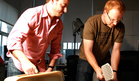
TASTEMAKERSModko Litter Boxes Address the Mess
A design duo has reinvented the much-maligned cat box, with an award-winning result
Full Story
FEEL-GOOD HOME12 Very Useful Things I've Learned From Designers
These simple ideas can make life at home more efficient and enjoyable
Full Story


Kathleen McGuire
todancewithwolves
Related Discussions
Things we've been up to lately....
Q
Why do squirrels mess up my new plants?
Q
Soaking tub - have I already messed up before we've really begun?
Q
We've done it - we've actually bought a house!
Q
albryantOriginal Author
lorriekay
albryantOriginal Author
Kathleen McGuire
lorriekay
todancewithwolves
User
donnawb
Ideefixe
michelleback
nhb22
mpwdmom
learn_as_i_go
annzgw
albryantOriginal Author
babs711
squirrelheaven
tfm1134
squirrelheaven
albryantOriginal Author
albryantOriginal Author
squirrelheaven
lizzie_grow
squirrelheaven
zipdee
orie
zipdee
nhb22
lyfia
albryantOriginal Author
nhb22
kahlanne
lyfia
kahlanne
albryantOriginal Author
chaispice
kahlanne
kahlanne
lorriekay
lizzie_grow
albryantOriginal Author
nhb22
chaispice
rubybaby43
rubybaby43
nhb22
lorriekay
lacombe