


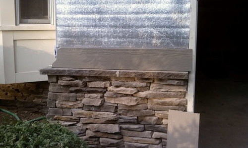
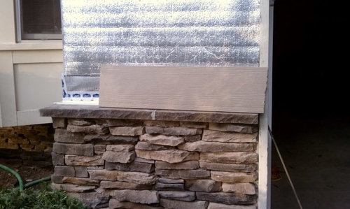
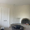
If I desperately beg....can someone please photoshop my house?
jamaraz
12 years ago

Sort by:Oldest
Comments (67)
Related Stories

EDIBLE GARDENSGarden BFFs? Why Your Vegetables Are Begging for Companion Plants
Foster friendships among plants for protection from pests, pollination support and color camaraderie
Full Story
ACCESSORIESEveryday Home Must-Haves Beg for a Makeover
The Nest's much-improved take on the thermostat has us pondering reinventions of other necessities around the house
Full Story
REMODELING GUIDES8 Lessons on Renovating a House from Someone Who's Living It
So you think DIY remodeling is going to be fun? Here is one homeowner's list of what you may be getting yourself into
Full Story
THE POLITE HOUSEThe Polite House: Can I Put a Remodel Project on Our Wedding Registry?
Find out how to ask guests for less traditional wedding gifts
Full Story
HOME OFFICESQuiet, Please! How to Cut Noise Pollution at Home
Leaf blowers, trucks or noisy neighbors driving you berserk? These sound-reduction strategies can help you hush things up
Full Story
DECORATING GUIDESWhat We Can Learn From the Minimalists
Discover the power of simplicity and how to employ a less-is-more approach in your decorating scheme
Full Story
SMALL SPACESHouzz TV: You Won’t Believe Everything This Tiny Loft Can Do
Looking for more floor space, a San Francisco couple hires architects to design a unit that includes beds, storage and workspace
Full Story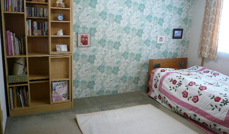
BOOKSCan Tidying Up Result in Life-Changing Magic?
Organizing phenom Marie Kondo promises big results — if you embrace enormous changes and tough choices
Full Story
PETS5 Finishes Pets and Kids Can’t Destroy — and 5 to Avoid
Save your sanity and your decorating budget by choosing materials and surfaces that can stand up to abuse
Full Story
GARDENING GUIDES10 Tips to Start a Garden — Can-Do Ideas for Beginners
Green up your landscape even if you're short on time, money and knowledge, with these manageable steps for first-time gardeners
Full StorySponsored
Leading Interior Designers in Columbus, Ohio & Ponte Vedra, Florida

adriennemb2
jamarazOriginal Author
Related Discussions
Photoshopping--could someone please help me w/a kitchen?
Q
Can someone please help my curb appeal. Photoshop my ideas please
Q
Photoshop help on my front porch--please!
Q
Can someone Photoshop me a front porch?
Q
dtchgrl
awm03
awm03
blfenton
User
awm03
jamarazOriginal Author
Lori A. Sawaya
Lori A. Sawaya
awm03
meowzer
yogacat
eandhl
deeinohio
jamarazOriginal Author
homeagain
meowzer
jamarazOriginal Author
homeagain
adriennemb2
homeagain
Lori A. Sawaya
homeagain
arcy_gw
Lori A. Sawaya
meowzer
Lori A. Sawaya
Lori A. Sawaya
Lori A. Sawaya
jamarazOriginal Author
Lori A. Sawaya
Lori A. Sawaya
jamarazOriginal Author
dtchgrl
Lori A. Sawaya
moonshadow
dtchgrl
Lori A. Sawaya
Lori A. Sawaya
awm03
Lori A. Sawaya
jamarazOriginal Author
dtchgrl
Lori A. Sawaya
jamarazOriginal Author
meowzer
jamarazOriginal Author
meowzer