


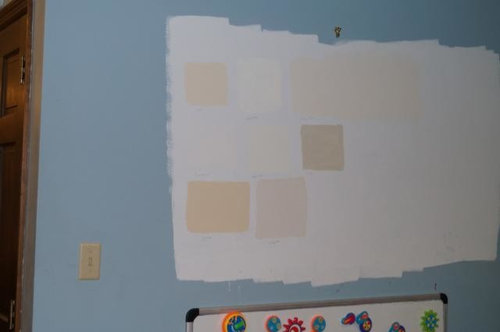
Well, I have ruled out 9 BM off whites for the walls :(
Boopadaboo
9 years ago

Featured Answer
Comments (66)

Annie Deighnaugh
9 years ago
nosoccermom
9 years agoRelated Discussions
What white/light color goes well with BM Mexicana?
Comments (5)sloyd thanks for the suggestions but I don't think those will work for me - most are too dark for this space which is a long rectangle with windows only at the far end (townhouse). THe lighter ones have green undertones and while I like green it doesn't look good with the warm red and the browns in our scheme, I think. I guess I am looking for a white with warm udnertones or a cream that is not "buttery"....See MoreAny Pics of BM White Sand, BM Muslin or BM Cream Fleece Walls?
Comments (6)You are so very welcome! :-) We tested a "gajillion" colors for the FR (this room is off the FR) until we finally settled on Mascarpone (one of my first choices, BTW, but DH wasn't too keen on it at first). Somehow I just knew that the Muslin would be the winner in the Guest Bedroom from the get-go. I did look at a two or three darker colors in there as well, just to be 100% sure, but really wasn't ready to go darker in there. Muslin is a terrific neutral color. We both absolutely love the Muslin. It looks a little creamier during the day, leans more toward khaki at night, but looks great either way. We are very happy with the Aura matte--have used it in every room we've painted over the past 5-6 years, incl ceilings (used matching colors to the wall colors in the satin finish on the baseboard molding in all rooms)....See MoreBM Decorator White walls with BM Super White trim and ceiling
Comments (16)Would you do simply white walls with super white ceilings and trim? Won’t the contrast make the walls look yellow? I would in a heartbeat. It's a very pretty combination. There's enough difference in Chroma that one won't make the other look dirty/dingy. But, yes, Simply White is more colorful, has more Chroma than Super White and it is yellower. The contrast of hue between the two could result in Simply White looking like a very pale creamy off-white. Considering the floor, I'd go with a little more color on the walls. Shoji White, Greek Villa kind of pale, subtle greige-y vibe....See MoreOff White BM paint colors to complement Georgian Bluff countertops
Comments (15)jacilla, that came out really nice. May I make a suggestion? replace the mini blinds. (they're horrible in a kitchen to keep clean) A diff window treatment would really jazz up that spot a bit. here: just a nice roman blind in a soft black/white pattern, some small green plants, and some cutting boards behind the stove. this blue/white ikat roman shade is cool or, some zebra blinds? and nice accesorries This Zebra Easy Roller blind in the blue gray is pretty diff colors woven wood blinds just showing you diff color combonations. maybe a blue/gray material that plays off the countertop Levilor Natural Woven blinds solar shades...See More
tibbrix
9 years ago
tinam61
9 years agopalimpsest
9 years ago
sas95
9 years agoBoopadaboo
9 years ago
CaroleOH
9 years agopalimpsest
9 years agoAnnie Deighnaugh
9 years agojackson2348
9 years agoAnnie Deighnaugh
9 years agonosoccermom
9 years agoBoopadaboo
9 years agoBoopadaboo
9 years agoUser
9 years agottodd
9 years agoBoopadaboo
9 years agoAnnie Deighnaugh
9 years agotinam61
9 years agottodd
9 years agotibbrix
9 years agotibbrix
9 years agottodd
9 years ago
susanlynn2012
9 years agotibbrix
9 years agoCindy
9 years ago
grubby_AZ Tucson Z9
9 years agoBoopadaboo
9 years agoBoopadaboo
9 years agotibbrix
9 years agoBoopadaboo
9 years agotibbrix
9 years agothree3apples
9 years agottodd
9 years ago PRO
PROLori A. Sawaya
9 years agoBoopadaboo
9 years agosusanlynn2012
9 years agoBoopadaboo
9 years agosusanlynn2012
9 years agonightowlrn
9 years agosusanlynn2012
9 years agonightowlrn
9 years agosusanlynn2012
9 years agoBoopadaboo
9 years ago
Elisabeth Saczek
6 years ago
L S
4 years ago
shirley glazer
2 years agosusanlynn2012
2 years ago


Related Stories
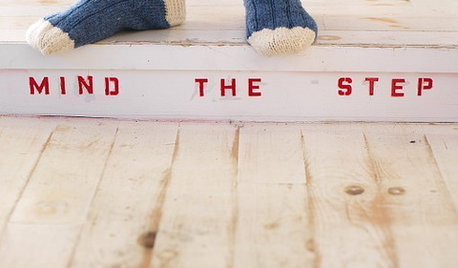
LIFEHouse Rule: Off With Your Shoes
Do you prefer your guests to go shoeless in your house? Here are some ways to encourage stockinged feet
Full Story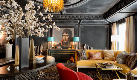
DESIGNER SHOWCASESGlamour and Colors Rule at 2016 Kips Bay Decorator Show House
See how 21 designers from around the U.S. outfitted a 1940 townhouse with vivid wall treatments and edgy furnishings
Full Story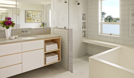
BATHROOM DESIGNRoom of the Day: Geometry Rules in a Modern Master Bathroom
Careful planning pays off in this clean-lined bathroom with his-and-her vanities, a semiopen shower and a soaking tub
Full Story
BEDROOMS9 Tips for a Well-Dressed Bed
How to Stack Those Decorative Pillows and Coverlets? Some Ideas to Sleep On
Full Story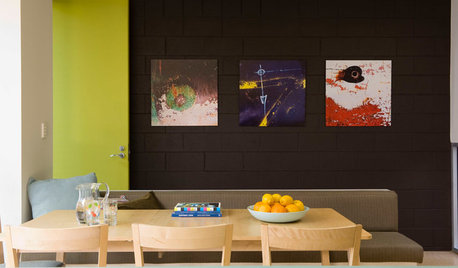
PAINTING10 Rules for Your Next Painting Project
Take your next painting journey from ‘argh!’ to ‘ta-da!’ with these designer tricks
Full Story
MOST POPULARMust-Try Color Combo: White With Warm Off-White
Avoid going too traditional and too clean by introducing an off-white palette that brings a touch of warmth and elegance
Full Story
COLORColor of the Year: Off-White Is On Trend for 2016
See why four paint brands have chosen a shade of white as their hot hue for the new year
Full Story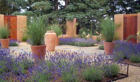
GARDENING GUIDESRegal Lavender Rules Gardens Coast to Coast
Learn how to grow this fragrant, beautiful herb and show off its full beauty in the landscape
Full Story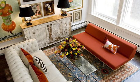
DECORATING GUIDESFeel Free to Break Some Decorating Rules
Ditch the dogma about color, style and matching, and watch your rooms come alive
Full Story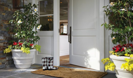
MOST POPULARThe Polite House: On ‘No Shoes’ Rules and Breaking Up With Contractors
Emily Post’s great-great-granddaughter gives us advice on no-shoes policies and how to graciously decline a contractor’s bid
Full Story

Lori A. Sawaya