


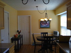
Am I looking for a soft buttery yellow or a soft buttery white?
happyintexas
13 years ago
Featured Answer
Comments (46)

graywings123
13 years agoRelated Discussions
LOOKING for: Paula Deen's Buttery Fingers :)
Comments (1)It looks like this board is kind of slow. I already made the cookies. They were not hard as rocks, but not exactly soft. Of course it is a shortbread cookie, so they are not supposed to be soft and chewy....See MoreThe perfect, beautiful, buttery yellow
Comments (35)Theresa2: I love your statement, "It's yellow enough to say I'm yellow." That is just what I want---nothing in your face but warm and happy. Dawnp: I was wondering if someone would suggest RH Butter. It is really pretty in those pictures. Windham Cream is going to make the short list. The pictures are yummy. I think SW has sample quarts? Wish Ben Moore did. A quart at BM is somewhere around $30 I believe. I just cringe at the thought of buying a bunch of quarts for experimental purposes. And those tiny sample jars do not seem to hold enough. Anyway, I have collected all of the sample chips readily available to me. My goal tonight is to narrow it down to the top 5 and then think about putting some samples on the walls. My DH (bless his heart) does not really care what I do and he has a pretty good sense of color. He is quick to say "that looks tan to me" or "green to me" so MAYBE I will let him in on the elimination process. Of course, involving someone else means letting go of a little control which is difficult for me. What if he comes out with a strong opinion?? Then what will I do??? LOL JR...See MoreNeed a soft white to off white for cabinets..too many choices
Comments (3)Seriously, I'm having this conversation with my DH right now. Every couple of days, I have a new "favorite" white. I think my problem is I'm afraid to commit. I never stress over the wall color. It's sooo easy to change. Cabinet color is harder to change. Here's a couple I've sampled: Benjamin Moore (BM) White Dove OC-17 - a bright, grey white. Light Reflective Value (LRV) 90 Cool undertone BM Cloud White OC-130 LRV 87.1 - not as bright as White Dove LRV 87.1 BM Feather Down OC-7 LRV 73.8 - a moodier gray off white, Cool undertone. Below is a link another gardenwebber shared with me. BuyAuraPaint. It has the LRV and some of the color undertone info. Sherwin Williams also has the LRV on the back of their cards too if you want to compare. Here's Pottery Barn's version of how to pick white: http://www.potterybarn.com/pages/getting-white-right.html BTW, my color of the week is Ancient Ivory ; ) Here is a link that might be useful: BM paint...See Morelooking for a warm soft yellow...
Comments (4)I also like SW Napery. I would describe it as a buttercream yellow. I wanted something yellow but soft for our laundry room so that is most likely the color I will be picking. Behr makes a Cottage Cream color also and I really like the look of that as well but it is much more pastel light where Napery is just the perfect yellow....See More
jay06
13 years ago
allie22031
13 years agottodd
13 years agosnailpace
13 years agoavaclark
13 years agocookingrvc
13 years agocherigw
13 years agograywings123
13 years agoelle3
13 years agohappyintexas
13 years agoshappy
13 years agottodd
13 years agograywings123
13 years agoyogacat
13 years agodoonie
13 years agogreatgollymolly
13 years agohappyintexas
13 years ago
Oakley
13 years agomjsee
13 years agoUser
13 years agonewdawn1895
13 years agobronwynsmom
13 years agonewdawn1895
13 years agomoonshadow
13 years agoUser
13 years agomjsee
13 years agonewdawn1895
13 years agonewdawn1895
13 years agothermsen
13 years agokristine_ca
13 years agotomorrowisanotherday
13 years agobronwynsmom
13 years agohappyintexas
13 years agomjsee
13 years agojennybrandt
9 years agoUser
9 years agoUser
9 years ago
lisa_mocha
9 years agolast modified: 9 years ago
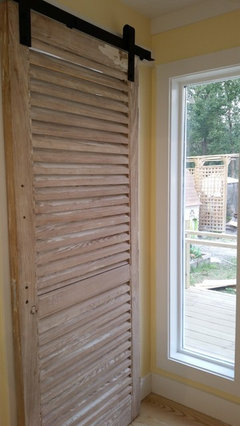
Vith
9 years agolast modified: 9 years agosujafr
9 years agolisa_mocha
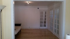
9 years agoUser
9 years ago
WalnutCreek Zone 7b/8a
9 years agolast modified: 9 years agoUser
9 years ago


Related Stories

COLORBest Ways to Use the Soft Yellow Color of 2014
You may fall for PPG Pittsburgh Paints’ Turning Oakleaf if you like your hues warm, mellow and cheery
Full Story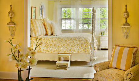
COLORWelcome Yellow Around Your Home for an Instant Lift
Keep on the sunny side with shades of yellow from buttery and soft to dynamic and bright
Full Story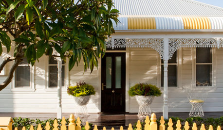
DECORATING GUIDESLighten Up — or Brighten Up — With Yellow
You can use this versatile color to create a buttery backdrop, add a zesty accent or make a bold design statement
Full Story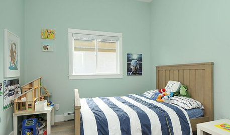
COLORGet a Soft Spot for Sea-Glass Green
Soften a room's look by washing its walls in this delightfully airy shade, no sand in your shoes required
Full Story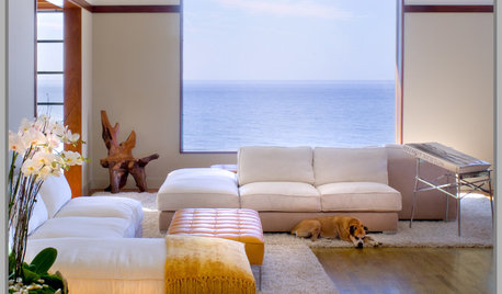

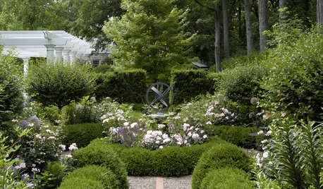
LANDSCAPE DESIGNDefine Your Garden Softly With Planted Borders
Why make things hard for your garden's edges? Embrace a softer side by trading brick and concrete for shrubs, grasses and ground covers
Full Story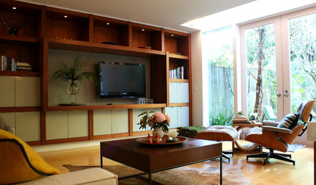
HOUZZ TOURSMy Houzz: Sleekness and Soft Touches in a Midcentury Home
Flowers and art make classic furnishings all the lovelier in a San Francisco couple’s overhauled gem
Full Story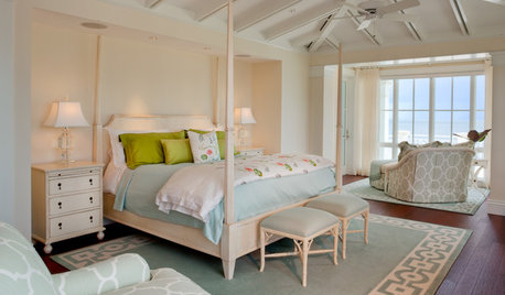
BEDROOMSSleep Sweetly With Mismatched Bedding in Soft Shades
Mixed linens and pretty pastels. Two easygoing trends combine to create a casual, inviting look for your sleep space
Full Story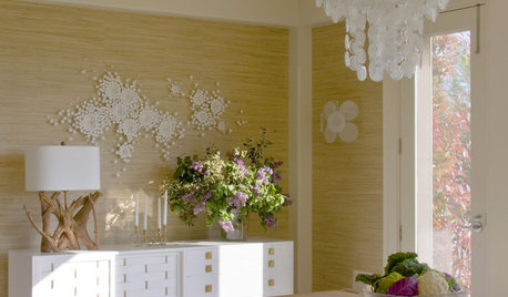
DECORATING GUIDES'Soft Modern' Style Offers Best of Both Worlds
Mix in a few curves and soft colors but nix the clutter, and the happy result is a balanced new take on modern design
Full Story
bronwynsmom