


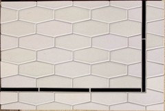
Please help with backsplash
tilelady1234
9 years ago

Featured Answer
Comments (122)

Gracie
9 years agolast modified: 9 years ago
laurencp
9 years agolast modified: 9 years agoRelated Discussions
Help, Oh, Please Help! - Backsplash Installation. (pics)
Comments (11)This is a situation I hate. Short of moving the switches (which isn't always possible), there's no real winning solution. I even talked a friend of mine this summer (who just happens to be an electrical contractor) out any backsplash at all, other than the 4" one that came with his countertop, just because of this, and he said those switches couldn't be moved, because of the way the framing fell, without opening up about 20" of the wall and redoing the framing. If it were up to me, and I had no choice but to deal with it, I'd tile that little space from the side of the cabinet to the door trim....See MorePlease help with backsplash
Comments (38)agree-long and thinner subway will be a great choice as for arabesque-I personally love everything that reminds me of home including arabesque:) so I'm afraid my judgement might be a bit clouded here.. I'd say-depends where you live. And how deeply you love it. whatever reads as very natural in one house, can start getting on your nerves in other house. I also love Sonoma. (besides Fireclay, Walker Zanger, Ann Sacks, Encore, and all the other great tile manufacturers there where plain subway is whatever I usually can afford lol..) With arabesque, I'd be even more mindful about tile's quality. I guess that's one of the reasons subway/squares are/were popular..harder to get them wrong when they're cheap. (Even though I highly prefer handmade tile..it's just different. Even being one shape and one color-it will allow for a different effect when applied to a wall..very slight subtle variation so slight you won't always get why you love this tile so much-you'll just love it. It will seem more alive) The more elaborate the shape is- the more visible any shortcomings will be. Usually. Might read as a bit fake. I'm trying to think now why..well probably because traditional shapes as arabesque are traditionally handmade? Simple shapes-easier to imagine them being produced en masse. So we don't have the same expectation of them as we would from more elaborated shapes. Glass mosaics-similar problem . Glass is plainly harder to get right. If you want to have dimension you need higher quality product. Or else it would fall too flat. Having said that-I'm a bit pickier about tile, because ceramics etc is one of my favorite materials ever. As for colors-yes I'd either repeat the countertop( white?) or cabinets(but would go lighter). So yes something in this warm white-to-tan realm. But same as you don't want to paint the walls because you feel they're great with your floors-you might feel the same about backsplash..it will be also vertical surface and will need to work with everything including your floors.. Sorry about the super long answer..and thank you for the opportunity to think out loud a bit.. I wish you great luck! looking forward to see your further choices in case you'll be in the mood to share them...See MorePlease help with backsplash!
Comments (19)Oh, I like the penthouse tile. After you pick the tile, you will probably want to do some sample boards to figure out the grout color. The color you pick will determine how much the tile pattern shows up and gets along with your countertop. Be sure to let them dry overnight, as the grout lightens up as it dries....See MorePlease help with backsplash dilemma
Comments (16)In this particular situation, I would prefer that the counter end flush with the cabinet - as it is, either the top of the backsplash sticks out, or the or the bottom of the backsplash is recessed. I don't love either of those options, but if I had to choose, I would prefer it as it is now - recessed on the counter. If it were me, I would try and get that counter section sized so that it was flush, and then there would be no issue with where the tile ends. In any event, remove those vertical pieces - that looks odd. A Schluter edge would look fine there....See Moretilelady1234
9 years agolast modified: 9 years agoPhoneLady
9 years agolast modified: 9 years agosandesurf
9 years agolast modified: 9 years agosandesurf
9 years agolast modified: 9 years agosandesurf
9 years agolast modified: 9 years agoPhoneLady
9 years agolast modified: 9 years agoPhoneLady
9 years agolast modified: 9 years agoGracie
9 years agolast modified: 9 years agoPhoneLady
9 years agolast modified: 9 years agotilelady1234
9 years agolast modified: 9 years agoPhoneLady
9 years agolast modified: 9 years agoGracie
9 years agolast modified: 9 years agotilelady1234
9 years agolast modified: 9 years agonosoccermom
9 years agolast modified: 9 years agoGracie
9 years agolast modified: 9 years ago
emma
9 years agolast modified: 9 years agoisabel98
9 years agolast modified: 9 years ago
romy718
9 years agolast modified: 9 years agoromy718
9 years agolast modified: 9 years agotomatofreak
9 years agolast modified: 9 years agoromy718
9 years agolast modified: 9 years agosandesurf
9 years agolast modified: 9 years agosandesurf
9 years agolast modified: 9 years agotilelady1234
9 years agolast modified: 9 years agotilelady1234
9 years agolast modified: 9 years agotilelady1234
9 years agolast modified: 9 years agoPhoneLady
9 years agolast modified: 9 years ago
gr8daygw
9 years agolast modified: 9 years agonosoccermom
9 years agolast modified: 9 years agotilelady1234
9 years agolast modified: 9 years agotilelady1234
9 years agolast modified: 9 years agoGracie
9 years agolast modified: 9 years agoannettacm
9 years agolast modified: 9 years agolisepomeroy
9 years agolast modified: 9 years agoPhoneLady
9 years agolast modified: 9 years agolisepomeroy
9 years agolast modified: 9 years agotilelady1234
9 years agolast modified: 9 years agoGracie
9 years agolast modified: 9 years agobookworm4321
9 years agolast modified: 9 years agotilelady1234
9 years agolast modified: 9 years agotilelady1234
9 years agolast modified: 9 years agotilelady1234
9 years agolast modified: 9 years agotilelady1234
9 years agolast modified: 9 years agotilelady1234
9 years agolast modified: 9 years agotilelady1234
9 years agolast modified: 9 years agorightdi_gw
9 years agolast modified: 9 years agoJillius
9 years agolast modified: 9 years agoromy718
9 years agolast modified: 9 years ago


Related Stories

ORGANIZINGDo It for the Kids! A Few Routines Help a Home Run More Smoothly
Not a Naturally Organized person? These tips can help you tackle the onslaught of papers, meals, laundry — and even help you find your keys
Full Story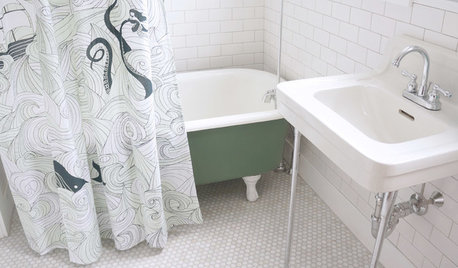
BATHROOM MAKEOVERSRoom of the Day: See the Bathroom That Helped a House Sell in a Day
Sophisticated but sensitive bathroom upgrades help a century-old house move fast on the market
Full Story
KITCHEN DESIGNHere's Help for Your Next Appliance Shopping Trip
It may be time to think about your appliances in a new way. These guides can help you set up your kitchen for how you like to cook
Full Story
COLORPaint-Picking Help and Secrets From a Color Expert
Advice for wall and trim colors, what to always do before committing and the one paint feature you should completely ignore
Full Story
COLORPick-a-Paint Help: How to Create a Whole-House Color Palette
Don't be daunted. With these strategies, building a cohesive palette for your entire home is less difficult than it seems
Full Story
ORGANIZINGHelp for Whittling Down the Photo Pile
Consider these 6 points your personal pare-down assistant, making organizing your photo collection easier
Full Story
SELLING YOUR HOUSE10 Tricks to Help Your Bathroom Sell Your House
As with the kitchen, the bathroom is always a high priority for home buyers. Here’s how to showcase your bathroom so it looks its best
Full Story
MOST POPULAR7 Ways to Design Your Kitchen to Help You Lose Weight
In his new book, Slim by Design, eating-behavior expert Brian Wansink shows us how to get our kitchens working better
Full Story
UNIVERSAL DESIGNMy Houzz: Universal Design Helps an 8-Year-Old Feel at Home
An innovative sensory room, wide doors and hallways, and other thoughtful design moves make this Canadian home work for the whole family
Full Story


amck2