


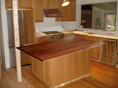
Counter granite/wood decision: ripping my hair out! Help!?! (pics
Stacey Collins
14 years ago
Sort by:Oldest
Comments (54)
Related Stories
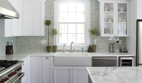
KITCHEN BACKSPLASHESHow to Choose a Backsplash for Your Granite Counters
If you’ve fallen for a gorgeous slab, pair it with a backsplash material that will show it at its best
Full Story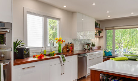
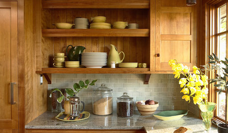
KITCHEN DESIGNThe Best Backsplashes to Pair With Wood Counters
Simplify your decision-making with these ideas for materials that work well with wood counters
Full Story
KITCHEN DESIGNWhat Goes With Granite Counters?
Coordinate your kitchen finishes beautifully by choosing colors that complement granite’s natural tones
Full Story
KITCHEN DESIGN5 Favorite Granites for Gorgeous Kitchen Countertops
See granite types from white to black in action, and learn which cabinet finishes and fixture materials pair best with each
Full Story
SELLING YOUR HOUSE10 Tricks to Help Your Bathroom Sell Your House
As with the kitchen, the bathroom is always a high priority for home buyers. Here’s how to showcase your bathroom so it looks its best
Full Story
SELLING YOUR HOUSE5 Savvy Fixes to Help Your Home Sell
Get the maximum return on your spruce-up dollars by putting your money in the areas buyers care most about
Full Story
DECORATING GUIDESThe Dumbest Decorating Decisions I’ve Ever Made
Caution: Do not try these at home
Full Story
KITCHEN DESIGNDesign Dilemma: My Kitchen Needs Help!
See how you can update a kitchen with new countertops, light fixtures, paint and hardware
Full Story
COLORPaint-Picking Help and Secrets From a Color Expert
Advice for wall and trim colors, what to always do before committing and the one paint feature you should completely ignore
Full Story


Stacey CollinsOriginal Author
User
Related Discussions
Granite counter top color help
Q
Help..... ran short on granite for the counter tops.....
Q
Counter top help for this cookie cutter kitchen..(pics)
Q
Help! Not sure if I want dark granite counter tops
Q
idrive65
fleur222
Stacey CollinsOriginal Author
wallycat
hk_san_diego
erikanh
Stacey CollinsOriginal Author
User
Jean Farrell
fleur222
rhome410
chachashea
Stacey CollinsOriginal Author
wallycat
sue36
nesting12
Stacey CollinsOriginal Author
nesting12
mindstorm
eandhl
hk_san_diego
pluckymama
Stacey CollinsOriginal Author
rhome410
Stacey CollinsOriginal Author
katienic
remodelfla
Stacey CollinsOriginal Author
boxerpups
phoggie
phoggie
nesting12
bellcrest
holligator
Stacey CollinsOriginal Author
desertsteph
Stacey CollinsOriginal Author
Circus Peanut
holligator
erikanh
granite-girl
rhome410
Stacey CollinsOriginal Author
rhome410
boxerpups
Stacey CollinsOriginal Author
Stacey CollinsOriginal Author
repaintingagain