


Living Room Desperately Seeking New Paint Color
anele_gw
10 years ago


Sort by:Oldest
Comments (37)
Related Stories
UPHOLSTERYSeeking a Quiet, Relaxed Spot? Try Upholstering Your Walls
Upholstery can envelop an entire room, a framed panel or a single wall. See some design options and learn what to expect
Full Story
KITCHEN OF THE WEEKKitchen of the Week: Seeking Balance in Virginia
Poor flow and layout issues plagued this kitchen for a family, until an award-winning design came to the rescue
Full Story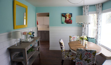
ROOM OF THE DAYRoom of the Day: A DIY Dining Room Full of Cheer
Seeking an uplifting spot during gray days in Washington state, this couple brightened their space with turquoise paint and DIY spirit
Full Story
MORE ROOMSCreate a Place for Books
Dining Rooms, Living Rooms, Halls — Even TV Rooms Have Library Potential
Full Story
MOST POPULAR9 Reasons to Buy a Painting
No print or poster can rival the power of an original painting, chosen by you, for where you live
Full Story
DECORATING GUIDESRoom of the Day: Romancing a Maine Dining Room
Glossy paint and country-style furnishings make a 19th-century interior an affair to remember
Full Story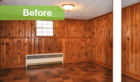
PAINTINGKnotty to Nice: Painted Wood Paneling Lightens a Room's Look
Children ran from the scary dark walls in this spare room, but white paint and new flooring put fears and style travesties to rest
Full Story
COLORFUL HOMESThe Best of My Houzz: 10 Living Rooms With Wall Colors to Love
Jet black, Meyer lemon yellow, mossy green — these spaces make a statement with bold color
Full Story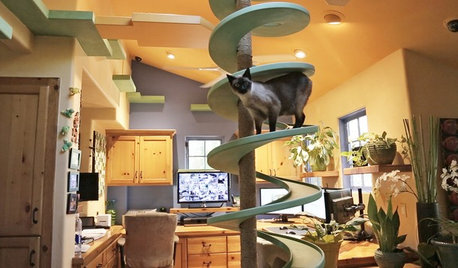
PETSWe Want to See the Most Creative Pet Spaces in the World
Houzz is seeking pet-friendly designs from around the globe. Get out your camera and post your photos now!
Full Story
LIVING ROOMSRoom of the Day: Newlyweds Embrace a Colorful New Look
Bright accessories and rich textures amp up a bland living room in a couple’s first home together
Full Story


User
Fluffeebiskits1
Related Discussions
Color of 'Desperate Housewives' living room
Q
Desperately Seeking ROOM LAYOUT & INTERIOR DESIGN help!
Q
desperately seeking cabinet color help
Q
Family living Room seeking comfort color and personality
Q
Tmnca
ellendi
anele_gwOriginal Author
alex9179
suero
funkyart
randita
anele_gwOriginal Author
alex9179
suero
liriodendron
annkh_nd
anele_gwOriginal Author
annkh_nd
alex9179
liriodendron
Tmnca
crl_
anele_gwOriginal Author
JGbeME
JGbeME
JGbeME
JGbeME
liriodendron
annkh_nd
roarah
anele_gwOriginal Author
Boopadaboo
anele_gwOriginal Author
roarah
amykath
Wolfpackmom
anele_gwOriginal Author
Tmnca
anele_gwOriginal Author