


Paint color to tone down peach floors?
jenva2010
12 years ago
Featured Answer
Comments (13)

jenva2010
12 years agoRelated Discussions
what paint colors will tone down pink floors?
Comments (3)I think we have the same tile! Is this it? That's my bathroom floor. What an exercise in frustration! I've been mulling over this room for ages. DH offered to pull the tile up for me, as my attempts at finding a new wall color are beyond exasperating. I'm dragging my feet tho. Although a new floor would immediately resolve this problem, a big concern is the bullnose tiles on the drywall instead of baseboard trim. It's not going to budge easily and I can just see giant chunks of the wall coming off. Right now I have a mid-level, very gray based purple on the walls. I didn't think I would care for that color because it's a small room and I thought a deeper color would close it in. But it hasn't, in fact, the opposite occurred, it feels more expansive. It's a smooth transition for the eye from floor to wall because of the common gray hues, but a nicer side effect is that some "oomph" on the walls and splashes of rich accent colors completely detracts from the rose colored marbled veining in the tile. But I'm ready for a change and have looked at every color of the rainbow and then some. This is a sample of the color I love and always go back to, but will not work with that tile. (The color is MS Atlantic, and is worth ripping the drywall, I like it that much! ;D ). With current tile it creates what I've fondly dubbed as the "Miami Vice" effect in that room. Sadly, many colors create that effect. Makes the pink in the floor 'pop' rather than recede. (You can see a bit of the current wall color in the background.) I lean toward your choice #1. Wouldn't suggest anything in the terra cotta/salmon family from #2, rather than detract from the floor it would feel jarring, imho. #3, I haven't found a sage yet that will work with my tile, and I love sage :( If we don't end up pulling the floor altogether I've narrowed it to a rich warm gray (providing I can find it, samples everywhere) with lots of white and hints of blue sea glass in accessories and accents (think spa). So that the atmosphere in the room will be a deterrent against the eye focusing on the pink in the floor. Have never considered myself a gray person, but with it being tagged as one of the 'new neutrals' and therefore some nice examples being shown in magazines, etc. shouldn't be difficult to hit on one that feels cozy rather than cold or industrial. Otherwise, a heavily gray based taupe with just a hint of green undertone does seem to work well. Another choice I've found that works is a cool gray based mocha. Like Restoration Hardware's Flax. (Click on the small color square in that row to see a sample of Flax in a room.) Hesitate to go that route, think I'd prefer to go lighter than what I have now for a change. Also, I wouldn't recommend dual contrasting colors. That would be a lot going on with our tile. Unless you stay in the same palette and do perhaps a darker shade near the floor and one level lighter above the chair rail. Just my humble .02. Guess my rambling on is a dead give away I've been doing a bit of obsessing over this ;D...See MoreWhat paint color to tone down peach/orange brick in fireplace?
Comments (11)I'm afraid I must disagree with the suggestion that green on the walls will tone down the brick. Actually, the opposite is true...colors that are opposites on the color wheel will bring up the color in both...so green makes orange look twice as orange, and yellow makes purple much stronger. We dealt with the same issue by painting our walls a soft neutral, and then putting a four to one mixture of water and paint in a bucket, washing it onto the brick chimney wall with a big paintbrush, and patting it down with a handful of cotton rag. This method works wonderfully to control the look, and keeps the variety among the different bricks, while tying it all into the room in a much more sophisticated way. It took one morning to do the whole thing, and gave the effect more of stone than brick. I wanted the hearth to relate to the dark floor rather than to the wall, because it keeps the brick wall from intruding visually into the room area...so I painted the inside of the firebox and the whole brick hearth flat black. Then I brushed a second coat of semi-gloss black just over the surfaces of the hearth bricks themselves, which made the whole thing settle into the floor. The grout stayed flat and shadowy, the nooks and crannies likewise, and the effect was much more natural than the dustiness of just flat black, or the fakey plasticky-ness of all semigloss. You could do the same thing with a deep tone of your carpet color. I wish I had a photo to show you. It looked wonderful, if I do say so myself!...See MoreXpost- Paint color to tone down pinkish tone in beige grout
Comments (1)Post photos....See MorePaint Color to Tone Down Maple Cabinets
Comments (12)A lot of people like Balboa Mist from Benjamin Moore that you listed, and you can search Houzz for photos of it in kitchens, but I don't have experience with it so couldn't advise. There is a comprehensive list of color leanings (blue, green, yellow red, with chroma values) in the Benjamin Moore Affinity line of colors at the following link, a terrific reference page: https://thelandofcolor.com/get-color-notations/benjamin-moore-affinity-color-notations/ The Benjamin Moore Affinity collection has some truly special colors in it. We just used one of them with subdued purple/blue tones for an entire master bedroom and bathroom suite and loved it, but it wasn't a color that would work for your situation. Early on, when I told a interior design consultant I was considering a paint color from the Affinity collection, she brightened up and said something to the effect that the collection was outstanding. We got the $8 sample quart of paint and tried it out first to be sure (differing sheens aren't available for the sample, just the color), and we definitely went with the premium Aura since it is more resistant to moisture than the Regal. For a kitchen area, I would recommend the Aura for the moisture resistance. We also did a satin sheen which turned out more glossy than I preferred. If I use Benjamin Moore for the kitchen, I'd probably scale back to eggshell on the sheen. Sherwin Williams also makes a well-reviewed interior paint called ProClassic that I've seen reviewed with similar or even better quality to some Benjamin Moore paints, and their color selections are extensive if you want to expand your color options. Given the total picture, it's going to be hard to really tone down wood cabinetry that takes up so much of the space. I think your kitchen looks lovely as it is. Pretty much all wood is going to naturally oxidize to some variation of an orange/amber/yellow tone with age, so that's why the painted cabinet craze is going so strong, to get away from those natural wood tones. Natural wood is coming back into vogue, and maple is one of the most popular woods commercially available for cabinetry with its quiet grain and intrinsic hardness to resist scratches and dents. Your natural finish will also hold up better over time than a painted finish would. Sometimes the best solution is to just pick a color that you really enjoy personally for the walls. You needn't feel tied to the maple color, as quite a few options for your wall would probably work well, and you can consider the maple somewhat of a neutral. The countertop reads dark neutral from a distance, so it's not that limiting either....See Moredawn25
12 years agoroarah
12 years agohtnspz
12 years agojenva2010
12 years agosis2two
12 years agozaara10
12 years agocindyloo123
12 years agoTracy Russo
9 years agoTracy Russo
9 years ago
lazy_gardens
9 years ago
Olychick
9 years ago
Related Stories
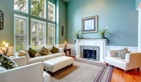
DECORATING GUIDESNeed Peace and Quiet? Muted Colors Tone Things Down
Subtle hues can be perfect for large rooms and to balance out bolder colors in a home
Full Story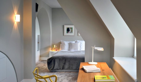
FLOORSBedroom Style: Set the Tone With Your Choice of Flooring
Design your bedroom from the bottom up by choosing your floor treatment first. The rest of the decor will follow
Full Story
DECORATING GUIDESSplit Your Colors with Two-Toned Walls
There's no need to choose between two paint colors — use both to add dimension and interest to your walls
Full Story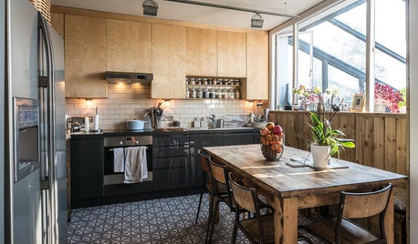
KITCHEN DESIGNA Two-Tone Cabinet Scheme Gives Your Kitchen the Best of Both Worlds
Waffling between paint and stain or dark and light? Here’s how to mix and match colors and materials
Full Story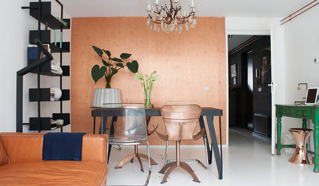
HOUZZ TOURSMy Houzz: Copper Tones Warm an Amsterdam Apartment
Paint, editing and a crush on copper help an Amsterdam resident conquer his compact space
Full Story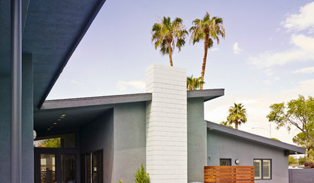
HOUZZ TOURSHouzz Tour: From Burned Down to Done Up in Las Vegas
A fire gutted this midcentury home — and laid the groundwork for a beautiful new floor plan
Full Story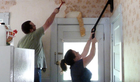
DECORATING GUIDESHow to Remove Wallpaper in 4 Steps
Learn the best way to remove wallpaper with only water (and elbow grease) so your next wall treatment will look great
Full Story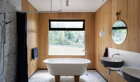
BATHROOM DESIGN15 Bathroom Trends Splashing Down in 2016
Four Australian designers break down the looks, finishes and features they believe will reign supreme in bathroom design this year
Full Story
COLORHow to Layer Tones of Gray for Depth and Harmony
Use texture, pattern, contrast and more to create a subtle, sophisticated look with this popular color
Full Story
KITCHEN DESIGNKitchen of the Week: Tile Sets the Tone in a Modern Farmhouse Kitchen
A boldly graphic wall and soft blue cabinets create a colorful focal point in this spacious new Washington, D.C.-area kitchen
Full Story
roarah