SHOP PRODUCTS
Houzz Logo Print
winesnob_gw

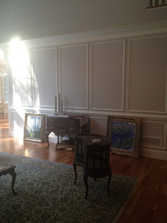
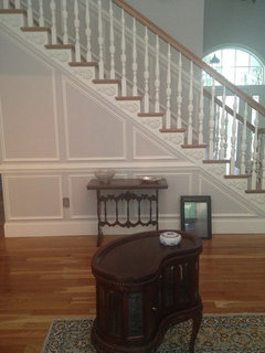
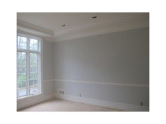
PLEASE Help me with Gray paint

winesnob
11 years ago

I have bought no less than 15 sample pots of paint, today I went back to BM Wish, I thought it was the color but now I am having second thoughts.....I will have Statuary Marble on the floors and in shower. French Greenish Blue cabinets, all this in the bathroom, adjoining bedroom dark oak floors. I thought that a gray would be perfect but I don't want lavender tint, don't want it to look like a boy's room with blue tints..... Gray is hard but always looks so beautiful on the photos in houzz. If you have advice, please pulling hair out on this one.

Comments (49)

  • beaglesdoitbetter1
    11 years ago

    Sherwin Williams Tinsmith. It is the ONLY grey that exists on this earth that does not look lavender in any light. We agonized over this and essentially bought out a sherwin williams to find it. Check out the pics on my blog to see it in multiple rooms (kitchen, great room, gathering room and hall all used it).

    Here are a few pictures of it:

  • yayagal
    11 years ago

    Take a look at Benjamin Moore Smokey Taupe, it's a color that can appear between light tan and gray depending on the light but it never looks any other color. Perfect for a boys room.

  • Related Discussions

    Please help me troubleshoot - greying leaves

    Q

    Comments (11)
    Clearly it is sun burn (sun scald). You gave them too much direct sun too quick. Start them out in shade the first couple times and then partial sun and eventually full sun. Also, slowly increase their time outside each day. Putting a plant out that isn't used to direct sun in the full sun for an hour will sun burn it. Those leaves that are "greying" will likely die depending on how bad it is. you will notice that in most cases they are the bigger, older leaves lower down on the plant. Those are the leaves most susceptible to sun burn. Don't sweat it if just those die. If you have worse sun burn and all or most leaves are burnt, then you may have an issue. Treat it like you would a person and bring them in for a while. Then start over and work up to full sun for prolonged periods. FYI: Sun through a window is not the same as direct sun. Most home windows have UVA/UVB filter protection built in to them so the plant is not exposed to "full" sun through the window. Bruce
    ...See More

    Please help me pick grout color for gray tile floor

    Q

    Comments (1)
    Pretty PLEASE... Advice on grout color really needed!!! I'm looking for a gray color grout to go with Clay Grafito porcelain tile from The Tile Shop. I like the look of this tile & grout:
    ...See More

    I had my Bedroom Painted as Grey. Can Anyone help me to renovate it?

    Q

    Comments (2)
    I love Madison Park and Madison Park Signature bedding sets...amazing quality and price.
    ...See More

    help me pick a dark gray paint!

    Q

    Comments (2)
    My living room is seal grey, a Glidden color, mixed by BM. It is a true charcoalish grey with not much undertone.
    ...See More
  • trudymom
    11 years ago

    I love gray too. I had the below site in my favorites:

    Here is a link that might be useful: Gray Paints

  • winesnob
    Original Author
    11 years ago

    Just carried my coffee in there to eye them all in the summer light. Still love the BM Wish, Balboa Mist, and Owl Gray. But when I go on the BM site where you can paint a room they all look so different. Some people think oh it is only paint but my idea with paint is getting it right the first time, buy good paint and don't worry about it for a couple of years so stressing over this seems the norm....but good grief this is too much. Gray is everywhere, in every book you pick up. I am going to take three colors, go to a fresh wall, if there is one and make a decision....My GC is I am OCD...Thanks for your replies.

  • PRO
    Lori A. Sawaya
    11 years ago

    But when I go on the BM site where you can paint a room they all look so different.

    There is absolutely nothing about paint colors you see online that is accurate. Especially grays and toned colors. One of the most difficult things to do in graphic design and color management is manage the aspect of gray. It's an additive light realm.

    Paint color is not in the same realm. Paint color is in the subtractive realm and the two realms, additive and subractive, can never align, never sync up and match. The goal of color management is to manipulate additive color to mimic in real life subtractive color (in whatever form it may be) as closely as possible.

    So, don't depend on those paint-a-room things. They're meaningless and only marginally useful.

    For testing, try using circles - cut circle-shaped sample boards or if you're painting directly on the wall (which you should not) paint circles, not squares/rectangles. Paint all the way to the edge, no white border.

  • Pipdog
    11 years ago

    BM Nimbus worked for me after I tried lots of samples - no blue or purple undertones in that one. I tried BM Wish too and it had pink-ish undertones.

  • jessicaml
    11 years ago

    Winesnob, you're not alone! I used about a dozen colors samples each before settling on an off-white for my living room and a green for my bedroom. They're the spaces where I spend the most time, and I wanted to get the color mood just right. I always wonder about the people who pick a color right in the store. Are they lucky, better at judging color chips, less sensitive to the wrong color, or do they hate it and just live with it?

    Funcolors, would you mind expounding on why to sample using circles? I always enjoy the depth you bring to paint color discussions, and this is the first I've heard mention of the circle tip.

  • bestyears
    11 years ago

    Just went on a home tour this weekend, and completely fell in love with a master suite painted in Sherwin Williams Aloof Gray. Beautiful, soft, pure gray. Bathroom counters were done in marble. It.was.exquisite....

  • winesnob
    Original Author
    11 years ago

    So interesting to read this.....and I agree how do people just go in the paint store, I actually think choosing the right color is a labor of love. I can't for the life of me figure how I decide on one and a few hours later, I am going no that is not going to work. I am going to look at the Aloof Gray. I am ruling out the Wish, I don't like the undertones, but I do seem to like Balboa Mist. I have a ton of light in this room, we live in the desert southwest, I have four very large windows in this room plus french doors, so my thought is no gray is going to look blah but it could very well look too blue or too green with the light, I am no authority but think I have a good eye for color. The advice is well taken and appreciated. Again the comments I get from some that IT is only paint, doesn't work for me, I am putting down reclaimed wood, have heavy furniture and marble in the bathroom, I have to get it right. Good luck with all your projects too.

  • abbycat9990
    11 years ago

    LOL! It is so comforting/validating to read this kind of thread. I know you all understand that I repainted my bedroom room four times because it just wasn't right. I finally ended up with BM Etruscan which complements the cork floors beautifully. Ahh!

  • dvarnell
    11 years ago

    We're in the same boat right now wine snob - I'm also picking paint for a white and marble bathroom although I'm doing Carrara on counters and venatino on floors (loved the statuary, but it was out of my budget!). I used BM Owl Gray in my master bedroom and girls' bathroom and it's lovely and very pure clean gray in my br that gets lots of light, but it shows green undertones in theirs which doesn't get as much (so I may have to have theirs repainted). I'm using SW Silver Strand in my bathroom - it's a gray, green, blue. It may have too much color for you (and maybe for me - may be repainting that one at some point too!) I also considered the Aloof Gray which is very nice too. Also got a sample of BM Cashmere Gray which has soft green undertones to it and might look very nice with the white/gray marbles. The one thing I have noticed is that all the grays look very different on the walls than on the paint chip and totally vary by the light in the room so I'd buy lots of samples and try them out in big swatches in the room itself. Good luck!

  • winesnob
    Original Author
    11 years ago

    I THINK I have decided on Balboa Mist, I have painted it in several places. It seems to be true gray in my light area, it goes with the marble. I will tell you this about the statuary, I love it, it was very expensive and I am over budget. I am doing my kitchen in a few months, after I recoup from this. Magazine after magazine I thought that I wanted it also in my kitchen, I have changed my mind....I have been so anal over this floor in the bathroom I don't think I can hold up to that in the kitchen, I just today got out the bar keepers friend in my kitchen to use after cutting some fresh flowers and I said I can't do marble in the kitchen, at least not everywhere, I am actually thinking of having stainless counters near my stove, oh well that is another thread, isn't it....we are discussing paint, and I really like all the colors you chose dvarnell. I am calling the paint store now, I need to commit. How do we make our lives so crazy?

  • bestyears
    11 years ago

    winesnob, I just looked at the Balboa Mist (in the paint deck) next to Aloof Gray (the color in the Southern Living House). I think I neglected to mention that the SL house also had statuary marble in the master bath. I am seeing pinkish in the Balboa Mist when I compare it to the Aloof Gray -which looked spectacular with the marble in the SL house. Don't want to send you back to the land of indecision....but....

  • winesnob
    Original Author
    11 years ago

    OMG.........and I am also trying to decide if I want Egg Shell or Matte, I think egg shell, I believe you need to be able to wash a bit. Okay I am going to look at Aloof Gray again...

  • bestyears
    11 years ago

    There are some very good scrubbably matte paints now. I think with the marble the softness of the matte will look better.

  • patty_cakes
    11 years ago

    ..what fun colors said AND the light in your home will be totally different than in the paint store. Gray ain't easy. ;o)

  • jessicaml
    11 years ago

    Thanks for the extra info, funcolors!

    Winesnob, FYI, I used BM Regal Select Matte in my living room and kitchen and it's held up to scrubbing well.

  • dvarnell
    11 years ago

    I've used the BM scrub able matte everywhere except bathrooms. The eggshell doesn't look at all shiny, but is supposed to be a better choice in bathrooms.

  • lazy_gardens
    11 years ago

    Interesting about circles ... and come to think of it, the color blindness tests use circles.

    The paint-a-room online sites are only good to get an approximation of the effects because they are so strongly influenced by your computer's monitor and room lighting.

    For starters, your paint is not going to be glowing at you, like the colors on a monitor. It's going to be reflecting light at you from every light source in the room, and reflecting the reflected light from other surfaces.

    I have a lovely pale yellow kitchen, except in the early morning when the sun is bouncing off the green lawn. Then I have a chartreuse, glowing evil green glow in there.

    You could have the purest grey in the can, but if it's getting light bounced off a blue floor, or a green lawn, it will not be the grey you wanted.

  • winesnob
    Original Author
    11 years ago

    I want the trim to be oil based. Is the paint contractor going to hate me.....I am also going to paint my ceilings the same color, will have 4 1/2 crown and 6 1/2 baseboard, very simple styles. I have white plantation shutters throughout my house that I have to match with the trim paint, so I guess I will pop into hardware store today to decide on trim and gloss level. Thank you all for your help....Every turn we make these days we seem to run into something about shades of Gray.

  • PRO
    Lori A. Sawaya
    11 years ago

    Depending upon where you live, he may hate you because he won't be able to find oil based paint to purchase in the quantity needed or any quantity for that matter.

    Oil, alkyd, paint for trim is not the best decision for many reasons. I currently am living with oil on all trim, doors and plantation shutters. It's a PITA and I know a waterbourne would have produced a better hand, finish and most importantly would not have changed color like oil.

  • winesnob
    Original Author
    11 years ago

    My GC just arrived to raise my lights on vanity...He says I probably should not do oil, I think I need to trust them and just tell them my color.....

  • dianamo_1
    11 years ago

    This is paint bought at Lowes. Valspar 'Urban Sunrise.'

  • dvarnell
    11 years ago

    I have always used oil based on trim, but it's close to impossible to find now. My contractor sold me on a Duron product that looks like oil (almost like lacquer) for my trim and doors and I love it! And it's hard to sway me dlp from BM paint. You should ask abt this product - I'm really impressed with it.

  • bestyears
    11 years ago

    warning: hijack ahead!!! dvarnell -do you know any more about the Duron product? I'm getting ready to paint an old secretary and I think that might be a good solution for that piece.

    I looked at the Duron product infor, but there are a few that seem to fit your description.

    Here is a link that might be useful: Duron paint products

  • fauve01
    11 years ago

    We painted our Master bath with Statuary marble BM Revere Pewter. We love it! in our room with three windows, the paint is a nice warm gray, not blue or lavender at all.

    here are a couple pics; you can see the gray against the white ceilings, marble, dark cabinets and slate.

  • dvarnell
    11 years ago

    Sorry Bestyears, I don't recall the name and none from the link rang a bell. I'm sure someone @ the Duron store would know. I think it's a relatively new product. It's really nice.

  • winesnob
    Original Author
    11 years ago

    I love hyjack's...hey when you need help you gotta ask. I have decided on the paint...I have moved on to a new issue..I want to be sure they use the correct grout on my tile....It is hard to believe that every night for over four months I have lived with decisions over this remodel. I am over it now, to say the least. It is time for thoughts of summer vacations and all that....and to think I have at least six more weeks of this....

  • shappy
    11 years ago

    I need help too!! I'm doing a master bedroom. Not too much light, purchasing white furniture, have white fireplace. Tried BM feather grey, thought it would be the one, was I wrong!! DH came home and said "we'd call this the BLUE room." It didn't look grey at all, only blue.
    I had some SW Aloof I'd gotten at the recommendation of the salesperson, when I first put it on, I thought, why bother, this is so drab!! But come nighttime it really looks nice! Revere pewter is too dark for my room, iced cube silver looks almost white and horrible against my swiss coffee trim (I didn't think it was possible ANYTHING could look bad against it but I'm wrong again!!)
    OK, back to the drawing board . . . moonstone? metropolitan ? (BM) Anybody use these--or any more suggestions???????

  • jessicaml
    11 years ago

    Shappy...a new thread might be a good idea.

    Have you looked at BM Nimbus, BM Edgecomb Gray, or Ace Seal Point? (I realize people considering Ace Hardware colors on a decorating forum may be few and far between, but I recently mixed some for a customer looking for a true gray and it was pretty). BM Metropolitan has been a popular bath color, too, though it's a bit darker.

  • PRO
    Lori A. Sawaya
    11 years ago

    ACE has a lovely palette. And I think it is their very own, right Jessica? It's not a guild or color group palette.

  • winesnob
    Original Author
    11 years ago

    I came on the site this evening to help decide what sheen I will need Matte for bedroom/closets and was wondering about eggshell for the bathroom...I don't like sheen and then I start going crazy over my paint color again. I just don't understand how in the world the paint chip on the computer from BM can look so different than the sample on the wall. It looks so tan on the web site, and nice gray on my wall, I am speaking of Balboa Mist. My friend has SW Aloof on her LR/DR and it looks lovely.

  • beachlily z9a
    11 years ago

    My great room, dining room, kitchen and nook are all in SW Rhinestone. Love it! I'm doing some daylily pictures from my garden on canvas to put on the great room wall. The paint gives the look of an art gallery. Pale and serene--just what's needed in a Florida home.

  • shappy
    11 years ago

    So after work yesterday I brought home 6 more samples--SW essential grey, BM metropolitan (too dark and blue) revere pewter (very nice but too taupe and dark for the room.) I did get some that were pure grey but I quickly realized that wasn't exactly what I wanted. I wanted a medium to light grey that wasn't depressing, had some 'life' to it.

    Spend the whole day (and evening) painting the room in SW Aloof Grey, Duration, Matt finish. We both LOVE it, it's exactly what I was looking for. Dark enough for the white trim and fireplace to 'pop'. DH (who wouldn't notice if I changed my hair color!) really likes it "It has the feeling of a room at the Four Seasons." Hmm, exactly what I was going for!

  • jessicaml
    11 years ago

    funcolors, Ace does have it's own palette. The customer using Seal Point had already tried and rejected a few BM grays, but Seal Point was a truer gray like she had in mind.

    winesnob, my parents used BM "ben" in eggshell in their bathroom. It seems to have enough sheen to hold up to humidity without looking "shiny". BM also makes a matte for bathrooms called Aura Bath & Spa. Not all BM dealers will carry it, but it might be worth asking about if you're really opposed to sheen. As for the way colors look on your computer monitor, I'm going to take the liberty of quoting funcolors from a thread on the Paint forum:

    Posted by funcolors (My Page) on
    Wed, May 23, 12 at 12:39

    "I've been painting houses virtually for several years and I think I've tried every option available.

    All the paint-a-room virtual painters have issues. They all have a learning curve that often proves too steep for some. If you're tech savvy, should be able to figure it out rather easily.

    If you use one brand's offering for paint-a-room software, you're stuck with only their palette to work with. I would never BUY a brand's paint-a-room software.

    Color By Numbers (CBN) from www.colorcharts.org costs $40 but it gives you oodles of paint brand's palettes to work with. Plus, it's easy and intuitive to use. Downside is it's only for PC not MAC.

    A lot of colors to work with is important because painting virtually is in the additive color space - emitting colored light beams to your eyeballs. Real paint color is in real life which is the subtractive color space - reflecting color to your eyeballs.

    Emitting vs. reflecting. The two color spaces NEVER sync up and match. Best you can do is try to ALIGN color you see on your monitor in those paint-a-room thingys to in-real-life color chips. And this is where having a bunch of colors to choose from comes into play.

    My top three tips for painting virtually:

    1. Zoom is your friend
    2. Ignore paint color names, they mean nothing. Pay attention to what you're seeing, not reading.
    3. Nothing you see virtually colorwise is take-to-the-bankable. Meaning the colors you see on your monitor are only loose representations of hue. It doesn't match anything or any part of in-real-life color. Use virtual color with caution."

  • winesnob
    Original Author
    11 years ago

    well believe it or not.....my cabinets came in today...I unwrapped one of them..they are installing tomorrow....I can't do Balboa Mist...it just doesn't make the veins in my marble pop...so I am back to OMG I don't have a paint color.....still want gray.....but a touch of blue....not warm....I have looked at all the above...nothing yet.....oh my....I know some of you can feel my pain....

  • positano
    11 years ago

    What about Benjamin Moore Alaskan Husky? It's a nice soft gray with a hint of blue and a touch of green


    From TemporaryItems
    From TemporaryItems

  • tfm1134
    11 years ago

    check out BM Stonington grey

  • indygo
    11 years ago

    Positano, that Alaskan Husky is gorgeous! I haven't been looking for a paint color, but now I'm trying to think of a room to paint!

  • PRO
    Lori A. Sawaya
    11 years ago

    Hmmm, wondering about Pratt & Lambert's Nickle.

  • redbazel
    11 years ago

    I did P&L Nickel in my small hall bath--no window or natural light. It reads soft blue in there. Looks pretty, but definitely blue rather than gray. I wonder how it would look in a well-lit room?

    Red

  • jessicaml
    11 years ago

    My brother recently used Silver Down (another Ace paint color) in his master bath and it reads as a blue-ish gray.

  • geokid
    11 years ago

    We have BM Stone Harbor in our LR and DR. Since it's just one shade lighter than Taos Taupe (love!), which is in the other room of our open concept house, we thought it would be perfect. It reads grey with a touch of blue. Especially in sunlight. Not for my space, but it may be what you are looking for.

  • hlove
    11 years ago

    We just painted our foyer BM Harbor Gray, cut down to 75%. It's a south-facing small entryway, with a window in the front doors and two small windows facing east and west, respectively. Definitely reads a soft blue in the day time, more gray as the light fades. As it carries up the staircase, where there is a large east-facing window, it actually tends a tad greenish...but definitely more gray than in the foyer.

    We used it 100% strength in our upstairs bathroom with one small window facing North and it doesn't come across as blue at all.

  • winesnob
    Original Author
    11 years ago

    GC says my time is up.....I have to choose the paint. My daughter arrived for a visit and off we went to the BM store. We picked up samples of Thunder for the walls and sparrow for an accent wall - we are painting the samples in a few minutes. When this is over I should think we are all experts in Shades of Gray.

  • redbazel
    11 years ago

    This photo definitely looks more blue than in real life, but here is a corner with P&L Satin Nickel in my hall bath.

    The Pottery Barn toile shower curtain in Alessandra pattern looks pretty seafoam like in this bath and the wall color goes well.

    Red

  • ruby4729
    11 years ago

    Redbazel
    I love your medicine cabinet..I would love to know where you got it??Thanks

  • breezygirl
    11 years ago

    Winesnob,
    I struggled and struggled with grays also and spent many $$ on samples. I finally hired a color consultant who helped me work it all out. I used BM Nimbus in my family room, which is open to my kitchen with very gray Carrara marble. Sometimes in certain lights and times of day, it has a wee bit of purpley undertones. I barely notice anymore as it just looks cool and goes well with the marble.

    My family room is somewhat open to my living room where I used BM Thunder. I love it! Its definitely darker than Nimbus, but has not the occasional purpley tones of it. Nor does it have any blue or green in my light. I wish I had pics, but I accidentally dropped my camera in the lake a few weeks ago.

    I laughed remembering my experiences and comparing them to some of the colors I tried that others mentioned above. Gray Owl, for instance, I rejected as it read very pastel/mint green in my family room with so much natural light, but in our office with far less natural light it's a pleasing light greenish gray. Quite the opposite of a previous poster's experience! Just goes to show you that it's all about the light in your OWN house!