


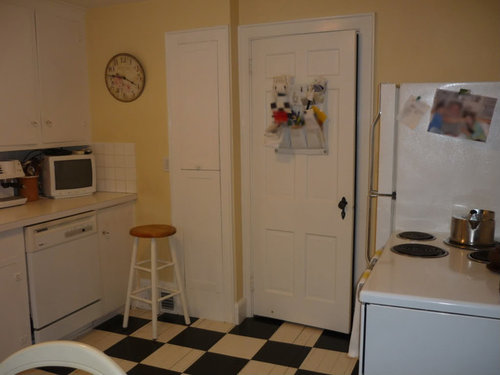
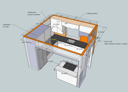
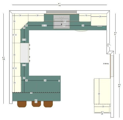
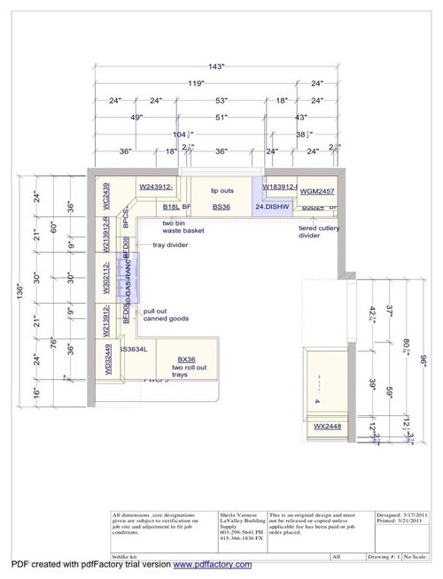
Tiny '20s kitchen returns!! Vote for a layout!
marcolo
13 years ago


Sort by:Oldest
Comments (52)
Related Stories
KITCHEN DESIGNKitchen Layouts: A Vote for the Good Old Galley
Less popular now, the galley kitchen is still a great layout for cooking
Full Story
KITCHEN DESIGNKitchen of the Week: Tiny, Fruitful New York Kitchen
Desserts and preserves emerge from just a sliver of counterspace and a stove in this New York food blogger's creatively used kitchen
Full Story
BATHROOM MAKEOVERSRoom of the Day: Retro Style Returns to a 1930s Bathroom
A compact guest bathroom in Southern California livens up with color, Art Deco details and space savers
Full Story
SMALL HOMESTiny Houzz: A Retractable Bed and Double-Duty Furniture Make It Work
Architecture graduates work with a builder to create a stylish tiny house with an efficient layout and a roomy feel
Full Story
HOUZZ TOURSHouzz Tour: Overhauled Interiors in a Tiny Fisherman's Cottage
Its 1880s structure is protected, but extensive interior damage and a puzzling layout are erased to make this Irish home livable and bright
Full Story
KITCHEN DESIGNHow to Plan Your Kitchen's Layout
Get your kitchen in shape to fit your appliances, cooking needs and lifestyle with these resources for choosing a layout style
Full Story
KITCHEN DESIGNDetermine the Right Appliance Layout for Your Kitchen
Kitchen work triangle got you running around in circles? Boiling over about where to put the range? This guide is for you
Full Story
KITCHEN DESIGNKitchen Layouts: Island or a Peninsula?
Attached to one wall, a peninsula is a great option for smaller kitchens
Full Story
KITCHEN DESIGNKitchen of the Week: Barn Wood and a Better Layout in an 1800s Georgian
A detailed renovation creates a rustic and warm Pennsylvania kitchen with personality and great flow
Full Story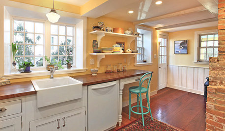
KITCHEN DESIGNKitchen of the Week: Uncovering History in an 1800s Colonial
Brick features from long ago return to prominence, but a raised ceiling and newly open layout set them squarely in the now
Full Story


ideagirl2
lavender_lass
Related Discussions
I swear this is my very last layout for my tiny kitchen
Q
Tiny '20s kitchen, big problem: Marcolo needs layout HELP!
Q
Tiny Kitchen Layout - final countdown
Q
How to fix awkward kitchen layout? Tiny Island? Peninsula? Double Ls?
Q
mtnrdredux_gw
John Liu
dianalo
mtnfever (9b AZ/HZ 11)
laughablemoments
marcoloOriginal Author
honorbiltkit
marcoloOriginal Author
palimpsest
blfenton
User
blfenton
cluelessincolorado
lavender_lass
Buehl
lavender_lass
marcoloOriginal Author
blfenton
marcoloOriginal Author
ncamy
marcoloOriginal Author
Lori Ryan
palimpsest
blfenton
marcoloOriginal Author
ncamy
lavender_lass
juliekcmo
marcoloOriginal Author
lavender_lass
cluelessincolorado
User
marcoloOriginal Author
marcoloOriginal Author
palimpsest
ideagirl2
laughablemoments
John Liu
marcoloOriginal Author
gwgin
gwgin
formerlyflorantha
marcoloOriginal Author
blfenton
marcoloOriginal Author
laughablemoments
lavender_lass
charlikin