


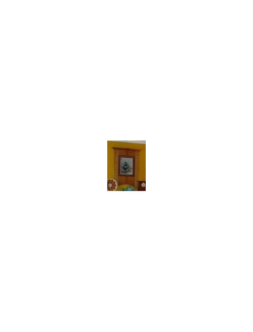
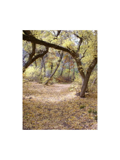
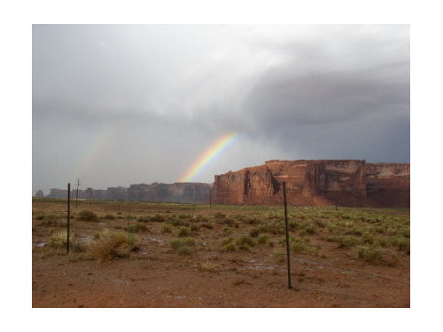
Photo enlargement - please vote!
IdaClaire
15 years ago

Sort by:Oldest
Comments (85)
Related Stories
KITCHEN DESIGNKitchen Layouts: A Vote for the Good Old Galley
Less popular now, the galley kitchen is still a great layout for cooking
Full Story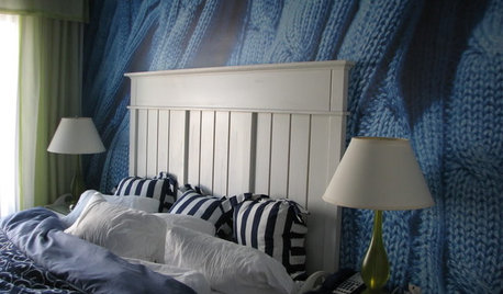
DECORATING GUIDESA Vote for the Cable Stitch in Home Decor
Warm Up a Room With the Look, Feel and Memories of Knitting
Full Story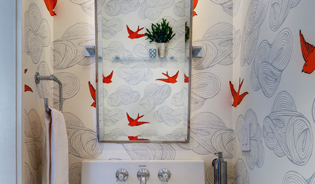
MOST POPULAR102 Eye-Popping Powder Rooms
Flip through our collection of beautiful powder rooms on Houzz and fill your eyes with color and style
Full Story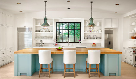
MOST POPULARHouzz TV: Let’s Go Island Hopping
Sit back and enjoy a little design daydreaming: 89 kitchen islands, with at least one for every style
Full Story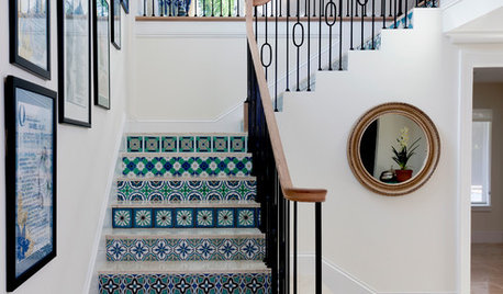
PHOTO FLIP80 Stairways to Design Heaven
Step on up and peruse this collection of spectacularly stylish staircases
Full Story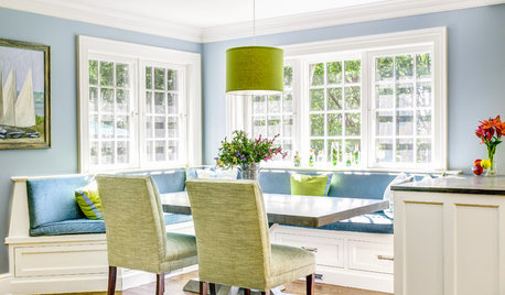
KITCHEN DESIGN91 Kitchen Banquettes to Start Your Morning Right
Slide into one of these stylish breakfast nooks and stay awhile
Full Story
MOST POPULARThe 25 Most Popular Photos Added to Houzz in 2013
See the newly uploaded images of kitchens, bathrooms, bedrooms and more that Houzz users really fell for this year
Full Story
DECORATING PROJECTSWhat to Do With Old Family Photos
Find out how to research, share and preserve images that offer a connection to the past
Full Story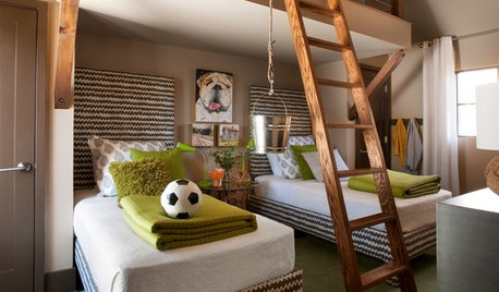
KIDS’ SPACESPhotos of 2013: The Most Popular Kids’ Spaces
Built-in bunk beds, cool colors and other smart design elements offer ideas for kids’ bedrooms, nurseries and playrooms everywhere
Full Story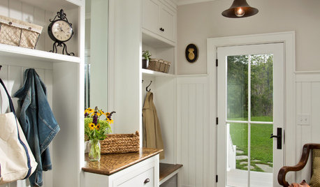
ENTRYWAYSThe Most Popular Entry Photos of 2015
Readers find inspiration in organized mudrooms of every shape and style
Full Story


pam-md
mpwdmom
Related Discussions
Please Vote! Photo 1 or 2?
Q
Countertop gurus - please vote on my countertop (photos!!)
Q
3 Tiles Patterns to Vote on - Only 7 Pictures- please vote
Q
Please vote on two photos!
Q
alisande
juddgirl2
bellaflora
les917
yayagal
IdaClaireOriginal Author
Janice
terezosa / terriks
Janice
threedgrad
flowerpwr45
squirrelheaven
peegee
oceanna
oceanna
peegee
kgwlisa
squirrelheaven
IdaClaireOriginal Author
IdaClaireOriginal Author
IdaClaireOriginal Author
squirrelheaven
IdaClaireOriginal Author
IdaClaireOriginal Author
squirrelheaven
squirrelheaven
IdaClaireOriginal Author
les917
squirrelheaven
IdaClaireOriginal Author
squirrelheaven
IdaClaireOriginal Author
IdaClaireOriginal Author
squirrelheaven
IdaClaireOriginal Author
squirrelheaven
squirrelheaven
lv_r_golden
IdaClaireOriginal Author
squirrelheaven
User
tracey_b
squirrelheaven
squirrelheaven
squirrelheaven
leahcate
squirrelheaven
squirrelheaven