


What color should I paint my kitchen?
try_hard
15 years ago


Sort by:Oldest
Comments (31)
Related Stories
LIFEYou Said It: ‘Just Because I’m Tiny Doesn’t Mean I Don’t Go Big’
Changing things up with space, color and paint dominated the design conversations this week
Full Story
ENTRYWAYSHelp! What Color Should I Paint My Front Door?
We come to the rescue of three Houzzers, offering color palette options for the front door, trim and siding
Full Story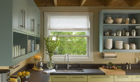
MOST POPULAR8 Great Kitchen Cabinet Color Palettes
Make your kitchen uniquely yours with painted cabinetry. Here's how (and what) to paint them
Full Story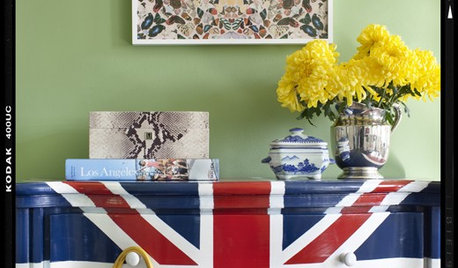
DECORATING GUIDESI Spy: Union Jacks
British Flag Adds a Graphic Punch via Pillows, Paintings, Rugs and Furniture
Full Story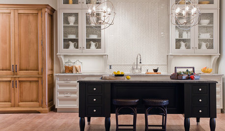
KITCHEN DESIGNYour Kitchen: Mix Wood and Painted Finishes
Create a Grounded, Authentic Design With Layers of Natural and Painted Wood
Full Story
KITCHEN DESIGNWhy Your Kitchen Wants Its Own iPad
Cooking-school gateway, recipe database, foodie networking ... an iPad in the kitchen has uses far beyond being a message center
Full Story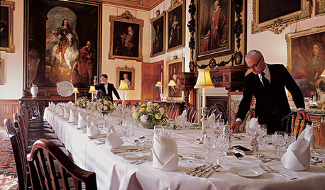
FUN HOUZZEverything I Need to Know About Decorating I Learned from Downton Abbey
Mind your manors with these 10 decorating tips from the PBS series, returning on January 5
Full Story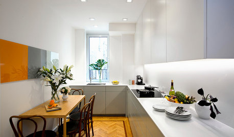
SMALL KITCHENSKitchen of the Week: Space-Saving Tricks Open Up a New York Galley
A raised ceiling, smaller appliances and white paint help bring airiness to a once-cramped Manhattan space
Full Story
COLOR12 Tried-and-True Paint Colors for Your Walls
Discover one pro designer's time-tested favorite paint colors for kitchens, baths, bedrooms and more
Full Story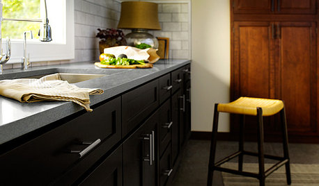
KITCHEN DESIGNAre You Ready for a Dark and Sophisticated Kitchen?
Black kitchen cabinets have a rich, timeless look. Get ideas for your next cabs — and how to paint the ones you have
Full Story

try_hardOriginal Author
htnspz
Related Discussions
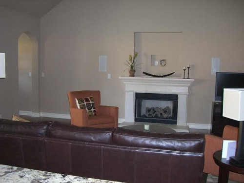
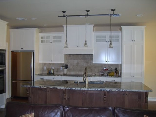
what color should i paint my kitchen
Q
What color should I paint my kitchen to make it brighter?
Q
What color should I paint my kitchen?
Q
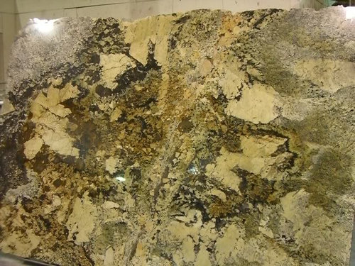
What color should I paint my kitchen cabinets with Taj Mahal quartzite
Q
htnspz
try_hardOriginal Author
msrose
amysrq
midwestmom
bellaflora
try_hardOriginal Author
try_hardOriginal Author
bellaflora
try_hardOriginal Author
cathrugg
try_hardOriginal Author
CaroleOH
les917
try_hardOriginal Author
Arapaho-Rd
try_hardOriginal Author
msrose
msrose
msrose
randita
designer4life
dana1079
msrose
queenofmycastle0221
judithn
rekhatrip
dreamywhite
tess70