


Need to figure things out ASAP! :)
anele_gw
11 years ago


Sort by:Oldest
Comments (42)
Related Stories

Figure Out Your Art Style
Bemoaning bare walls but flummoxed by all the choices for art? Here's help deciding on a style
Full Story
PRODUCT PICKSGuest Picks: Graphic Geometrics Figure Into Decor
Show good form by factoring the shapely patterns trending in 2013 into your interior decorating
Full Story
DECORATING GUIDESFigured Velvet Piles On a Luxurious Look
When is it enviable to be a little loopy? When the loops comprise a gorgeously textured fabric like this one
Full Story
DOORSDiscover the Ins and Outs of Pocket Doors
Get both sides of the pocket door story to figure out if it's the right space separator for your house
Full Story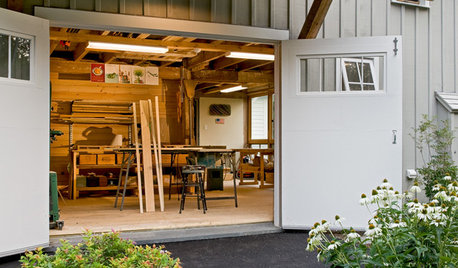
LIFEStressed Out? Try Hitting the Woodshop
Building things with your hands just might boost your mood while giving you personal new pieces for your home
Full Story
LIVING ROOMSHow to Decorate a Small Living Room
Arrange your compact living room to get the comfort, seating and style you need
Full Story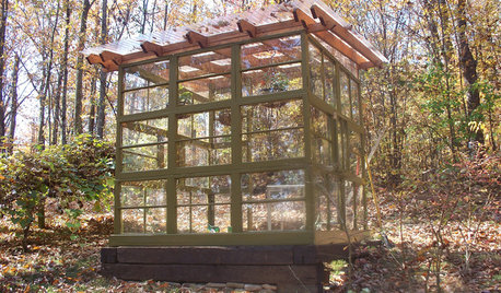
GARDENING AND LANDSCAPINGSee a Family Greenhouse Grown From Scraps
Can-do resourcefulness and less than $400 lead to a new 8- by 8-foot home for plants on a Tennessee family's property
Full Story
LIFE7 Things to Do Before You Move Into a New House
Get life in a new house off to a great start with fresh paint and switch plates, new locks, a deep cleaning — and something on those windows
Full Story
MOVINGHome-Buying Checklist: 20 Things to Consider Beyond the Inspection
Quality of life is just as important as construction quality. Learn what to look for at open houses to ensure comfort in your new home
Full Story
REMODELING GUIDESContractor's Tips: 10 Things Your Contractor Might Not Tell You
Climbing through your closets and fielding design issues galore, your contractor might stay mum. Here's what you're missing
Full Story


roarah
roarah
Related Discussions
Help! Told I need to pick out floor ASAP.
Q
Need help figuring this out
Q
I need some help figuring out how to lay out this kitchen
Q
Need help figuring out how to make my house feel less "busy"
Q
anele_gwOriginal Author
roarah
funkyart
anele_gwOriginal Author
chickadee2_gw
SaraKat
roarah
roarah
Oakley
Annie Deighnaugh
yayagal
Tmnca
anele_gwOriginal Author
User
anele_gwOriginal Author
erinsean
anele_gwOriginal Author
User
yayagal
User
daisychain01
anele_gwOriginal Author
funkyart
anele_gwOriginal Author
roarah
fripper
dilly_ny
anele_gwOriginal Author
daisychain01
erinsean
anele_gwOriginal Author
Boopadaboo
anele_gwOriginal Author
erinsean
funkyart
anele_gwOriginal Author
roarah
Boopadaboo
funkyart
patty_cakes