


Can you please offer an opinion on my furniture fabrics?
ontariomom
10 years ago


Sort by:Oldest
Comments (26)
Related Stories

DECORATING GUIDESNo Neutral Ground? Why the Color Camps Are So Opinionated
Can't we all just get along when it comes to color versus neutrals?
Full Story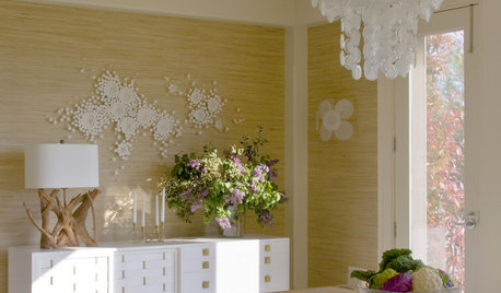
DECORATING GUIDES'Soft Modern' Style Offers Best of Both Worlds
Mix in a few curves and soft colors but nix the clutter, and the happy result is a balanced new take on modern design
Full Story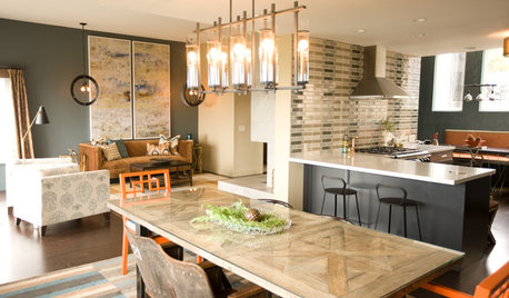
KITCHEN DESIGNKitchen of the Week: Navy and Orange Offer Eclectic Chic in California
Daring color choices mixed with a newly opened layout and an artful backsplash make for personalized luxury in a San Francisco kitchen
Full Story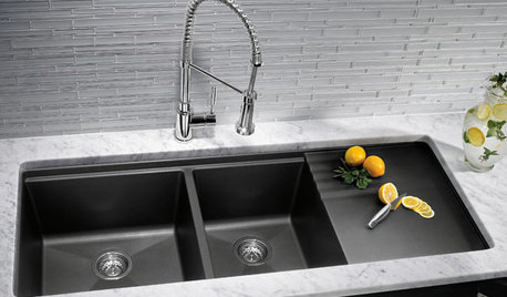
KITCHEN DESIGNKitchen Sinks: Granite Composite Offers Superior Durability
It beats out quartz composite for strength and scratch resistance. Could this kitchen sink material be right for you?
Full Story
DECORATING GUIDESWoven Works of Art: Mexican Textiles Offer Rich Hand-Crafted Style
For colorful embroidery and patterns to decorate furniture, accessories and even walls and floors, look to the indigenous people of Mexico
Full Story
DECORATING GUIDESICFF Booth Designs Offer Lessons on Style
Exhibitors at the 2012 International Contemporary Furniture Fair show that color and creativity aren't limited to the products on display
Full Story
WALL TREATMENTSBeadboard Panels Offer a Shortcut to a Classic Style
Traditional touch: Change up plain bathroom walls with beaded hardwood planks and trim you can install yourself
Full Story
BATHROOM DESIGNLight-Up Mirrors Offer Bright Design Solutions
If you're taking a dim view of a problem bathroom area, try the flash of design brilliance that is the electric mirror
Full Story
WINDOW TREATMENTSSmall Luxuries: Motorized Window Coverings Offer Benefits to All
Free yourself from the mess of cords and the bother of blind rods. Motorized blinds and drapes make managing natural light easy
Full Story
INSIDE HOUZZInside Houzz: New Data Offer Insights on Landscaping Trends
Homeowners are looking to manage water and add more enjoyment to their landscapes, according to a new Houzz survey
Full Story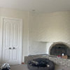
deeinohio
ontariomomOriginal Author
Related Discussions
please help my with my curtains!!! need opinion please!
Q
Opinions needed please - furniture 'feet' in kitchen or not?
Q
Can I please get your opinions of my kitchen design
Q
My Guest Room, Opinions & Suggestions PLEASE!
Q
yayagal
ontariomomOriginal Author
cawaps
User
ontariomomOriginal Author
corgimum
tibbrix
RNmomof2 zone 5
mtnrdredux_gw
ontariomomOriginal Author
lovestowalk
ontariomomOriginal Author
tibbrix
ontariomomOriginal Author
tibbrix
tibbrix
User
ontariomomOriginal Author
ontariomomOriginal Author
nepool
yayagal
ontariomomOriginal Author
nepool
ontariomomOriginal Author