


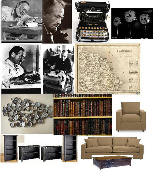
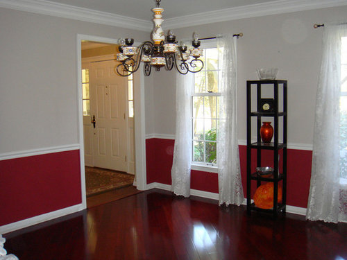
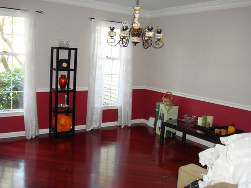
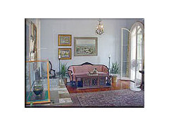
Reading Room/Home Library - Paint Color Help!
azwildcats70
14 years ago
Featured Answer
Sort by:Oldest
Comments (53)

ttodd
14 years agoazwildcats70
14 years agoRelated Discussions
Help with paint colors...home office and powder room
Comments (8)momtoseth, thank you, that is a beautiful color! (love the decor as well!) I am going to have to sample that color as well. And thanks to both Laurie and dawnp for pics of the mineral alloy nursery. I do like the color, just hoping it's not too "blue". I still want to paint up a sample board and place it in the room before I decide for sure. Thank you all again! :)...See MoreJingle all the Way to the Library-December 'What are you reading?
Comments (150)I withdraw what I said earlier about James lee Burke's Swan Peak being disappointing. I finished listening to it yesterday as I spent 10 hours driving from Tennessee to Baltimore (an hour or so in dense fog at both ends.) SPOILER ALERT!!!!!!!!!!!!!!!!!!!!The character introduced as a depraved bully and for whom I could see no redemption, became the man on whom I pinned hopes at the end. At some point I realized he was our hero David Robicheaux with a slightly different childhood. His violence was not different from Robicheaux's, but his primary victims were. The novel made me question my previous acceptance of Robicheaux's violence as nasty but necessary. The novel does strike me as the final David Robicheaux installment. Carolyn, I know you read it. What did you think? SPOILER OVER I also finished Wodehouse's The Code of the Woosters which had me laughing aloud....See MoreHelp with ceiling paint color for cinnamon-colored library/office
Comments (23)OK, it took me a while to get up the nerve to try color on the ceiling then to test samples. Hubbard Squash was too peachy. I didn't try turquoises/teals because those don't fit with the rest of my house or the rug that will go in the office (cream, rust, navy, and olive). That left sky blues. After several samples and time spent lying on the floor looking at sample boards propped on top of the bookcase, I ended up using SW Open Air. Here's a photo of the work in progress. The blue looks a little more violet in the photo than in person. I'll post another photo after the room is all together but I like the blue ceiling better than the off white. Thanks!...See MoreHelp with dining room and library room!
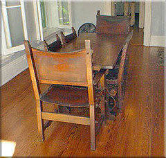
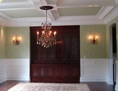
Comments (6)Start by centering the table under the fan (chandelier) and taking exact measurements of both rooms and all openings. Draw a scale floor plan on grid paper, writing the measurements clearly so we can see them. Do you have any other furniture pieces you plan to use here? If so, bring them in and place them somewhere, removing any pieces you do not want to use. Take new pix, upload a shot of the proposed chandelier, and we'll get started....See Morejolynna
14 years agoazwildcats70
14 years ago
justgotabme
14 years agojolynna
14 years agosweeby
14 years agopowermuffin
14 years agoazwildcats70
14 years agoazwildcats70
14 years agosweeby
14 years agotomorrowisanotherday
14 years agoazwildcats70
14 years agoazwildcats70
14 years agoazwildcats70
14 years agoazwildcats70
14 years agosusanilz5
14 years agopeaches12345
14 years ago
amykath
14 years agoazwildcats70
14 years agopatty_cakes
14 years agoazwildcats70
14 years agosis3
14 years agogreenthumbfish
14 years agobuyorsell888
14 years agopatty_cakes
14 years ago
Kathleen McGuire
14 years agoyborgal
14 years agopatty_cakes
14 years agobronwynsmom
14 years agomahatmacat1
14 years agoscanmike
14 years agoscanmike
14 years agopatty_cakes
14 years agoloribee
14 years agoazwildcats70
14 years agottodd
14 years agoamykath
14 years agoazwildcats70
14 years agopatty_cakes
14 years agoscanmike
14 years ago
angiedfw
14 years agocatkin
14 years agoloribee
14 years agoKathleen McGuire
14 years agopps7
14 years agobronwynsmom
14 years ago
redbazel
14 years agoazwildcats70
14 years ago


Related Stories

COLORPick-a-Paint Help: How to Create a Whole-House Color Palette
Don't be daunted. With these strategies, building a cohesive palette for your entire home is less difficult than it seems
Full Story
HOUZZ TOURSMy Houzz: Saturated Colors Help a 1920s Fixer-Upper Flourish
Bright paint and cheerful patterns give this Spanish-style Los Angeles home a thriving new personality
Full Story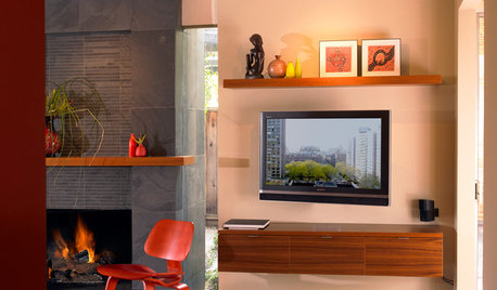
DECORATING GUIDESDecorate With Intention: Helping Your TV Blend In
Somewhere between hiding the tube in a cabinet and letting it rule the room are these 11 creative solutions
Full Story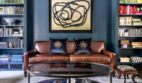
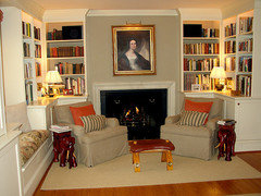
MORE ROOMSDeep Color Soothes in a Favorite Reading Room
A wood-burning fireplace, beloved collections and comfortable seating make this library a family favorite
Full Story
ARCHITECTUREHouse-Hunting Help: If You Could Pick Your Home Style ...
Love an open layout? Steer clear of Victorians. Hate stairs? Sidle up to a ranch. Whatever home you're looking for, this guide can help
Full Story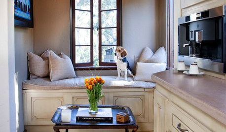
FEEL-GOOD HOME15 Cozy Book Nooks and What They Want You to Read
Put the beach reads away; these comfy spaces are creating a fall reading list. What books do they suggest to you?
Full Story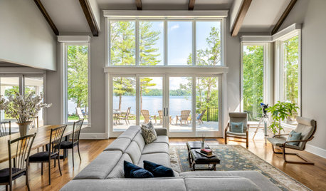
DECORATING GUIDESCould a Mission Statement Help Your House?
Identify your home’s purpose and style to make everything from choosing paint colors to buying a new home easier
Full Story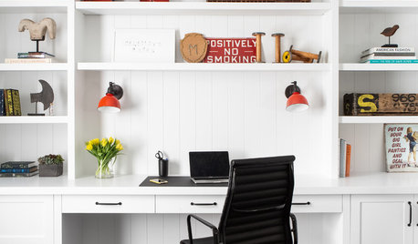
REMODELING GUIDESKey Measurements to Help You Design the Perfect Home Office
Fit all your work surfaces, equipment and storage with comfortable clearances by keeping these dimensions in mind
Full Story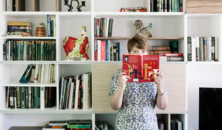
HOMES AROUND THE WORLDWorld of Design: 11 Book Lovers and Where They Like to Read
Bibliophiles across the globe reveal their top books and favorite reading spots, from a 2-story library to an artfully curated book nook
Full Story
COLORColor Palette Extravaganza: Room-by-Room Help for Your Paint Picks
Take the guesswork out of choosing paint colors with these conveniently collected links to well-considered interior palettes
Full Story


patty_cakes