


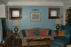
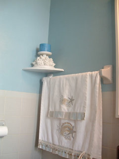
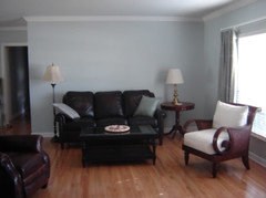
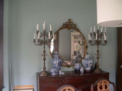
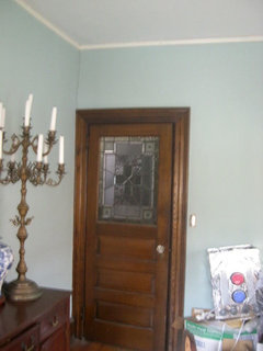
Why is blue green almost impossible to work with?
jockewing
15 years ago
Featured Answer
Sort by:Oldest
Comments (29)

threedgrad
15 years agojockewing
15 years agoRelated Discussions
Every old bud died on my Nikko Blue. Why why why?
Comments (5)I had the same problem this year with a florist hydrangea that I've been trying for years to get blooms out of. I did the same as you, just kind of wrapped it in burlap, and surrounded it with bags of leaves and covered it with pine needles. Like you, when I uncovered the plant, I had lots of bright, healthy green buds, most of which shrivelled up and fell off within weeks. It could be that even though it seemed warm enough to me to uncover the plant, it may have been too early for the hydrangea. However, more likely as Luis points out, the straw or in my case pine needles and bags just didn't provide as much protection as it needed once everything settled beneath months of snow, and rain. Anyway, sorry that happened, I know how frustrating it is. The links Luis provided have great information, I read a lot of Hayseedman's thread last fall and will probably try some different methods this coming fall again. If I haven't moved by then, in which case it will be someone else's problem. :p...See MorePenninsula lighting - why is it so impossible to decide?!
Comments (12)Hey Cathy - aren't you the one that offered to be my "reno buddy" ?? It's fun to have someone else on the same schedule with me. Ours starts Monday (eeek, gulp, breath!!!) I think your light suggestion is also what my gut is telling me. I'll be sorry if I don't go with task lighting. I like the Charleston's a lot so I don't feel like I'm settling - but I did love the onion lights for more of a statement. Maybe I will find another place to use them elsewhere in the house - or outside on a decking post of the new deck my husband PROMISES to build me once the kitchen is done. All I can say is, start packing your kitchen up gradually. I way under-estimated how long it would take to pack up my kitchen. I"m also cleaning everything as I go, combining spices that I have multiple of... Yesterday was trash day and we filled about 8 bags full of "junk" that we do not want to clutter up the new kitchen with. I had all my medicine tucked into a kitchen cabinet - so it was a good chance to review all the expiration dates of everything and PURGE! Out with the old - in with the NEW!...See MoreWhy all the green?
Comments (42)This is a very interesting thread! I have liked green (light apple, celery greeen) for a long time. As one of the members mentioned, it was hard to find this color in clothing before, and when I did(shirts or blouses) I would buy it. I am so glad is trendy now. I painted my bedroom about three years ago in a celery green (the walls had two tones-a darker and lighter one). At the same time, I also painted the bathroom. I still love it in both rooms. In the bedroom, it makes my mahogany furniture look great, and the room look so much warm and calm. I recently painted my living room in a soft, apple green (I mixed it with brown to get something close to a soft-yellow-olive green. I loved the color that I got!. It is warm, inviting, and everything comes to life with the color cause it is very cheery. My adjoining room is the dining room and it is in red! so it looks great. I am even thinking of painting the wall next to the living room in green and leaving only one wall of the Dining Room in red. I am re-painting my bedroom, and the bathroom in the same color as the living room. I would have to confess though.........that I wouldnt probably have done the living room, if it wasn´t so trendy now. I am sure that a lot of us usually pick a ¨save¨color in the living room that would go with anything and everything, but I see green in my house for a long time now, even when will not be as trendy! Cause the good thing about green family is a very flexible color, and all the accent colors look great!...See MoreWhy Blue?
Comments (1)Well I'm NOT a blue person. Indoors I have NO blue. My husband doesn't understand this. I have no idea why I feel this way. Outdoors things are different! I have a blue/yellow/white garden bed which I love. Yes, delphineums, catananche, campanulas, baptisia and more, are mixed with trollius, coreopsis moonbeam, peony Claire de Lune and low growing white clematis and aquilegia. It is a big mix and wouldn't be any fun at all without the blue! There are loads of clematis that are purple or blue/purple, but also some very nice blues I think. You do get into the question of "what is blue?" My husband and I think this could well be a male/female issue! Also, by saying a flower is blue, perhaps a catalogue gains more sales? * Posted by: coolbeans (My Page) on Sat, Feb 2, 02 at 13:12 This is my VERY favorite thread, and I totally agree with all those who feel that there is just "something" about blue flowers; they ARE magical, they ARE very special; and they make me happier than any other color flower. Don't know why...I just started a flat full of Bluebird delphinium seeds I saved from my one lonely plant last year. A bunch of them germinated, so now I can't wait to have a huge stand of them! Maybe they won't bloom this year, but maybe they will. And also "true blue" penstemons, I'm trying for the first time. I can't get enough of this precious color. * Posted by: Anne_Marie_Alb (My Page) on Tue, Feb 5, 02 at 17:47 WOW....... Did anyone realize that this thread started almost 5 years ago... on Feb. 15, 1997!!!!! I am amazed it has survived that long. Probably, the oldest thread still on the top page! I wonder if "Clare B" (who started the thread) is still an active member of the Garden Web!!! I personally love blue flowers (I mean blue, and not purple, which I also like). I can't believe how many blue flowers I am starting from seeds this year... and that was just a pure coincidence! I also love RED flowers.. Maybe, I should start a "red flower" thread! I will first check the archives! * Posted by: Clare (My Page) on Thu, Feb 7, 02 at 20:34 Yes, Ann_Marie, I am still here! I will be a bit sad to see this thread fade away when it hits the 100 posts mark. After that, the threads are closed. I don't think I have any true blue flowers still. "Victoria Blue" Salvia is the closest thing. I use it a lot. It is such a heavy, long bloomer, and about one in twenty of them will survive winter here. Just wish I could predict which would survive so that I could save seed from those alone and perhaps work up a more hardy strain. By the way, the Hydrangeas in Memphis, Tennessee are incredible. Some are so saturated blue that I'd have to call them navy. * Posted by: Dswan (My Page) on Sat, Feb 9, 02 at 22:37 I'm going to add to this extremely long thread only because there really is something to true blue. I grow from seed a very difficult plant to propagate called Penstemon cyananthus or Wasatch Penstemon. I cold stratify and plant these every year in hopes of gettting one or two in my garden every year. Absolutely gorgeous. * Posted by: Rosa (My Page) on Mon, Mar 11, 02 at 10:24 Did no one mention Gentians-now those are blue! (along with my favorite penstemson of course-some are indeed blue). * Posted by: pineshade7b ) on Mon, Apr 15, 02 at 11:02 i agree with gloria mc coy. i love blue and green , they are my favorite colors in anything. just look in my house and closets. blue..ocean, blue jeans, my own eyes are blue and my husband's are green. many reasons to answer -why blue. although i do not "hyperventilate" , if i should go into a nursery and ask for a blue -flowering plant and the staff looks down their nose at me, i'll know now that they are only doing it because they think I'M a snob. until i adopted gardening as a serious hobby i had no idea that blue was a "snob" color. i just naturally began to look into flowers in the colors i liked personally. you learn something new everyday. i would have been hurt and confused to walk into a nursery and be looked at like a pariah, what did i say? now i know, thanks clare. * Posted by: DesertGardner (My Page) on Fri, Apr 19, 02 at 12:38 Wow - I never knew there was such a controversy over the color blue in the garden. After reading all the posts, I now understand why some gardeners prefer the color. And I have to say that I've never met any gardeners whom I would consider snobbish. Most of them are really quite down to earth! (if you pardon the expression...) I recently tried planting a red, white and blue flower bed, with 'Victoria Blue' Salvia being my blue color. It's a little too purple and doesn't look right as a "patriotic" design. I will probably tear out the red and white and keep the "blue" (purple) since it seems to like this desert heat. Someone mentioned black flowers, and I remembered seeing black pansies in the most recent Burpee catalog. They're a beautiful velvety black with a spot of yellow in the center. I think I'll plant some this winter, and start an obsession with black flowers! (just kidding Clare...) -Kara [* Posted by: yeona_sky (My Page) on Mon, Jun 24, 02 at 0:37 I just bought a blue poppy and am nervously watching its progress. My success with blues has been an up hill battle, but that hasn't changed my desire to spotlight it in my garden. Why blue?, again it's a passion with me. Clare, I hope you get the last word on this thread, and I hope you understand Why blue, a little better. * Posted by: Duster (My Page) on Wed, Jun 26, 02 at 23:56 I agree with the many others about getting annoyed when purple is referred to as blue. Maybe that's why I take up the cause of truly blue flowers! 99% of my Delphiniums are the true electric blue ones. I'd love one of the Himalayan Poppies but just not right for my little yard. I like the blue flowers, rather than the blue foliage plants. And no, blue is NOT my favorite color - I have nothing blue in my home decor. I just like the uniqueness of the TRUE blue and my stubbornness to get people to stop calling it purple!!!!...See More
judiegal6
15 years agojockewing
15 years agojudiegal6
15 years agorunninginplace
15 years agojockewing
15 years agoparma42
15 years agoronbre
15 years ago
DLM2000-GW
15 years agobudge1
15 years agokelpmermaid
15 years agomclarke
15 years agopumpkin_spice
15 years agottodd
15 years agosis3
15 years agorebeccainchicago
15 years agobudge1
15 years agojockewing
15 years ago
graywings123
15 years agooceanna
15 years agorunninginplace
15 years agorebeccainchicago
15 years agorebeccainchicago
15 years ago
redbazel
15 years agottodd
15 years agokailleanm
15 years agobronwynsmom
15 years ago


Related Stories
COLOR5 Ways to Go Bold With (Almost) All White
Take away color to gain focus on textures and interesting details and create a purely relaxing mood
Full Story
HOUZZ TOURSMy Houzz: Family of 5 Lives (Almost) Clutter Free
Smart decor decisions and multipurpose items help this San Francisco family keep things tidy
Full Story
GARDENING AND LANDSCAPINGScreen the Porch for More Living Room (Almost) All Year
Make the Most of Three Seasons With a Personal, Bug-Free Outdoor Oasis
Full Story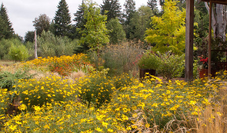
FLOWERSGreat Design Plant: Zagreb Tickseed Takes Care of Itself (Almost)
Get colorful drama along with deer resistance, drought tolerance and low maintenance — plus a butterfly or two
Full Story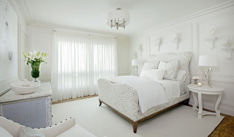
BEDROOMS10 Ways With (Almost) All-White Bedrooms
White rooms need a thoughtful tweak or two to bring on the sweet dreams
Full Story
MODERN HOMESHouzz TV: Seattle Family Almost Doubles Its Space Without Adding On
See how 2 work-from-home architects design and build an adaptable space for their family and business
Full Story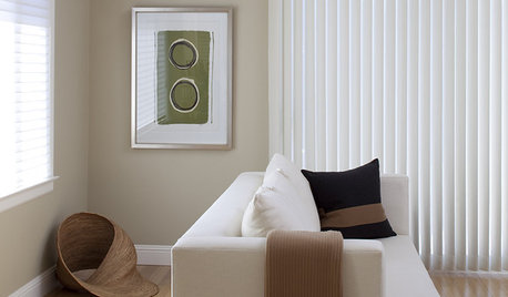
BROWNBeige to Almost Black: How to Pick the Right Brown
Warm your home with paint the color of lattes, espresso and chocolate
Full Story
PRODUCT PICKSGuest Picks: 20 Fab Outdoor Finds, Almost All Under $100
Sprinkle these budget-friendly furniture, decor and tableware pieces around a porch or patio for an easy warm-weather update
Full Story
NEUTRAL COLORSSoothing, Almost-Neutral Bedrooms
You don't have to go all-neutral for a relaxing bedroom. If color is calling your name, here are some ways to answer
Full Story
SHOP HOUZZShop Houzz: How to Decorate With Blue Paisley
Cool shades of blue-green work wonders with neutrals and warm hues
Full Story


bluekitobsessed