


Question About Paint Colors for Office
User
11 years ago
Featured Answer
Sort by:Oldest
Comments (20)

patricianat
11 years agoUser
11 years agoRelated Discussions
Question about tumbled marble back splash and paint color ?
Comments (5)Hi live wire oak, the back splash is gray and white but my lighting in the kitchen makes everythng look more warm or yellow tone for some reason (fluorescent). I really don't like an orangeish tone at all, the laminate counter has no orange in it but beige, black and gray. here's another photo of the back splash and counter....See MoreFuncolors-- Question about color matching one paint brand to anot
Comments (2)Can depend on the color. Valspar premium is very nice paint. Recently used it to repaint kid #2's room. Got a wild hair late Friday night, went and bought paint so I could paint Saturday morning. I would get my LA color in Valspar premium just to keep it simple. But if you want to use Aura, which I understand, then BenM should be able to do match. As we all know, crossing brands with color is always a risk so it's a matter of making your best guess about the right channel to choose to get your color....See MoreLoribee, question about one of your paint colors
Comments (3)THANK you... I was just reading the thread about choosing color vs bold and I was the only one who said play it safe and go neutral. Thought there was something wrong with me...or maybe my age is showing, lol. Thanks :)...See MoreWhere to ask questions about designing a home office?
Comments (2)Look at Diamond or Kraftmaid for the distressed black. But you'll pay a pretty penny for distressed black from anyone. For an office area, I'd recommend a wood over a painted surface. It wears better. If you want dark cabinets, look at doing an oak in something like a peppercorn stain. Oak is a standard charge wood and you'll save a LOT of money going that route. For the counter, look at doing a Corian. It's a great warm surface to work on as long as no one uses a utlity knife to score paper on it. (Yes, I had an intern do that.) Or look at laminate. There are some really beautiful laminate colors out there right now....See More
Oakley
11 years agoUser
11 years agobronwynsmom
11 years agoVertise
11 years agoOakley
11 years agoUser
11 years ago PRO
PROLori A. Sawaya
11 years agoUser
11 years agobronwynsmom
11 years ago- PRO
Lori A. Sawaya
11 years ago bronwynsmom
11 years agoThe3DGenie
11 years ago- PRO
Lori A. Sawaya
11 years ago The3DGenie
11 years agoUser
11 years agobronwynsmom
11 years agoUser
11 years ago
Related Stories
COLORBye-Bye, Minimalist White — The New Nordic Style Is All About Color
The Scandinavian color palette is moving away from pale, cool shades with hot new hues on walls and floors
Full Story
EXTERIORSCurb Appeal Feeling a Little Off? Some Questions to Consider
Color, scale, proportion, trim ... 14 things to think about if your exterior is bugging you
Full Story
REMODELING GUIDES9 Hard Questions to Ask When Shopping for Stone
Learn all about stone sizes, cracks, color issues and more so problems don't chip away at your design happiness later
Full Story
GREEN BUILDINGConsidering Concrete Floors? 3 Green-Minded Questions to Ask
Learn what’s in your concrete and about sustainability to make a healthy choice for your home and the earth
Full Story
MOST POPULAR8 Questions to Ask Yourself Before Meeting With Your Designer
Thinking in advance about how you use your space will get your first design consultation off to its best start
Full Story
WORKING WITH PROS10 Things Decorators Want You to Know About What They Do
They do more than pick pretty colors. Here's what decorators can do for you — and how you can help them
Full Story
BEDROOMSHouzz Quiz: What Color Should You Paint Your Bedroom Walls?
Cool and soothing, or warm and spicy? Answer these questions and learn what hue is right for you
Full Story
COLORHave You Heard the Hues? 15 Colors You May Not Know About
Name-drop these shades at holiday parties — or better, try one on your walls — and expand your palette possibilities
Full Story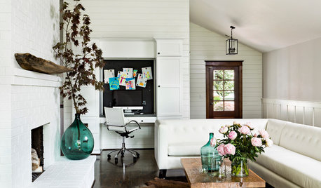
COLORYou Said It: ‘Adding Color Is About So Much More Than Shock’ and More
Highlights from the week include color advice, Houzzers helping Houzzers and architecture students building community housing
Full Story
REMODELING GUIDESSurvive Your Home Remodel: 11 Must-Ask Questions
Plan ahead to keep minor hassles from turning into major headaches during an extensive renovation
Full Story


decornewbie