


Need help with Turquoise, Tomato & Toile master suite
hostalover67
15 years ago
Related Stories
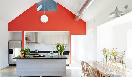
COLOR10 Reasons to Make a Splash With Tomato Red
You won’t duck at these tomatoes. See how bold red shades can play up architecture, light up a dark spot and add drama
Full Story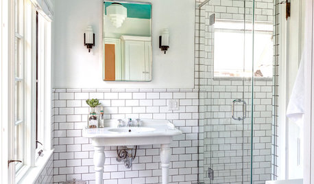
BATHROOM DESIGNRoom of the Day: A Splash of Turquoise in a Vintage-Inspired Bath
An Ohio couple’s Victorian-era home and love for art deco style shape their new master bathroom
Full Story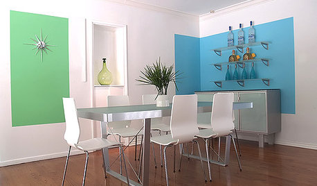

TURQUOISEFavorite Color Combinations: Turquoise and Red
Give your interiors added brilliance and fun with this bright color pairing in your accessories and design
Full Story
DECLUTTERINGDownsizing Help: Choosing What Furniture to Leave Behind
What to take, what to buy, how to make your favorite furniture fit ... get some answers from a homeowner who scaled way down
Full Story
COLORPick-a-Paint Help: How to Quit Procrastinating on Color Choice
If you're up to your ears in paint chips but no further to pinning down a hue, our new 3-part series is for you
Full Story
HOUZZ TOURSMy Houzz: Saturated Colors Help a 1920s Fixer-Upper Flourish
Bright paint and cheerful patterns give this Spanish-style Los Angeles home a thriving new personality
Full Story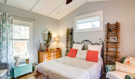
BEDROOMSRoom of the Day: From Laundry Room to Shabby Chic-Style Master Suite
A Florida bungalow addition mixes modern amenities with pieces of the past, thanks to a homeowner’s love for using old things in new ways
Full Story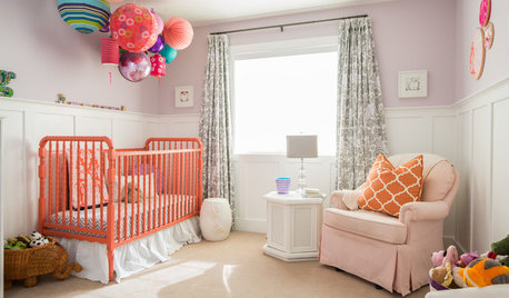
COLOR10 Reasons to Love Coral
A little goes a long way with this cheery and unexpected color. See how coral brightens rooms from the nursery to the master suite
Full Story
COLORCatch a Splash of Ocean Blue This Summer
Dip a toe into cobalt or take on turquoise at full blast for rooms that soothe, energize and feel as breezy as the beach
Full StorySponsored


newdawn1895
threedgrad
Related Discussions
master bdrm color/and selling..HELP!
Q
black and white toile needs freshening
Q
Master redo – brainstorming and need feedback
Q
Is high gloss light turquoise / blue ceiling too daring?
Q
hostalover67Original Author
mitchdesj
hostalover67Original Author
yayagal
hostalover67Original Author
msrose
lkplatow
parma42
hostalover67Original Author
sweeby
tgd2008
hostalover67Original Author
kathleenca
tgd2008
hostalover67Original Author
bepeace
les917
hostalover67Original Author
tgd2008
joanie_b
hostalover67Original Author
kswl2
hostalover67Original Author
kswl2
lorriekay
flyingflower
hostalover67Original Author
hostalover67Original Author
joanie_b
nanny2a
hostalover67Original Author
Circus Peanut
tgd2008
bettycbowen
ronbre
nanny2a
Ideefixe
kaycee_ann
hostalover67Original Author
parma42
hostalover67Original Author
ttodd