


How would you decorate around this rug?
stinky-gardener
14 years ago
Sort by:Oldest
Comments (28)
Related Stories
DECORATING GUIDES11 Wonderful Ways to Use Wool Around the Home
Natural and durable, wool is a stylish and practical choice for upholstery, rugs and bedding
Full Story
MORE ROOMSDesign Dilemma: Decorating Around an Open Entryway
How Would You Design This Narrow Space?
Full Story
DECORATING GUIDESWorld of Design: Decorating Ideas From 10 Renters Around the Globe
Even if you don’t own your home, you can live beautifully. Browse these ideas from international tenants who’ve made their spaces special
Full Story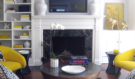
MORE ROOMS5 Ways to Decorate Around a Flat-Screen TV
Color, Placement and Accessories Help that Big Black Screen Blend In
Full Story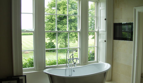
DECORATING GUIDESDecorating Around the World: British Style Charms Any Home
Whether you want country home style or the look of a luxurious loft, something British might be just your cup of tea
Full Story
DECORATING GUIDESDecorating Around the World: Hip and Trendy Vancouver
Natural beauty gets a cosmopolitan edge in this Canadian city that keeps its eye firmly on design style
Full Story
DECORATING GUIDESDecorating Around the World: Turkish Delight
Whether clad in wild patterns or bathed in all white, rooms with a Turkish spirit conjure a delicious air of the exotic
Full Story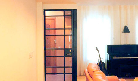
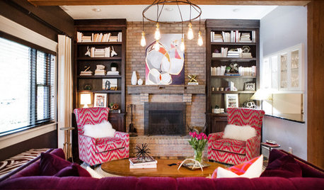
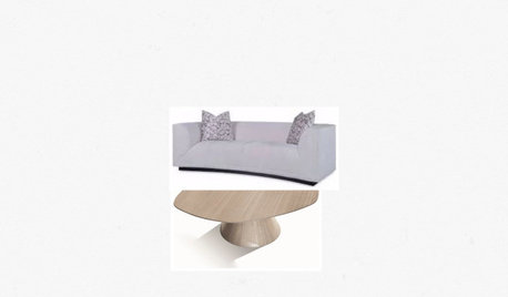
LIVING ROOMSNew This Week: 3 Ways to Work Around a Living Room Fireplace
The size, location and materials of many fireplaces present decorating challenges. Here are a few solutions
Full Story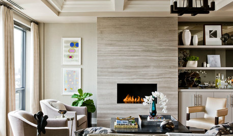
DECORATING GUIDES6 Focal Points to Build a Beautiful Interior Around
Not sure what element to make the attention getter in your room? Find some great choices here
Full Story

palimpsest
palimpsest
Related Discussions
How would you decorate around this rug?
Q
How would you decorate a room around this cushion?
Q
How would you find this rug? Would you call it a variegated knot rug?
Q
How would you decorate this entry?
Q
vampiressrn
justgotabme
stinky-gardenerOriginal Author
User
stinky-gardenerOriginal Author
yborgal
User
parma42
teacats
bestyears
palimpsest
cooperbailey
stinky-gardenerOriginal Author
stinky-gardenerOriginal Author
holleygarden Zone 8, East Texas
Ideefixe
stinky-gardenerOriginal Author
palimpsest
palimpsest
justgotabme
loribee
msrose
stinky-gardenerOriginal Author
amysrq
stinky-gardenerOriginal Author
parma42