


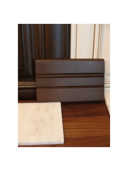
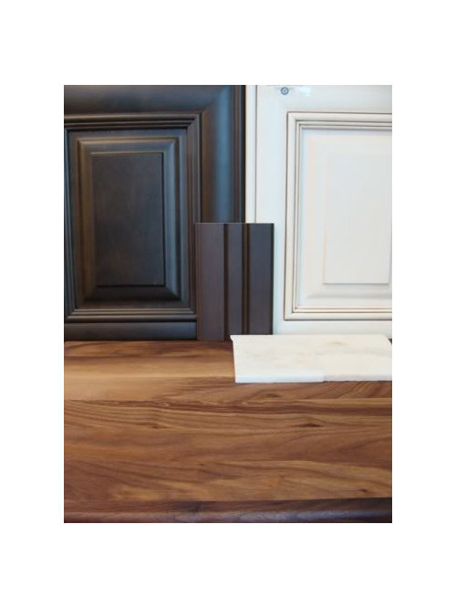
Help needed choosing an accent color for our kitchen
2LittleFishies
12 years ago


Sort by:Oldest
Comments (64)
Related Stories
ORGANIZINGGet the Organizing Help You Need (Finally!)
Imagine having your closet whipped into shape by someone else. That’s the power of working with a pro
Full Story
DECLUTTERINGDownsizing Help: Choosing What Furniture to Leave Behind
What to take, what to buy, how to make your favorite furniture fit ... get some answers from a homeowner who scaled way down
Full Story
KITCHEN DESIGNDesign Dilemma: My Kitchen Needs Help!
See how you can update a kitchen with new countertops, light fixtures, paint and hardware
Full Story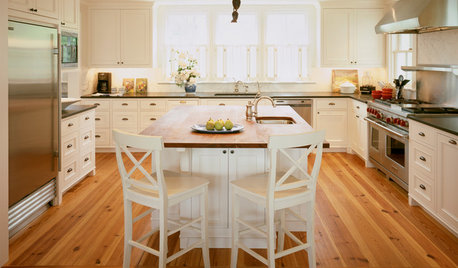
KITCHEN DESIGN3 Steps to Choosing Kitchen Finishes Wisely
Lost your way in the field of options for countertop and cabinet finishes? This advice will put your kitchen renovation back on track
Full Story
LIFEDecluttering — How to Get the Help You Need
Don't worry if you can't shed stuff and organize alone; help is at your disposal
Full Story
HOUSEKEEPINGWhen You Need Real Housekeeping Help
Which is scarier, Lifetime's 'Devious Maids' show or that area behind the toilet? If the toilet wins, you'll need these tips
Full Story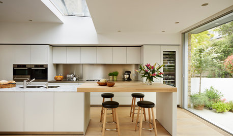
MATERIALSKitchen Ideas: How to Choose the Perfect Backsplash
Backsplashes not only protect your walls, they also add color, pattern and texture. Find out which material is right for you
Full Story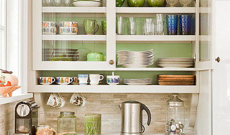
KITCHEN DESIGNChoose Your Kitchen Cabinet Glass
Textured? Frosted? Seeded? Find the cabinet glass style that will set off your kitchen to its best advantage
Full Story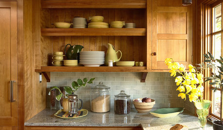
KITCHEN BACKSPLASHESHow to Choose a Backsplash for Your Granite Counters
If you’ve fallen for a gorgeous slab, pair it with a backsplash material that will show it at its best
Full Story

formerlyflorantha
2LittleFishiesOriginal Author
Related Discussions
Need help choosing a shingle color for our home.
Q
Need help choosing color for our foyer entryway
Q
Help us choose a paint color for our remodeled kitchen
Q
Need help choosing an accent wall and color!!
Q
2LittleFishiesOriginal Author
Bunny
lavender_lass
2LittleFishiesOriginal Author
2LittleFishiesOriginal Author
lavender_lass
marcolo
2LittleFishiesOriginal Author
2LittleFishiesOriginal Author
2LittleFishiesOriginal Author
lavender_lass
2LittleFishiesOriginal Author
lavender_lass
2LittleFishiesOriginal Author
lavender_lass
2LittleFishiesOriginal Author
lavender_lass
marcolo
2LittleFishiesOriginal Author
blfenton
2LittleFishiesOriginal Author
2LittleFishiesOriginal Author
dianalo
lavender_lass
2LittleFishiesOriginal Author
2LittleFishiesOriginal Author
lavender_lass
lavender_lass
blfenton
2LittleFishiesOriginal Author
blfenton
2LittleFishiesOriginal Author
lavender_lass
marcolo
2LittleFishiesOriginal Author
lavender_lass
blfenton
blfenton
2LittleFishiesOriginal Author
lavender_lass
blfenton
2LittleFishiesOriginal Author
lavender_lass
lavender_lass
2LittleFishiesOriginal Author
lavender_lass
2LittleFishiesOriginal Author
lavender_lass