


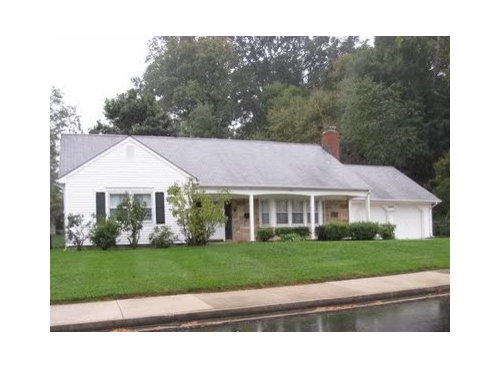
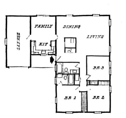
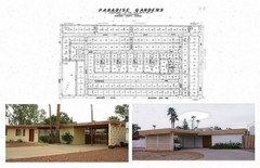
Design Around #12--1960s tract house.
palimpsest
12 years ago


Featured Answer
Comments (92)

cawaps
12 years agolast modified: 9 years ago
mtnfever (9b AZ/HZ 11)
12 years agolast modified: 9 years agoRelated Discussions
Why I'm building a tract home
Comments (26)The building company we like has a web site with their floor plans listed and all the options available and the cost of the upgrades spelled out. As I said before, most of the items available we have researched and we like what's offered. On those areas we don't, we will have the ability to tell the company what we would prefer to use and then they will order it and install it. For example, the company uses Mohawk carpet. We don't care for any of the levels they offer. However, there are higher levels of Mohawk that we like. Given that it is still Mohawk, they will order it through their supplier. The same holds true for the Congoleum vinyl they use. How much extra is unknown to me right now given that we aren't ready to break ground. The company sales rep said the company doesn't begin to start talking numbers on items until we put down a $500 completely refundable good faith deposit meaning we have a floor plan in mind and are ready to act on it, which I can completely understand. I will know how much it would cost retail (which I completely understand is not what the company would pay for it) so I can at least compare the price they give me to what it would cost me to have it done on my own. That is an option, as we were told the other day by the carpeting sales lady we were talking with regarding our current home. In fact, she was preparing for a meeting with the building company next week on a whole-house install. If I don't like the price the company offers then I'm free to have the work done myself as long as I'm willing to foot the costs. They will tell me how much of a credit I will be getting for them not doing the work or providing the material. Again, that was spelled out to me in the email with the company's sales rep and confirmed independently by a friend. Another example is in the appliance package. They offer different levels of GE appliances, which I hate. I prefer LG. The only thing I will be required to do is to purchase the appliances, provide the builder with the measurements, as it will affect the kitchen cabinet sizes, and then pay to have them installed. I understand the builder will not warranty them, but the installer I hire will and so will LG. Maybe this company is different from other production builders, but one of their advertised promises is that they will take any of their floor plans and modify them however you want with whatever material you want. They are even willing to do some structural rearranging. We want a pantry in the kitchen, which their in-house architect will work into the floor plan before the contract is signed, and which we will then be presented in terms of how much it will add to the cost. We also want a different style of backsplash in the kitchen incorporating a tile mural I love. I will buy and supply the tile and they will provide the installation based on the detailed plans I am required to provide. Again, I understand that all that will come at a higher cost, but before the contract is signed all those costs will be spelled out in writing. When it comes to the main structure of the house, I know this company's reputation. They build solid homes. We will see the floor plan we like in a few weeks as they are currently building it as a market home. At that time I will be able to judge how well it will work for us. Where the structure of the house is concerned (the bones) from the experience of people I know and trust the house is fine. Where we will want changes are in the areas I've previously mentioned, and they are willing to accommodate us in those changes. If I think I can get a better price on those cosmetic areas then I'm free to do so. Even the pantry isn't that big of a deal as we know a couple who did the same thing. They spent an additional $800 for it and was given a $250 credit for the cabinet they chose to leave out....See MoreDesign Around This #14: Rustic Modern
Comments (140)Actually, the quintessential steampunk piece is a modern computer decked out to look like a 19th century device. I met a guy profiled in the Boston Globe who has a steampunk house, and whose kitchen was featured here once. He was selling a cast iron Victorian stove that had been outfitted with a barely-discernable electric cooktop. It's not so much working Rube Goldberg contraptions as it is window dressing on modern technology. I think of it as a stage set in search of a story. Let's say Steampunk is a definite one month from now, as the project that follows the next one. For the very next one to start this weekend, I'm thinking Hollywood Regency, based on an unscientific review of the preference lists people have posted so far. I would sort of like to do the setup for Steampunk, so if you'd rather I not do two in a row, I can happily defer to pal on the HR project. Thoughts?...See MoreTract House examples for upcoming Design Around
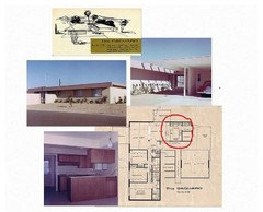
Comments (28)In California in the 1960s, some tracts were similar to those already posted on this thread, but there were also tracts of very MCM modern houses - Eichler in the San Francisco Bay area and other parts of California and very similar Streng house is Sacramento. On objective of the developers was to produce larger houses for the money by saving costs in areas that they felt were less important. Therefore, many of these are on slab foundations with low slope or flat roofs - the ceiling is the underside of the roof. No attic or crawl space which makes remodeling more challenging. In their original state, they brought the outside in with large windows facing back and sometimes side yards. Some also had atrium spaces. For privacy, they had no windows or only high windows for ventilation on the front. They often have pretty nice sized kitchens. They often used brick, stone and wood for an organic modern rather than a shiny lacquered or metal version of modern. Here is a link that might be useful: Examples of some Eichler houses....See MoreTract Home/Production Builder Questions
Comments (64)We did this too, and really, it was fine. We bought a 3500 sq ft house on a pre-sale basis from a mid-size builder in the Seattle area. Overall, I thought the quality was good enough. There was a major problem with the second floor sloping in our house plan and this affected several homes, but the builder was very responsive about it and fixed it. We also had a problem with the front door that needed to be replaced and painted. They did that too, although there was a problem with the painter using a paint machine that got into our heating ducts and spewed fine droplets of paint everywhere. It was not a pleasant experience but I will give the builder credit for trying to fix things. I would say the most painful aspect of owning that home was dealing with most of the not-so-customer-oriented contractors for all the fixes during the warranty period and the drain on my time (luckily I was a stay-at-home mom). I don't believe that third party inspectors were allowed during construction. But I did have three different inspectors look at the house, but only after the house was completed. One was before the closing walk through, one before the one year warranty ended, and one when we eventually sold it 2.5 years later to be in a close-in neighborhood. The inspectors didn't find anything big and I believe the quality of the build was similar to other new construction homes around this area. That builder limited our choices to some pre-selected options (unless you wanted to pay $500 to go to the "design" center which was basically the hard surfaces contractor/supplier's showroom--remember this is a mid-size builder in the Seattle area post recession), a couple of room layout options, two lighting package choices, AC and irrigation. We would not have been able to add windows, extra doors, or really anything else outside of the pre-set options, since the market was really warming up to be a seller's market and we bought the house on a pre-sale basis. I don't know of anyone else in the neighborhood that was able to make non-standard layout changes or add/change windows. Overall, it was a good experience buying and living in that house. It was nice to be in a neighborhood full of children that were my kids age and meet other neighbors that were similar in life stage to us . We made some good friends that way. We lived in a 1960's development before that and rarely talked to the neighbors and didn't know any neighbors with young children. It was also a relief not to have to worry about replacing the roof right away or worry that our old plumbing system would need to be replaced. I would have bought another tract home if I could have found one with a layout that was good enough, with enough yard space, in a close-in location, and that was at a more "affordable" price point. In fact, I did try to buy another tract house but was outbid (I think they sense that I was going to be a PITA :-). Now we are building a semi-custom house. While I do enjoy interior design/decorating, this has been a very stressful and time-consuming process. I often dream of moving into an already built house so I don't have to obsess over all the details and can get on with my life!...See Morebeaglesdoitbetter1
12 years agolast modified: 9 years agosteph2000
12 years agolast modified: 9 years agomudhouse_gw
12 years agolast modified: 9 years agopalimpsest
12 years agolast modified: 9 years agopalimpsest
12 years agolast modified: 9 years ago
gsciencechick
12 years agolast modified: 9 years agopalimpsest
12 years agolast modified: 9 years agopalimpsest
12 years agolast modified: 9 years agopalimpsest
12 years agolast modified: 9 years agomelissastar
12 years agolast modified: 9 years agocawaps
12 years agolast modified: 9 years agopalimpsest
12 years agolast modified: 9 years agomarcolo
12 years agolast modified: 9 years agocawaps
12 years agolast modified: 9 years agoadel97
12 years agolast modified: 9 years agopalimpsest
12 years agolast modified: 9 years agogsciencechick
12 years agolast modified: 9 years agomudhouse_gw
12 years agolast modified: 9 years agomarcolo
12 years agolast modified: 9 years agopalimpsest
12 years agolast modified: 9 years agoformerlyflorantha
12 years agolast modified: 9 years agolavender_lass
12 years agolast modified: 9 years agomudhouse_gw
12 years agolast modified: 9 years agocawaps
12 years agolast modified: 9 years agomudhouse_gw
12 years agolast modified: 9 years agopalimpsest
12 years agolast modified: 9 years agomudhouse_gw
12 years agolast modified: 9 years ago
sochi
12 years agolast modified: 9 years agoharrimann
12 years agolast modified: 9 years agomtnfever (9b AZ/HZ 11)
12 years agolast modified: 9 years agopalimpsest
12 years agolast modified: 9 years agolavender_lass
12 years agolast modified: 9 years agomelissastar
12 years agolast modified: 9 years agopalimpsest
12 years agolast modified: 9 years agogsciencechick
12 years agolast modified: 9 years agosochi
12 years agolast modified: 9 years agocawaps
12 years agolast modified: 9 years agolavender_lass
12 years agolast modified: 9 years agolavender_lass
12 years agolast modified: 9 years agosochi
12 years agolast modified: 9 years agopalimpsest
12 years agolast modified: 9 years agolavender_lass
12 years agolast modified: 9 years agomarcolo
12 years agolast modified: 9 years agosochi
12 years agolast modified: 9 years agolavender_lass
12 years agolast modified: 9 years agosochi
12 years agolast modified: 9 years agopalimpsest
12 years agolast modified: 9 years agojessicaml
12 years agolast modified: 9 years ago


Related Stories
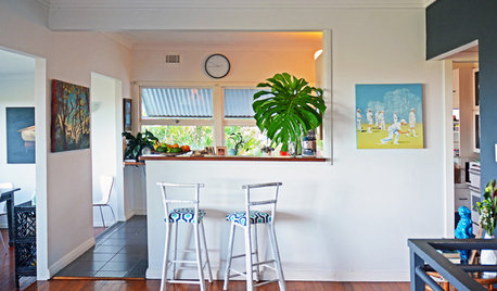
HOMES AROUND THE WORLDMy Houzz: Bohemian Eclectic Flair for a 1960s Coastal Home
An interior designer with a passion for sustainability personalizes her Australian rental home with eco-friendly furniture, color and warmth
Full Story
'Pan Am' Inspires Flight Back to 1960s Design
15 updated '60s homes offer lessons in craft, simplicity and style
Full Story
ARCHITECTUREWorld of Design: 10 Homes That Lap Up the Landscape Around Them
As building techniques develop, architects all over the globe are finding new ways — and new places — to integrate houses with nature
Full Story
HOMES AROUND THE WORLDHouzz Tour: Family House With a Surprise Around Every Corner
If houses could smile, this 1903 New Zealand villa might have the biggest grin of them all
Full Story
TRAVEL BY DESIGN11 Amazing Home-Away-From-Home Tree Houses Around the World
Go climb a tree — and spend the night. Tree house hotels and lodges are booming as exotic vacation alternatives
Full Story

MOTHER’S DAYWhat to Do for Mom Around the House on Mother’s Day
Show appreciation for your mother and make her day extra special with these ideas
Full Story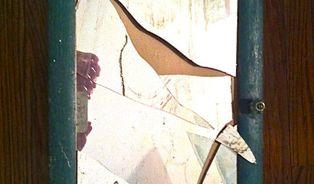
LIFEDo You Believe in Luck Around the House?
Broken mirrors, spilled salt, an unavoidable ladder — superstitions don't seem to affect this homeowner. Knock wood
Full Story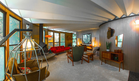
HOUZZ TVHouzz TV: Travel Back to the 1960s in a Most Unusual Round House
An Oakland, California, couple’s midcentury circular home provides a stunning time capsule for all-out vintage modern style
Full Story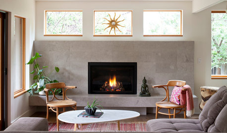
LIVING ROOMSNew This Week: 5 Living Rooms Designed Around the Fireplace
Overcome one of design’s top obstacles with tips and tricks from these living rooms uploaded recently to Houzz
Full Story


marcolo