


Recent Activity


Ty JJ, Just had the perimeter counters installed & love them. Still a ways to go but I certainly will.


Madre Perla has a warm tones mixed with gray and taupe. Some slabs even have some orange/rust in them. The best thing about MP is that it is totally bulletproof and in 2 years we have no etching or staining. We love it!
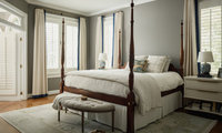

I would also like to know the bedroom paint info.
I’m interested as well. Having my whole interior repainted next month and finalizing the palette.
I usually go for SW Anonymous in my master bedrooms (I’ve moved a lot!) and this looks close. Could be it. Anonymous is a great colour but she’s a chameleon- is it green, is it charcoal grey, is it brown? - totally shifts based on your room direction & light. But I like all 3 of those so it alway works well for me :-) And the intensity (I guess this is true for all colours) shifts dramatically based on lighting conditions. Sometimes appears as a soft mid-tone and sometimes looks fairly deep (like a ‘dark academia’ look).


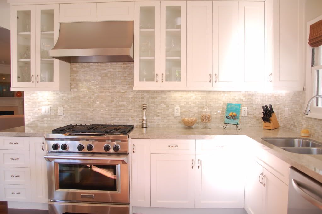
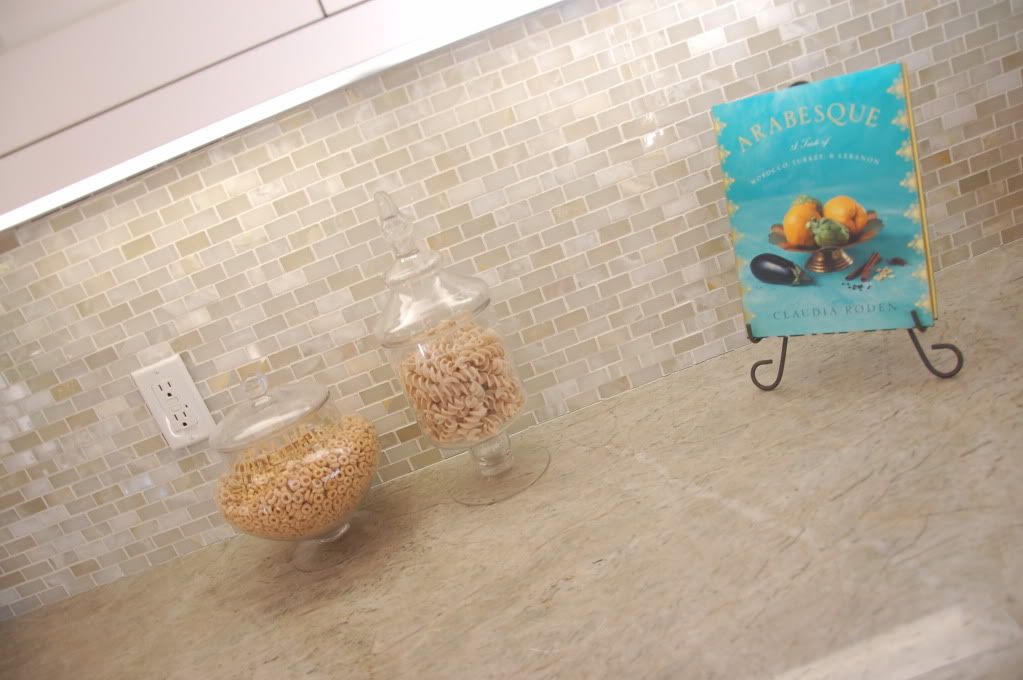
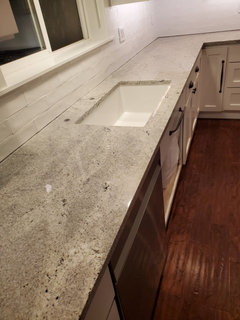
My granite was finally recently installed and we are in love. I am so glad we chose the Himalayan white, it has so much movement and white highlights throughout. We also put it on our fireplace surround. Cabinets are PPG standard white. So happy with how it all turned out.


A trick I learned from our cleaning lady. After washing the window, go over the surface with a squeegee. THEN cover the squeegee with a microfiber cloth and go over it again. Cuts cleaning time in half and no streaks.
You might have a tie breaker if you look at the full size slab. When we looked at Pentax Misterio on a small sample, the veining looked pretty uniform, but when I saw the slab, it was all on one side of the slab, meaning much of the counter would have looked out of balance in comparison. We ended up choosing a soft gray quartz with movement that was more consistent throughout.
I’m very happy with how these waterfall counters using TERRENO look.