


Recent Activity


I would stick to one cabinet wood for a small galley kitchen. Use either the oak or the walnut but not both.
Also, if you want drama, select a really special natural stone. Those heavily veined quartz materials are so fake looking and are not going to age well.


"layout is what it is, we looked into changing it and it was far beyond our budget and we really wanted to be able to see the dining table from the kitchen as we have a big family and the wall closed off the space. As far as cooking in traffic area, there is no helping that it was like that to begin with, again we don’t love it but we are doing the best with the layout we have."
NO......You are not.
I totally understand a large family, wanting a different kitchen. But!!
Even with the awkward layout, it was a big mistake to remove all the wall. Aside from the fact there is no venting? There is not enough room behind the cooker; it isn't as if the cook were on a peninsula.
I would build UP that entire run of drywall behind the cook to a height of 45" minimum.
You will still have a view. ............
You have done a refresh with no thought to safety or function.
Which of two counter tops hardly matters.
( you're lucky, it's a big vacation week, or a few pro's here would be beating you on the head with a stick!!, and I would not be the lone voice)


I'd get new light fixtures, new mirrors, and new cabinet hardware. Then, add a large white rug that sits from the entry door to the end of the vanity, and paint the room white.
Update: New downward lights, new interesting mirrors with frames (or add frames to existing mirrors), new countertop, paint the vanity, new hardware including towel rods, probably new faucets, and new color on the walls. A bigger rug all needed on floor. Coordinate hardware/faucets finish with whatever is in the shower. All predicated on shower being neutral finishes. To raise the bar add glass shower/bath doors. That can be done later when budget allows.

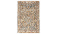
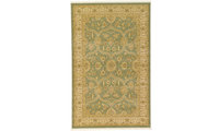
Very pretty room. For me personally, the rug looks rather dark (at least on my monitor). I like the pattern but personally would look for something lighter as well as a more colorful pillow on the corner chair. I also think the mirror over the dresser looks too small but again it could just be the view from the picture.

Your room is very pretty the way it is. My only suggestion would be to turn the two paintings above the bed to horizontal. I'm curtains were hung High and Im assuming that's why you're pictures were high as well. They look to be abstract so maybe it would work. Maybe it wouldn't.

Just me, but I do think with all the rectilinear lines in the room, something round and textured would look nice over the bed. And the plant on the floor in a round basket or round pot.


I would do site finished oak to match the rest of your floors. You are over thinking the upkeep.


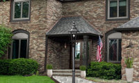
No to painting the brick! Here's a mock up. I would also add some brick along the pathway.

Personally, I would not paint your brick. I think it looks very nice. What I would change is as follows:
1. New house numbers. What you have looks cheesy.
2. New light fixture. Something bigger than you have.
3. Personally I would lose the shutters.
4. Paint your front door a vibrant color to stand out against the brick.
5. Landscape with some flowering bushes and get rid of all the depressing green bushes.
Re-evaluate at that point to determine if these relatively simple fixes are all you need. Good luck!..


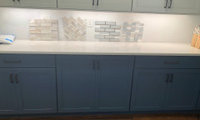
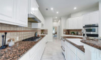
The slab is gorgeous. I think the floor tile is too busy, and will compete with the countertop. How about choosing a porcelain tile in a color pulled from the slab?
Something like this, still a hex shape but calmer: https://www.tilebar.com/pergola-taupe-12-5-hex-matte-porcelain-tile.html

Yay. easy to clean.
What is it that you are hoping to achieve with altering the wall? Opening up to a half wall with bar stool seating will require moving into the living space to accommodate counter depth and bar stools....is that some you want to live with? In addition, looking into a sink seems quite undesirable to me. Perhaps posting floor plan with all measurements here in the same post might allow for some other recommendations to improve your space.
You're trying to bring more natural light into the kitchen?
Is that wall loadbearing?
A to scale floor plan of the whole space you are planning to redo Do it on graph paper show every window , doorway where those lead every measurement clearly marked and posted here in a comment in jpeg format . This is the only way to get help here. The pics are pretty useless BTW.
Personally I don't like any of them. The patterns are all very busy with the small tiles and multiple grout lines. I would choose a much larger glass subway tile in a color perhaps a little lighter than what you have.
You want to go to an actual tile store not a big box store. You can also order samples on line from Tile Bar to see how they look in your space.
Ashley:
Here are 2 examples of what I was thinking of for your space
https://www.tilebar.com/santa-monica-gray-4x12-tile.html
https://www.tilebar.com/seaport-chameleon-2x10-polished-ceramic-tile.html
I like the 2nd one the best. I think it would look stunning as either herringbone pattern or subway. You will want to be careful about the color. You have dark floor and lower cabinets (at least on my monitor) and I can't see how much natural light is in the room so you don't want it to look like a tomb. Good luck and keep us posted!

I wrote above that of your choices, the gray glass subway was the best.
Crazy, isn't it? So many choices to begin with, it's finally narrowed down to four, and then here come dozens more...choices. All good, earnest and helpful ideas, to be sure.
Keep it simple; back to your four.
You've got dark base cabs, light wall cabs, a white/bright counter, and warm wood floors.. That design needs your third choice, the gray-glass subway tiles. They produce a blend-in/non-competitive pattern (unlike the hexagon, e.g.). And they're darker, which is needed; the depth will pull everything together.
Have Fun - Good Luck

Ashley - I so totally agree with @lazidazi !! All the choices being thrown around were making me crazy & I was feeling bad for you! 😁 The lesson is I think that there are so many choices & people have so many different styles & preferences that it’s very important that a person focuses on what they like & want to see everyday in their space. It’s good to have all this input as it makes one consider other choices & the input also should help each of us understand what our personal style is. So, you pick & please don’t be afraid to come back & tell us what you did pick. I’d like to know!

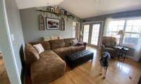
If you just moved in, you should live with the kitchen for a bit. ......
You can't do much with the island until you determine if the shape can change. if it can be enlarged, still provide adequate clearances and cover the flooring. You can't , (and we can't) determine that because you would need to provide all the dimensions of every wall, window and passage, and appliance in the kitchen.
It's certainly not ideal as is, but largely telegraphs a kitchen too small to even HAVE an island, and worse? The island contains the cook top with NO venting I can see in the picture.
It's a kitchen begging for a re do.....and the best thing? Save money and wait it out, versus pecking at it.
Or accurately measure the kitchen. Walls and all, every inch, with the island placement within. Where doors and openings lead..etc.
Of all the things the sellers spent money on why paint? Sorry for the mess you bought. Yet another example of how kitchens don't sell homes. Don't add insult to injury by adding more paint. Wait this out and start over.

No to shutters. Your home is lovely. I do agree that a brighter front door color would make that area look spectacular.

No shutters. Lovely home!!
No shutters, they are not needed.

What will be the bathroom floor tile? What is the vanity coutertop? Both materials impact the choices for the shower tiles.
I would not go to the expense to redo a shower and use an acrylic pan with large format tiles.
I also don't care for the marble-look pan, marble-look walls and marble-look herringbone niche...too much color variation and all the angled gray streaks will more than likely be too busy.
I dislike a tiled niche that doesn't relate (layout or tile) to anything else, plus all those perimeter small cuts in the niche will be a nightmare unless you have a highly experienced tile master.
Between your choices and your current "boring off-white cultured marble shower" I'd rather keep the boring shower. Price the house accordingly.
Unless there is a structural issue with the bathroom, don't spend the money trying to update to what you think mught be more appealing to buyers. Personally, I don't like the shower pan and tiles.....just looks like you bought a bunch of discontinued items on sale to flip a house. Your changes would discourage me from buying not entice me.
Yes, post a picture without the photoshopped elements so we can see how the house really looks. Then we can offer suggestions.
I’ve got samples of both, so I’ll see what ties in better with the brick.
Agree to add nothing to the windows but paint out the red and update the landscaping.