


Recent Activity

Yes
I don’t think there is a leak .. it’s been years
It looks like it is probably sheetrock. It can be repaired, but, there are some suspicious spots, that look like moisture. Do you have an attic? Can you get in the attic? It needs to be inspected to see if there is a roofing leak. Remember roofing leaks, can be up higher on the roof, and run down to a lower spot, so you need to look good. Take a flash light, and look around for any staining on the underside of the roof.

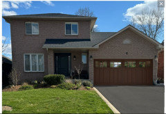
Wow what a beautiful house as is. It already has stone on it, imo no need to add more.

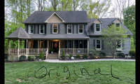
We can barely see the entryway from the picture you posted (I understand you don’t own it yet) so we don’t know for sure what is needed.
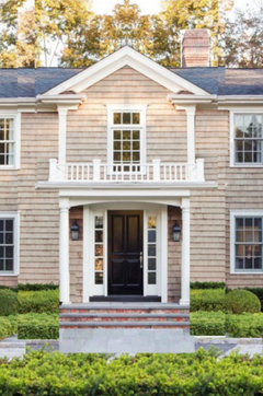
But here’s a picture I pulled off the internet that demonstrates what I was talking about for an entry well-matched to its house.

Some version of this in the center section, though you probably need a wider pair of windows or maybe a Palladian window but match the header and sill height to the rest of the second floor. This is just a close up of Beverly’s picture. It’s a classic house, push it the rest of the way there.

Why is your daughter looking at a property that she hates, and why are you trying to get her to like it?

OP stated the mirror was there when they bought the house. Art would be so much better on that wall.
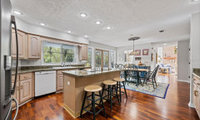
This is rough and don’t have measurements but this is concept. Transform peninsula to peninsula/table. Or totally remove existing peninsula and create large island. I would put my dollars 💵 on this part, and not spend on changing window and door. Leave those as is.


Your house is nice enough as is, or with a couple of small improvements, as already suggested. But a wnderful landscape could elevate it to a new level.


I'd add some white to your home.


Agree that all the architectural chat is likely to be wasted money and agitas. Paint your front door a bright color, consider one of the suggested changes to the garage door, and put all the rest into landscaping. Check back in a year and see how you feel.


I think quite a bit depends budget, and the feel you want.
Fabric is expensive, and upholstery labor has gone up considerably in every market!
More importantly? Those who favor traditional looks have been largely left in the dust by the marketplace, and that is a truth whether high end, or the mass market you see online.
Get with the designer you chose, make sure you're a good fit and she "gets" you. Make sure you understand her contract, her fees. try not to crowd source ( here) as you will get as many opinions as posters: )
There is such a thing as a bossy, traditionally inspired contractor. And in his 30 years of installing wood flooring apparently he has never been involved with a modern home. Ask the decorator it is correct. It is her job to oversee.
Remember, neither the decorator or the contractor will be living there or paying for it. Be polite but firm about what you want.

Because you can still see the grain of the wood, I wouldn't paint. I would use clear tinted or semi-transparent tinted wood stain.
I don't know your sun exposure, but dark deck flooring can get hot. It also shows every speck of dust.
If you choose some of your gray stain for certain areas and then a natural cedar stain for other areas, it would be a nice modern look with your natural vibe.
For accent color, a couple of seat cushions for the bench, a few throw pillows and colorful plant pots here and there.
Sounds like fun!

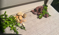

I would go with gravel more natural looking like those shown by Debi and Kate. And ignore the naysayers .
@gardengal48 (PNW Z8/9) Odd comment... anyone can put any rock or gravel of any color they like... in any state, in any climate. You need to loosen up with the rules.
I really like the look of Debbi and Kate's suggestions. I particularly like Debbi's because the blue pieces look a lot more like native rock and schist you find in PA. (Was born in raised in PA.) The red and gold look like something from a Colorado office park.
Not only are the colors of their examples better, but they sizes are not uniform and the variation is nice. They look more like smooth smooth stones rather than the red chunky rock fragments, which also remind me of something you'd put in a fish bowl.


I think they will work together nicely. The grey tones will help mediate the strongly contrasting pop between stark white and blue. Just be thoughtful about your grout color and grout line width.


Another vote to leave the brick alone and don’t add grills.
What would really up the curb appeal of your home would be a stately garage door. There are many options in all price ranges that would bring some pizzazz to an already attractive house.


Oh wow! Thanks everyone! I was so hoping I would not need to go down the drape rabbit hole again. I think I just need to get used to the change. I do love the increased views and the light is the best in the house. I do not dislike the deep green color in the bad mock up. But I’ll make that the next resort rather than drapes. Unless I get some more ideas ;)
Oooh, that sounds like an expensive and messy project! I’ve recently bought a home. My rental had 9’, 10’, 12’ and a two story living room. My new (old) house is mostly 9’ and 8’. Going from 20’ ceilings to 9’, I love that it cools easier and is easier to decorate. And I don’t even notice the difference between 8’ and 9’ honestly. If the neighborhood is great, house is great otherwise, consider buying it. I doubt you’ll notice the difference after a few days.
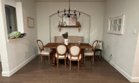
Could we see the table turned? It's free and can easily be turned back if you don't like it.
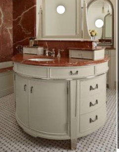
Hoping some pros will chime in, have you considered changing vanity to a lighter color that compliments the veining in the countertop?
The black fence, with some landscaping inside and outside, will visually disappear. White will be a lot more prominent.
I would go with white chairs.
For those rare occasions I would just buy some nice quality white folding chairs. Why take up room in the house with rarely used chairs?
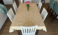
Why the tablecloth? You have a nice kitchen and living space ... and all I see is an old wrinkled tablecloth which brings the whole space down a few notches!

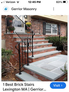
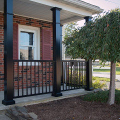
IMO rhe railing should be heavier in scale to balance the brick.


Can't suggest any specific plants but the house is very colourful so I would opt for white blooms. I've introduced some black for sharpness and make a few things stand out such as 2 pendant lights, the metal railing, flower pot and flower boxes. Plantings that would hang over the retaining wall would look nice as well as a flower bed on both sided of the walkway.


I would post this on an audiophile subreddit. Leave out the blaming the wife info and just ask how you should set this up so it doesn't look like a college dorm room with a crazy nice view.

Do you have a stereo system in your other home? If so, how did you and your wife compromise between aesthetics and sound quality?
I have to side with your wife here. That set-up looks like something dreamed up by a 20 year old who won the lottery.

Those giant chess pieces are awesome. Very cool.
When I look at your set up, while the equipment isn't on the floor, it has that appearance, which makes it look like there is a missing piece of furniture. It gives a cluttered feeling to the space. Furthermore, because the equipment at the back is visually small, it makes the forward items seem all the more massive. While it seems counterintuitive, in order to lessen the impact of the equipment overall, you actually want to make the items in the back bigger in order to ground the larger elements in the front. Adding a piece of furniture that spans the lot does this as well as unifies the elements to reduce the visual clutter. (Obviously, these are not clutter, but when they appear as a cluster of smaller objects, it looks busy and this more cluttered than fewer larger items.) The undersized coffee table stand-in (piano bench) isn't helping the visual clutter either. At least that's my two cents.

It's "USELESS"?!!! P.C? How so?
That is THE most ridiculous statement . I agree it deserves only paint vs. a more intensive refinish.......BUT
It's got four nice sized drawers, undie, bra, and sock drawers.....jewelry......rolled up tees or leggings and room for lord knows what she has at 16 yrs!
That was a bratty / arrogant/rude statement and wrong to boot.
Were I sixteen, and my mom was willing to paint it and let me pick hardware and a color?
I'd be darn happy, especially if I had NO dresser at all.


What good are two chairs that can't view the TV? Move them to a better location.

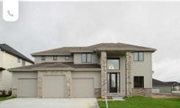
For those particular houses I don't like dark. It doesn't go well with the stone placements.

If the house is well insulated, there shouldn't be any difference in the interior temperature between having a dark vs. a light exterior.
It's really a personal preference between the two photos. I would prefer the light color.
Dani I don’t think anyone was calling you out; the vicious post by Coldwell was completely unnecessary., but typical for her.
I agree to match the siding. Your house is beautiful!

I think it would look odd if it weren't there. What is your objection to it and how are you planning on trimming the window instead? Can you post a picture from further back so we can see the whole facade?

I love MCM and Japandi homes, but the front facing triangular gables make it look more traditional cottage or country cape, don't you think?
Someone mentioned pale yellow, white trim with your red brick. That's a possibility. Yellow's one of the trickiest paint colors--go more pale yellow than you think. Here the white birches connect to white trim. Before you put on shutters, see how the house looks. This is a clean, no shutter look.

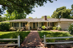
The house above has red brick path to connect to red brick chimney. Any hardscaping/landscaping should have some red touches to enhance the red brick.
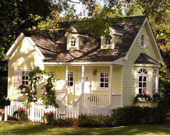
Here's a cottage look in great pale yellow. Here the landscaping includes a white picket fence between the house and the rest of the front yard--something to consider.
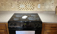
Stainless steel: durable, easy to clean.

Stainless steel with rounded corners, which makes it easy to clean.


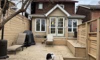
I disagree with some of the comments that suggest you won't use the space since it's at the front of the house. I LIVE for my front porch. It's my favorite place for morning coffee or an evening cocktail. I do agree that adding something screened in wouldn't be great fit for curb appeal and the roofline would make that type of structural addition expensive. What I would do in your position, since that patio area is big and awesome is add a pergola and tons of climbing and hanging plants. A very easy solution for the bugs is to add a fan or two for constantly moving air, no bug issues when I have one going.


Personally I do not care much for rod pocket drapes. They are too country style for me so my go to choice is either back tab, clip rings or grommets. If you go grommet make sure you have fuller pleating. That is why I always purchase more sets and sew them together. This makes for more than the standard four folds. I do this for most off-the-shelf drapery panels. No matter what style you choose, the drapery fullness is what makes them luxurious. Plus you dont see the gromets much, and they are easy to adjust. To get the best look, I love a soft linen that drapes beautifully. My favorite are from Crate and Barrel, Lindstrom, which I modify by adding drapery clips.
So IMO grommets are still a good look if done right.
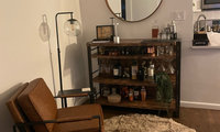

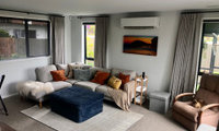
So potentially lose the rug and chair, how about suggestions for the space? Just keep the bar area the way it is, and maybe some art on the other wall where the lamp is?

I’d have to agree with the above about losing the rug. Without seeing the other angle of the room I’m not much help but I’m assuming there’s a TV on the other side of the coffee table. That chair could work on the empty corner of the rug adjacent from the sofa ….
Same as above, no chair, no rug, the rug also looks like a trip hazard. Place the chair with the seating group.
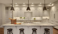
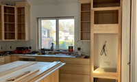
It is a tract house. It is what you could afford. It has a kitchen you can live with for a couple of YEARS with zero issue!
Don''t get in a rush to turn a basic and functional space into an Instagram photo op.
You are looking at a kitchen with no visual "use" at the moment! Move in, take your time, and relax. Design in haste, often leads to repent in leisure.