


Recent Activity

Another vote for All White, it’s the perfect white - soft and easy on the eye without any harshness that Pure Brilliant White can sometimes have..
If your hallway really is dimly lit and you are sensitive to shadows, I wouldn’t look to an uber light, near neutral white such as FB All White first.
Near neutral whites are very low in chroma. (degree of colour).
Zero chroma = a true neutral.
Such whites, really require a decent amount of well-balanced light, to be at their luminous and gleaming best. They aren’t illuminants in themselves.
An off-white with more chroma (degree of colour), such as Wimborne White, would be worth viewing in situ first.
Don’t dismiss it because it may appear too yellowish in the better lit areas of your home.
That extra kick of chroma may simply translate to a welcome softness, in lower lighting.
Should Wimborne White still feel too much of a colour in that space for you,
chroma = 0.68 and All White render a little raw and shadowy, with a chroma of 0.21?
Then you are looking for a white with a degree of chroma which sits between the two.
See BM Snowfall White + PPG Swansong/Delicate White within this list.
(PPG = Johnstones Trade Colour)
#chroma


so if you have any suggestions for a blue-gray colour for kitchen, please let me know :)
Perfect Palettes on my IG feed.

I would pull tonal colours from the brick or mortar for your lower render.
Keep the brick as is.
If the windows aren’t UPVC then I would also soften them off with another tonally related colour and use the front door to introduce a touch of drama.
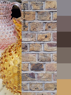

Dulux Weathershield has some great colours. You can use a visualiser to help decide on colour
https://www.dulux.co.uk/en/dulux-weathershield

For the lower level, having a light shade of grey would be more cohesive, or magnolia could also be a great colour match for your house.


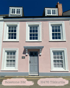
If you are thinking a seafoamish family for the door accent. Maybe a pale shell pink and a deeper tone of it for your pinks. Or at least I think it might be shell pink. Like the pink inside a conch shell that has a touch of salmon/peach to it. But the pastel tones of it instead of the bold natural tone. Not to the blushing bubblegum or fuchsia or purple variants of shell pink. The salmon/peach tone to the pink should also play well with the haint blue.
I measured the colour attributes of this lovely pink house in St Mawes, Cornwall, England. These were the nearest paint matches from those measurements I could find. 🌸
See Benjamin Moore Rosetone.
🌸
What is the original colour of blue?
These are near neighbours to SW Dutch Tile Blue.
They are higher in value + lower in chroma, so lighter and that bit more neutral than SW Dutch Tile Blue.
FB Borrowed Light + BM Mountain Mist are much lower in chroma again, so the most near neutral options of all.
wow, you guys are awesome - thank you so much!
Is it better to just try to find another color
Always. The search can be done digitally like Marylee H did and you can pull the chips to evaluate.
If nothing shows up +/- in terms of lightness and/or intensity, then going the cutting formula route makes sense.
Cutting formulas means you have no idea what you're going to get until it's mixed, swatched and dry. At which point you own the custom mix whether you like it or not.